Project Overview

Kitchen Confident is a cooking website that provides home cooks with a variety of both recipes and tutorials to build new cooking skills. Recipes are recommended based on user profiles and on what a user has previously cooked and liked. Each recipe page offers direct links to specific tutorials that are useful for that recipe. Users also have the option to save their own notes within the body of the recipe and to see notes that others in the community have saved.

Project Duration

October-November 2022

My Role

Lead UX Designer - UX Researcher - UI Designer

TOP
-00. Background

Introduction

I created this project as part of the Google UX Design Certificate program. As a design team of one, I was in charge of the entire process, which included user research, wireframing, visual design, low-fi and high-fi prototyping, and usability studies. I set out to make a cooking website that was more than just a collection of recipes, but rather a feature-rich platform that could help home cooks of all abilities feel confident in their skills and excited to cook.
Recipe page and pop-up recipe features

The Problem

The vast world of food blogs and cooking sites gives home cooks nearly unlimited access to recipes and tips, but cooks need a way to easily find, organize, and interact with these resources. Beginner cooks often need extra explanation and assistance with a recipe. And cooks of any skill level often find it more difficult to cook from a device than from a traditional cookbook. No matter their skill level, cooks want to feel comfortable and confident learning new recipes so they can add them to their repertoire of standards.

The Solution

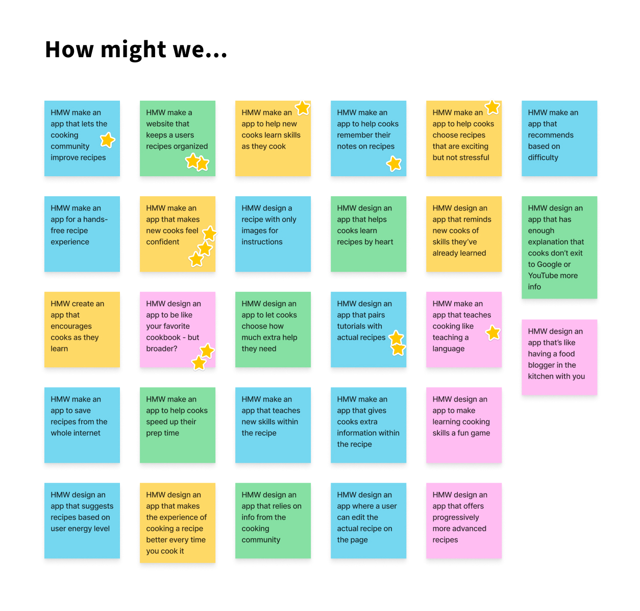
The goal of this project is to offer home cooks a way to choose recipes that align with their skill levels and encourage them to build their skills and confidence in the kitchen, by recommending recipes and suggesting relevant tutorials. The project also aims to help cooks interact with an online recipe more in the way they would a traditional cookbook, with the ability to bookmark things for the future and write their own notes and edits.

Recipe page hero section on desktop
Recipe page on desktop with video tutorial pop-upOrder confirmation screen, order details screen, and user dashboard showing movie ticket and concessions order
-01. Empathize

User Research

“It’s exciting when I find something that I want to do that I think might become a good go-to. I want to keep expanding my repertoire.” -Jamie, interview participant

Research Goal:

Understand home cooks’ and bakers’ experiences learning new recipes and techniques, and what challenges are faced.

Research Process:

I conducted in-person interviews with four amateur cooks representing a broad range of cooking skills and comfort levels. I asked a series of questions with the goal of understanding:
  1. Users’ methods of learning new recipes and cooking techniques.
  2. The challenges faced when learning a new recipe or technique, and what users do when encountering these challenges.
  3. What could be improved about the experience of learning a new recipe or technique.
User interview notes

Research Findings

“The stressful bit is if there are parts where I’m not sure if I’m doing it right, or if the instructions aren’t clear and you’re not sure if you’re doing the right thing. You’re nervous that you’re gonna screw it up and then you’re just gonna have to throw it away and start from scratch.” -Meredith, interview participant
I organized my interview notes and created an empathy map for each interviewee. I then turned these into an aggregated empathy map and began to see several patterns emerging among interviewees' opinions.
Empathy map from user interviews showing what user says, thinks, does, and feels
Aggregated empathy map

User Pain Points

Poorly written recipes:
Needing more instruction:
Saving notes:
Difficulty reading from phone:

User Goals

User Personas and Journey Maps

After interviewing real people to understand their experience of ordering concessions at movie theaters, I created fictional user personas to capture important needs and frustrations that I could refer back to throughout the rest of my design process. I then created a journey map for each of these personas to further empathize with them.

Personas: Eleanor and Cody

User persona of Eleanor Pena with photo, demographics, and information

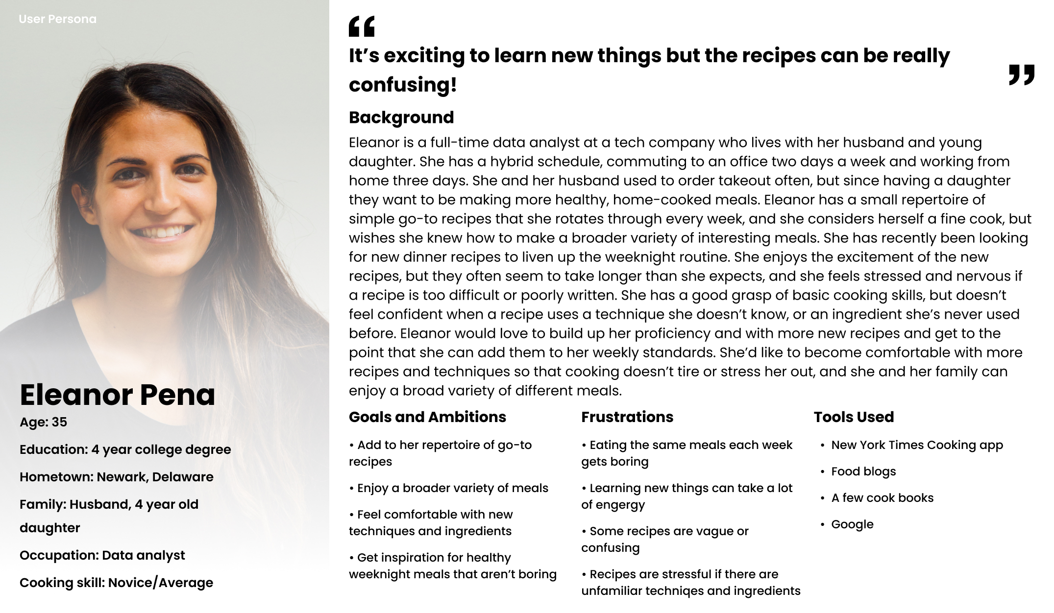
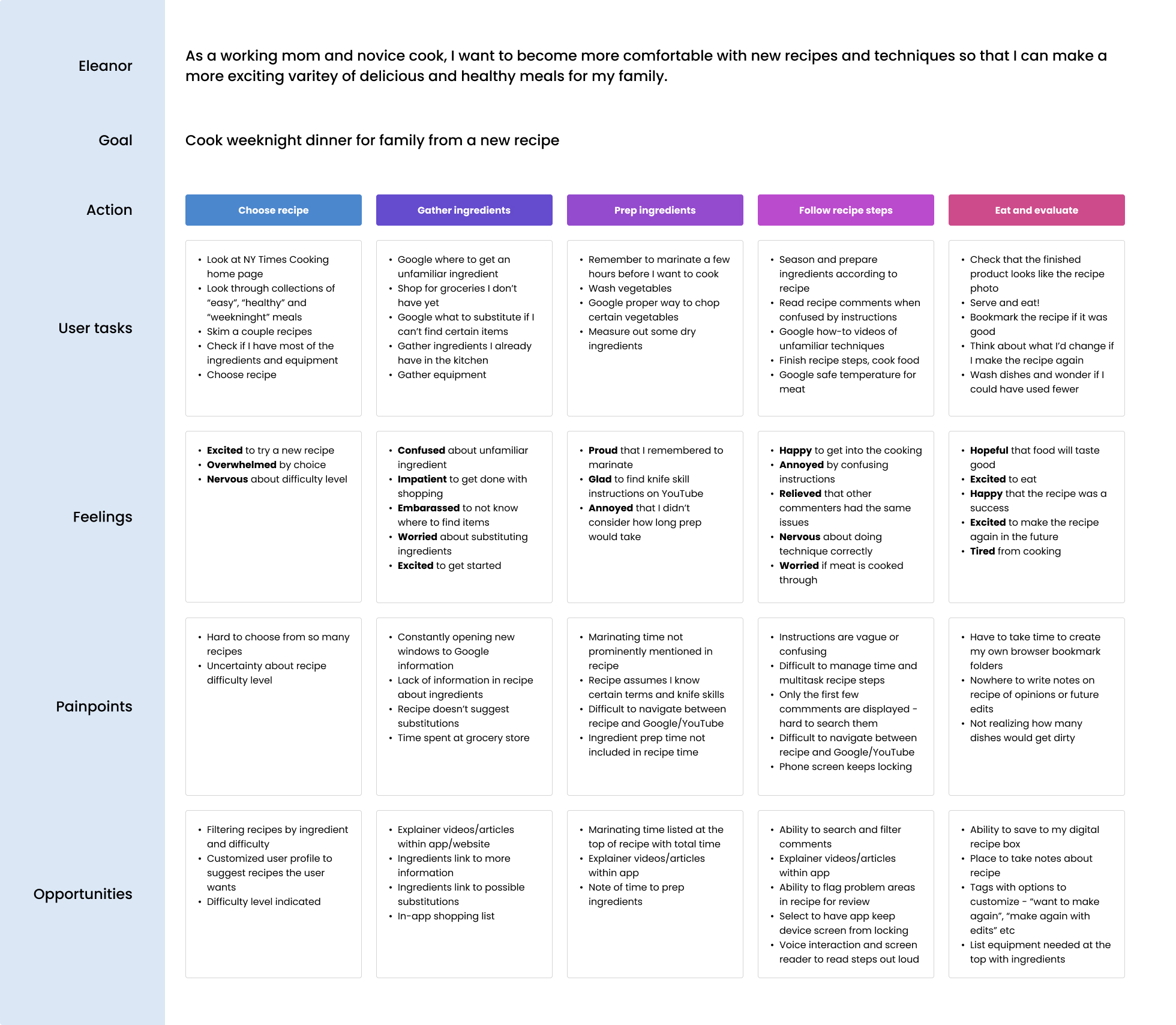
Eleanor is a working mom and novice cook who needs a way to easily get extra instruction and information while cooking, and remember her notes on a recipe, because she is building new cooking skills by trying recipes that are unfamiliar to her.

User persona of Cody Fisher with photo, demographics, and information

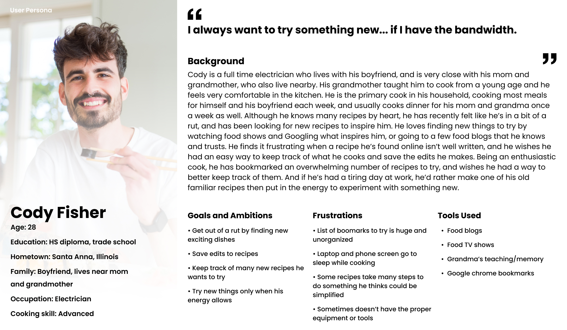
"As a busy professional who loves cooking, I want to easily keep track of new recipes and techniques to try, and save my notes on them, so that I can get out of a rut and find new meals to make again and again."

Journey Map: Eleanor

User journey map for Eleanor Pena
Eleanor's goal: A way to build confidence so she can cook a more exciting variety of weeknight dinners for her family.

When considering Eleanor’s journey, I looked at the process of planning and preparing a weeknight family dinner. I relied heavily on pain points brought up in my user interviews and focused especially on all the times that she might be trying to look up extra explanatory information if the recipe was vague or unfamiliar.
-02. Ideate

How Might We...

I began my ideating with a "how might we" brainstorming exercise, aiming to keep my ideas as broad as possible to allow many possible design solutions.

How might we create a responsive website...

Digital sticky notes of How Might We brainstorm

User Needs

To narrow my broad ideas into more specific possible design solutions, I thought back to my personas to brainstorm user needs. I began to consider design solutions that could address these user needs.
Digital notes of brainstorms of User Needs

Information Architecture

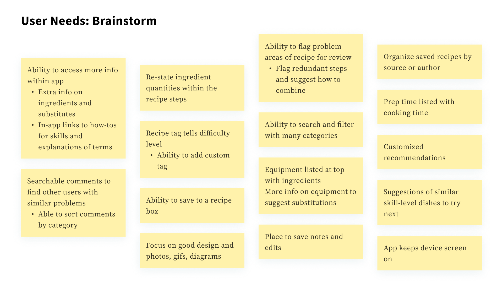
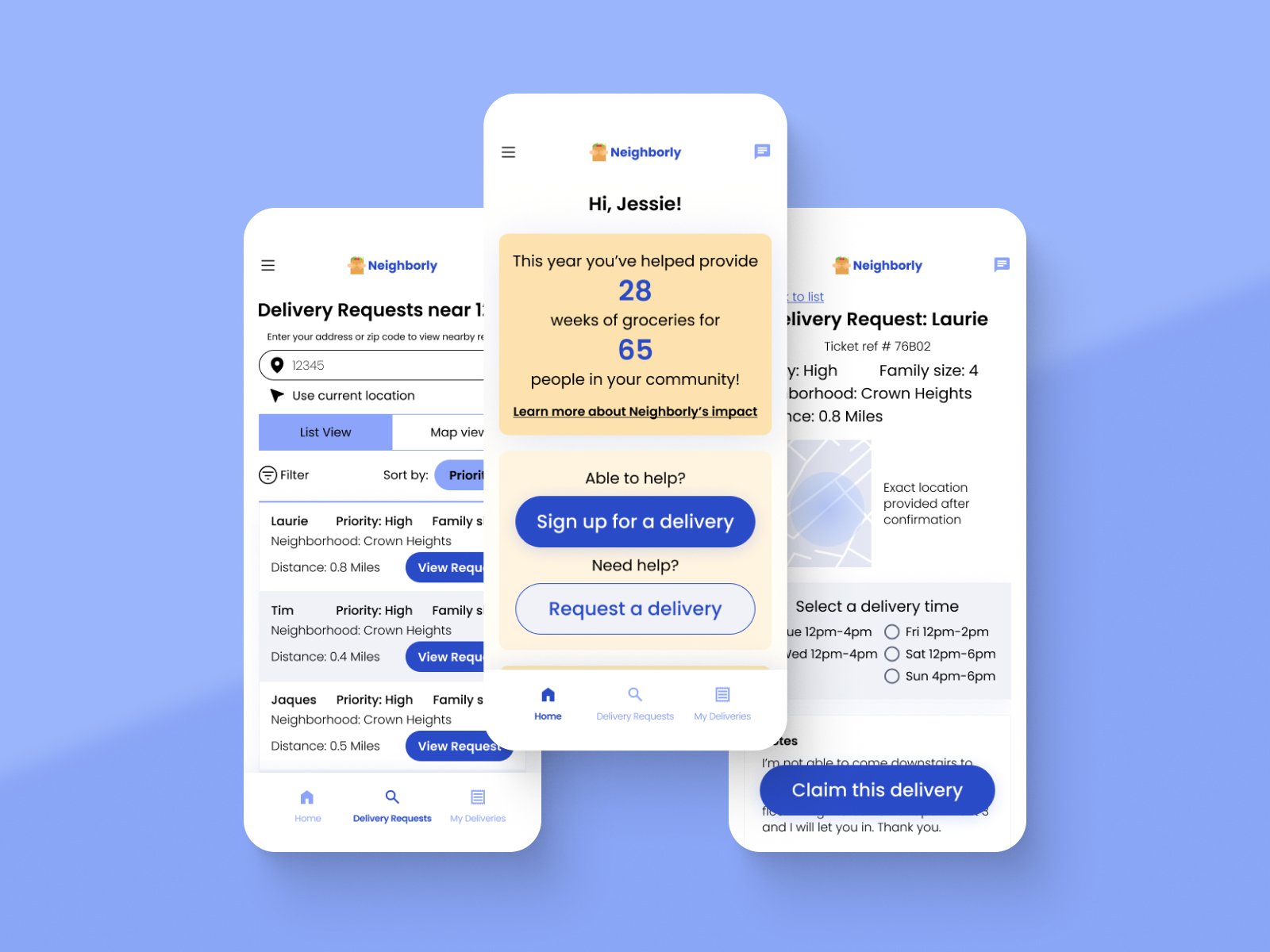
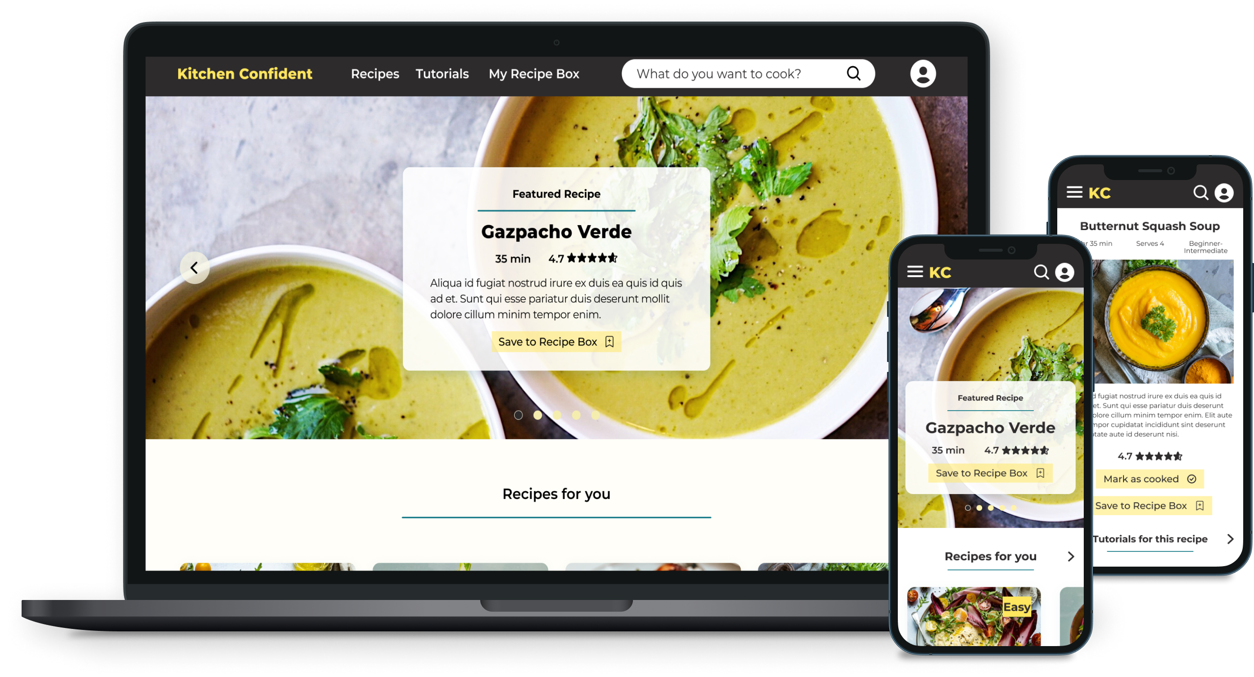
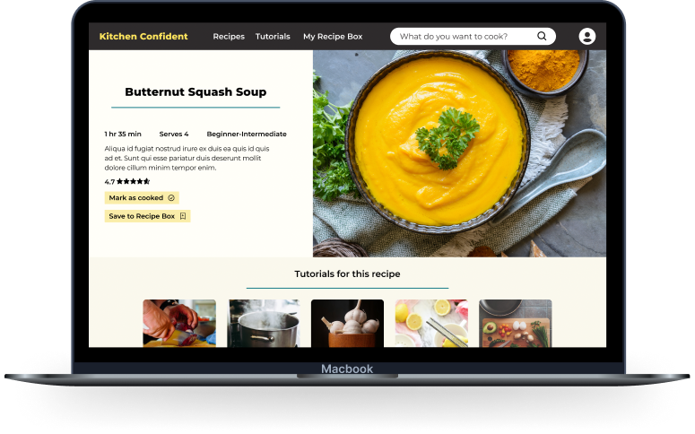
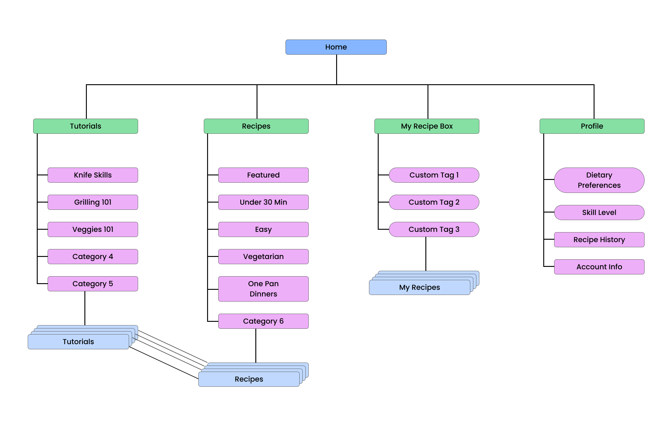
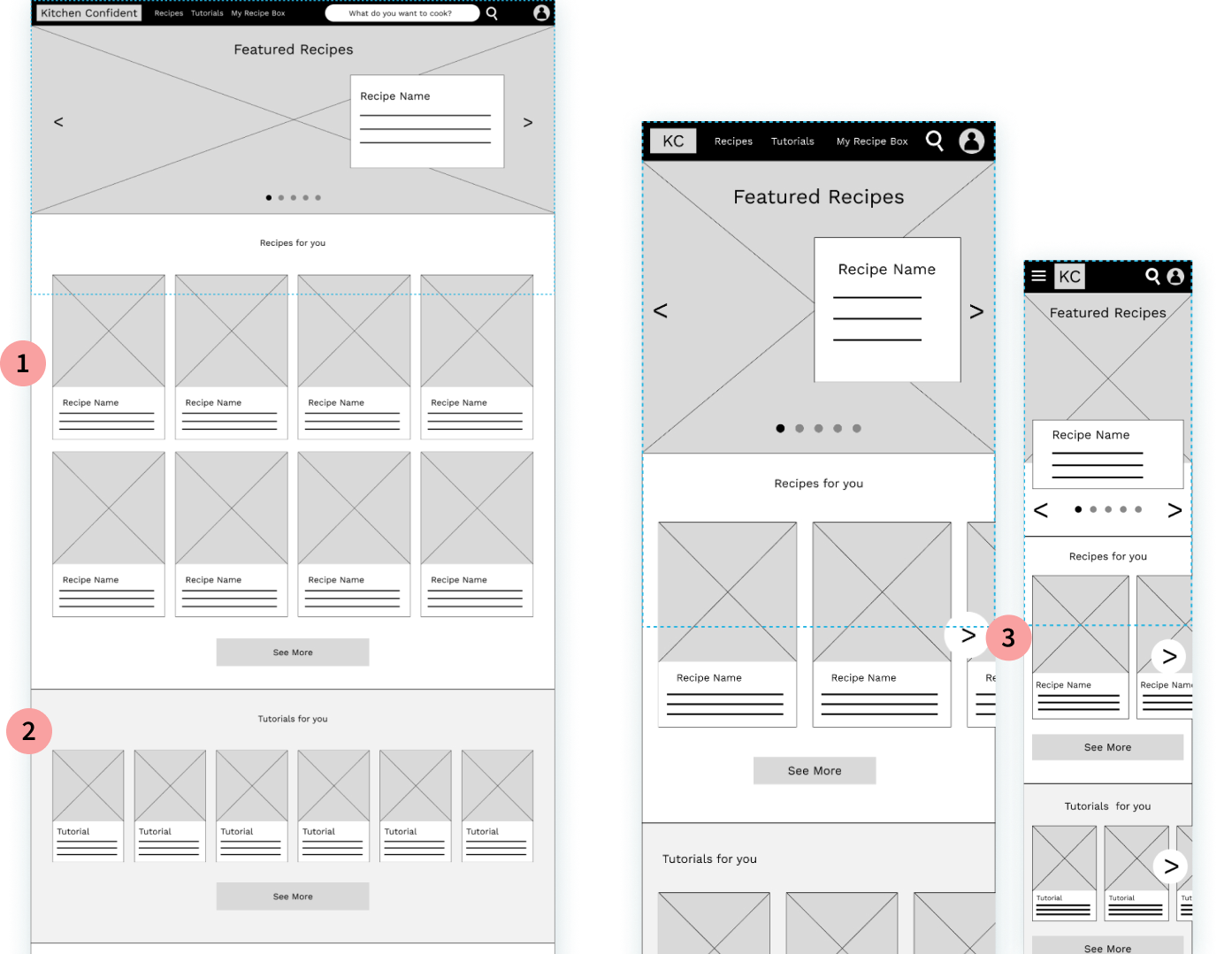
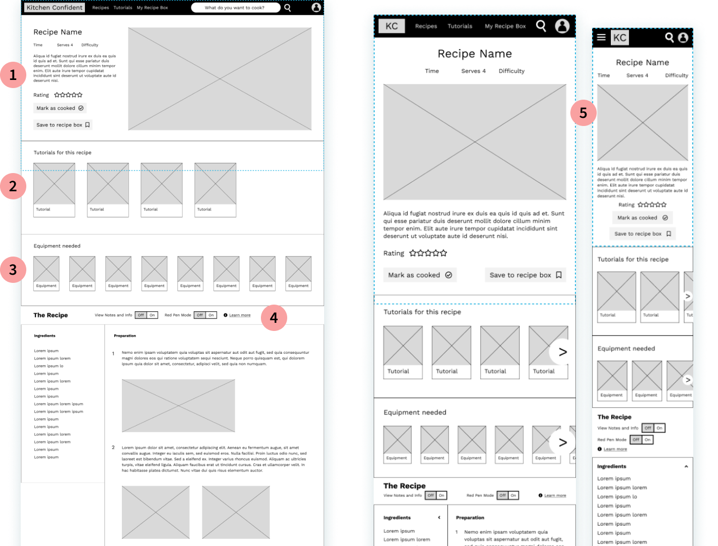
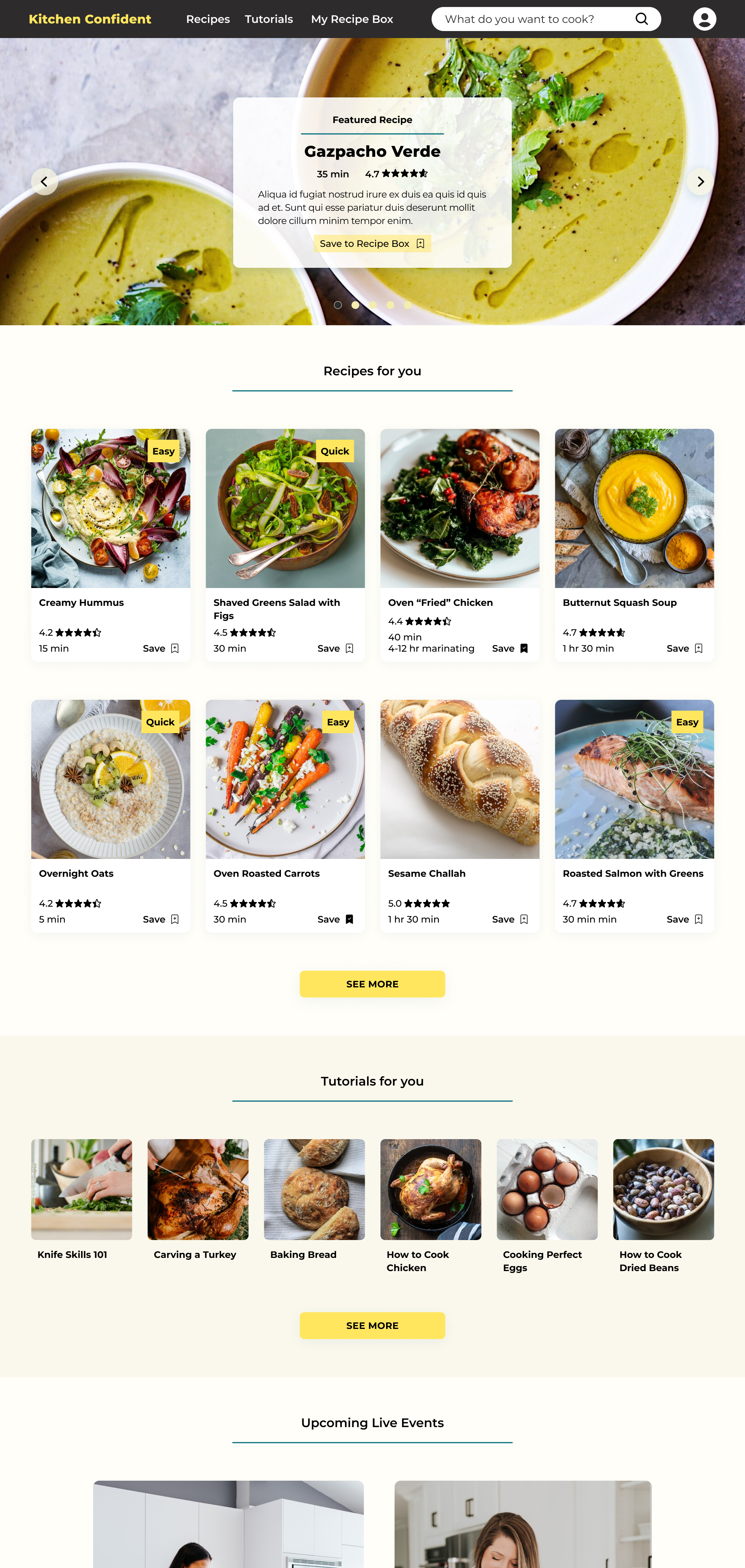
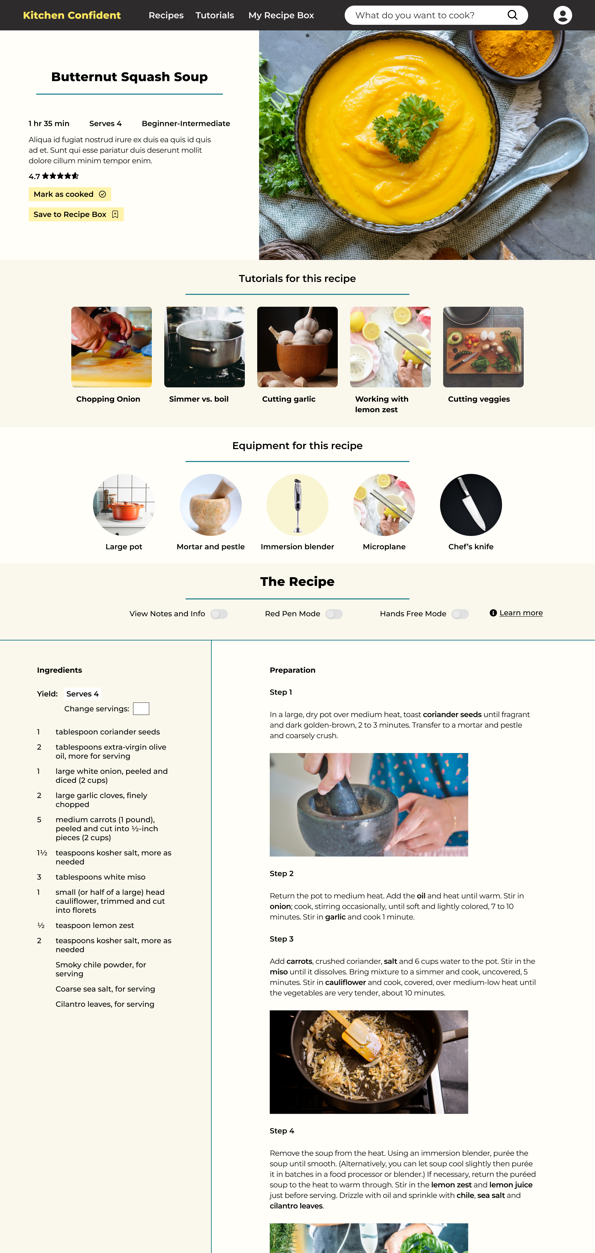
The structure of this website would need to include top-level sections for full recipes and cooking tutorials. Within these pages would be databases of individual recipes and tutorials that could be organized by category, and searchable with keywords, filters, and tags. Each recipe page would have links within it to relevant tutorials and vice versa.

In addition, there would be another top-level section in which a user could save recipes to their private “recipe box”.

Site map showing information architecture of website
-03. Wireframe and Prototype

Wireframes

Paper Wireframes

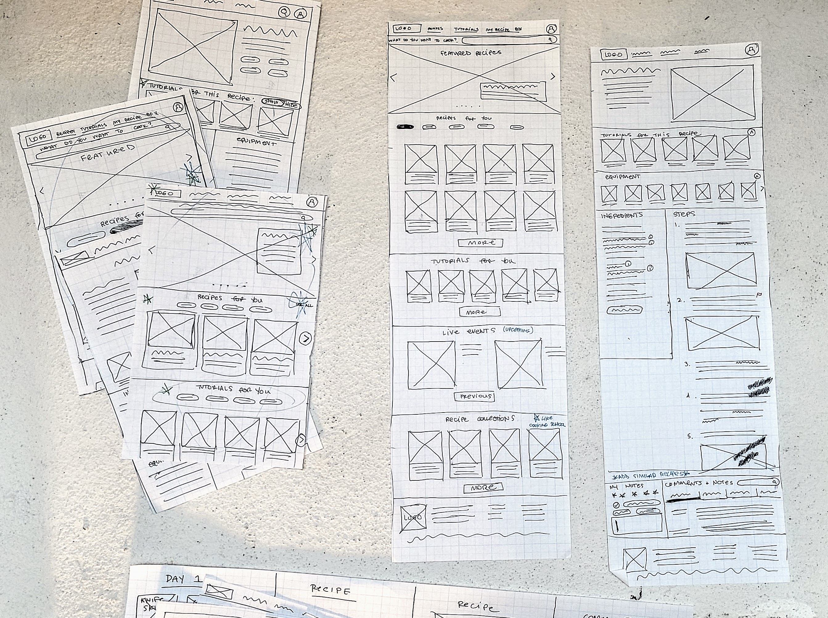
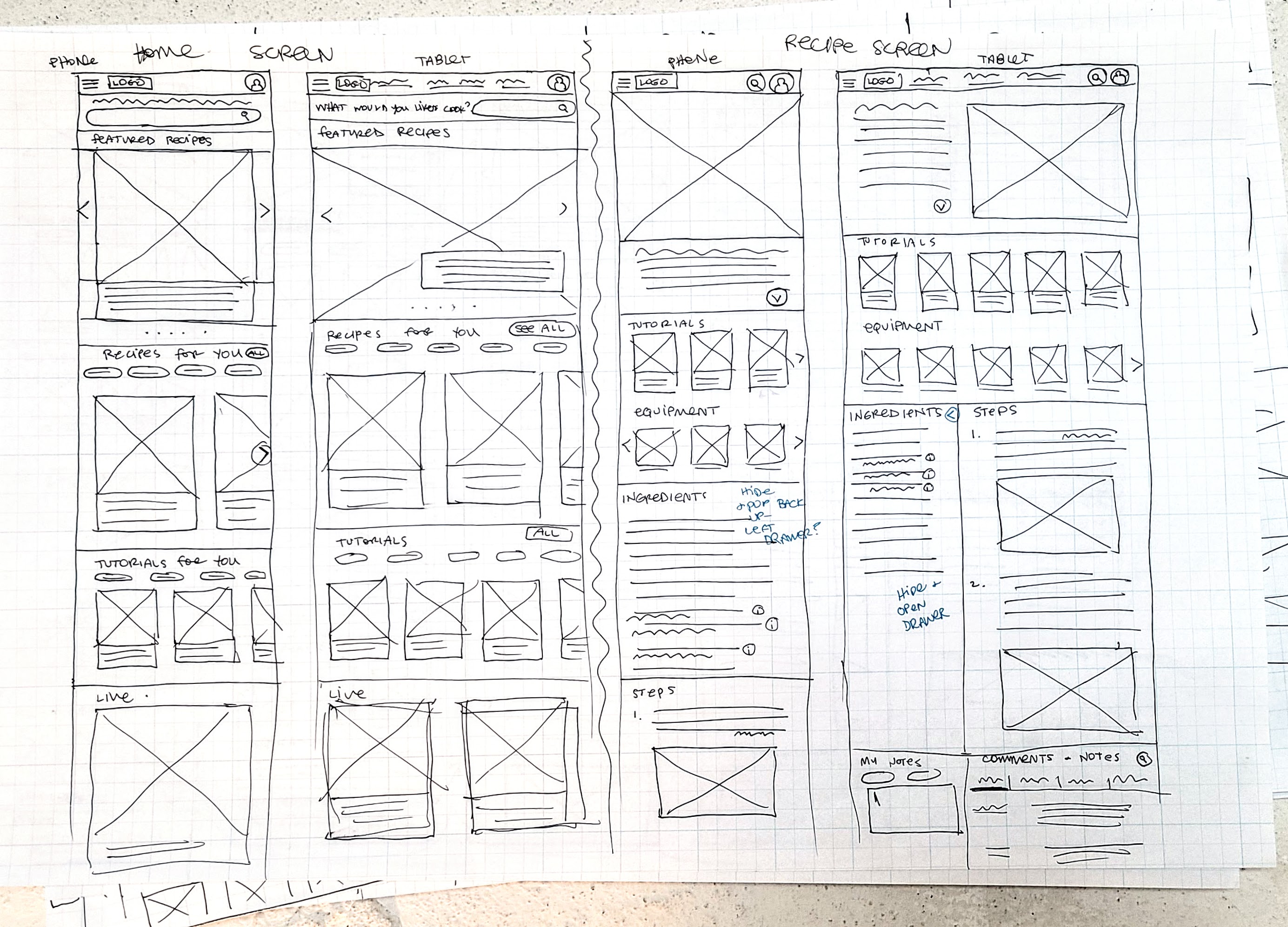
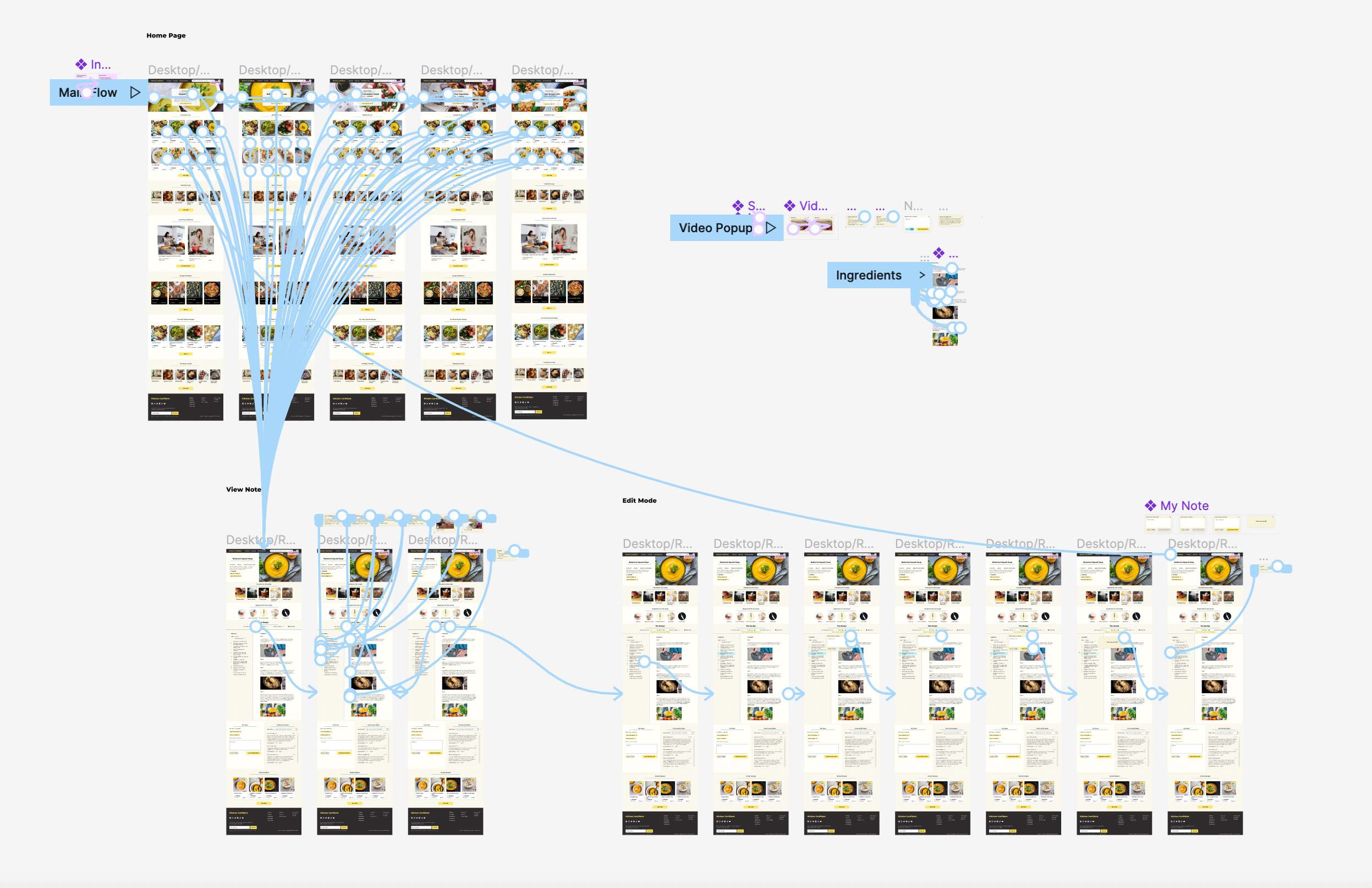
I  began wireframing with several rounds of Crazy 8s to rapidly iterate on possible structures. I chose a version of a “layer cake” layout, with many rows of different content, generally rows of cards stacked on top of one another. I drew wireframes for the desktop version of the home page and recipe page, and once I was happy with these I turned them into phone and tablet sizes as well.

Hand drawn paper wireframes of desktop size of website home page and recipe pageHand drawn paper wireframes of phone and tablet sizes of home page and recipe page

Digital Wireframes

Home Page:

Digital wireframes of desktop, tablet, and phone sizes of home page with annotations below
  1. Recipes recommended to the user based on what they've made or saved recently and preferences they've selected in their account (dietary preferences, general likes and dislikes)
  2. Tutorials recommended based on what the user has done recently and preferences they've selected in their account (what they want to learn, what their skill level is)
  3. Tablet and phone size: card grids are changed to a single row that scrolls horizontally

Recipe Page:

Digital wireframes of desktop, tablet, and phone sizes of recipe page with annotations below
  1. Main details of recipe. Users can rate, save, and mark as cooked to stay organized and get better recommendations
  2. Tutorials for cooking skills that are used in this recipe. Beginner cooks can read/watch these brief tutorials before starting the recipe.
  3. Equipment list shows what kitchen tools will be used, and when “view notes and info” is turned on users can click to get suggestions of substitutions they can make if they don’t own a particular tool.
  4. Users can toggle options on and off. “View notes and comments” will highlight areas that many other users have commented on. “Red pen mode” allows users to write their own notes in the recipe, which they can save as public or private notes - so the next time they make the same recipe they can remember what edits to make.
  5. Tablet and phone layouts are a single column. Tutorials and equipment card rows scroll horizontally.

Recipe Features:

Digital wireframes of desktop sizes of recipe page showing notes and edits features, with annotations below
  1. Turning on “red pen mode” allows users to write their own notes directly into the body of the recipe. Highlighting text will open a comment box. Notes can be saved publicly or privately and will help a user remember edits they want to make the next time they make the recipe.
  2. With "view notes and info" on, information added by the website editors can link to additional in-site tutorials.
  3. “View notes and info” highlights areas where many other users have left public comments. Examples: ingredients that can be substituted, more information about an ingredient or technique, advice on a particular step, suggested edits to make, etc.

Low Fidelity Prototype

In this prototype, a user begins at the website home page and selects a recipe to make. They turn on the “view notes and comments” feature to read extra recipe information. Then they turn on “red pen mode” to save their own recipe note.
Low-fi prototype: view notes and make edits
Screen shot of figma workspace in prototype mode showing connecting nodes
Click to try the prototype!
-04. Test

Usability Study

I conducted a remote usability study with five participants to test this low-fi prototype. Participants were asked to explore the home page and recipe page, then read comments in the recipe and add their own note. I wanted to learn:

Findings

Participants tended to have an easy time navigating the site and appreciated that the structure of it felt familiar. They also tended to feel that the notes and edits features were helpful and easy to use. However, many participants wanted to see these features fleshed out even more, and felt that additional tools would still be needed to address certain pain points. Some actionable insights were:

Updating the Wireframes

I iterated on my designs to address these insights from my usability study:
Digital wireframes of desktop, tablet, and phone size of recipe page showing updates to notes and edits tools, and hands free mode, with annotations below
  1. Added field to change total servings, which will update all the ingredient quantities
  2. Clicking on an ingredient within the recipe steps will pop up a reminder of the quantity needed
  3. “More info” pop-up has a preview video of the tutorial it is linked to
  4. Users can up-vote or flag comments
  5. Hands-free mode allows voice control of recipe
-05. Refining the Design

High Fidelity Mockups

Home Page

To create high-fidelity mockups, I chose a color scheme of yellows and tans, keeping the look of the design light, fresh, and upbeat. I stuck very closely to the structure that I had created with my digital wireframes. With so much information needing to be displayed on the page, I was careful to keep each section as neat and uncluttered as possible. I used different shades of tan in the background to differentiate new sections.
High fidelity mockup of desktop size of home page
Recipe Page
On the recipe page, I again used alternating shades of the background tan color to differentiate sections and keep this information-packed design organized. I continued my use of large, eye-catching images, and used rows of cards for linked tutorials and recipes.
High fidelity mockup of desktop size of recipe page

High Fidelity Prototype

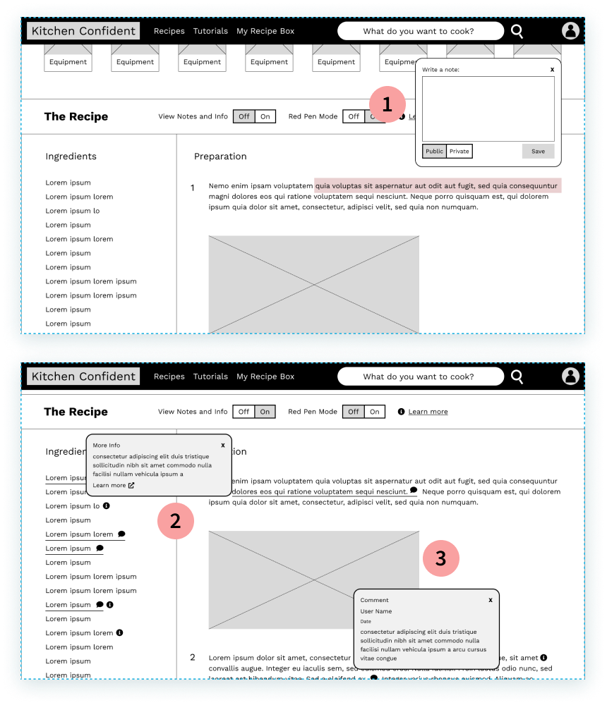
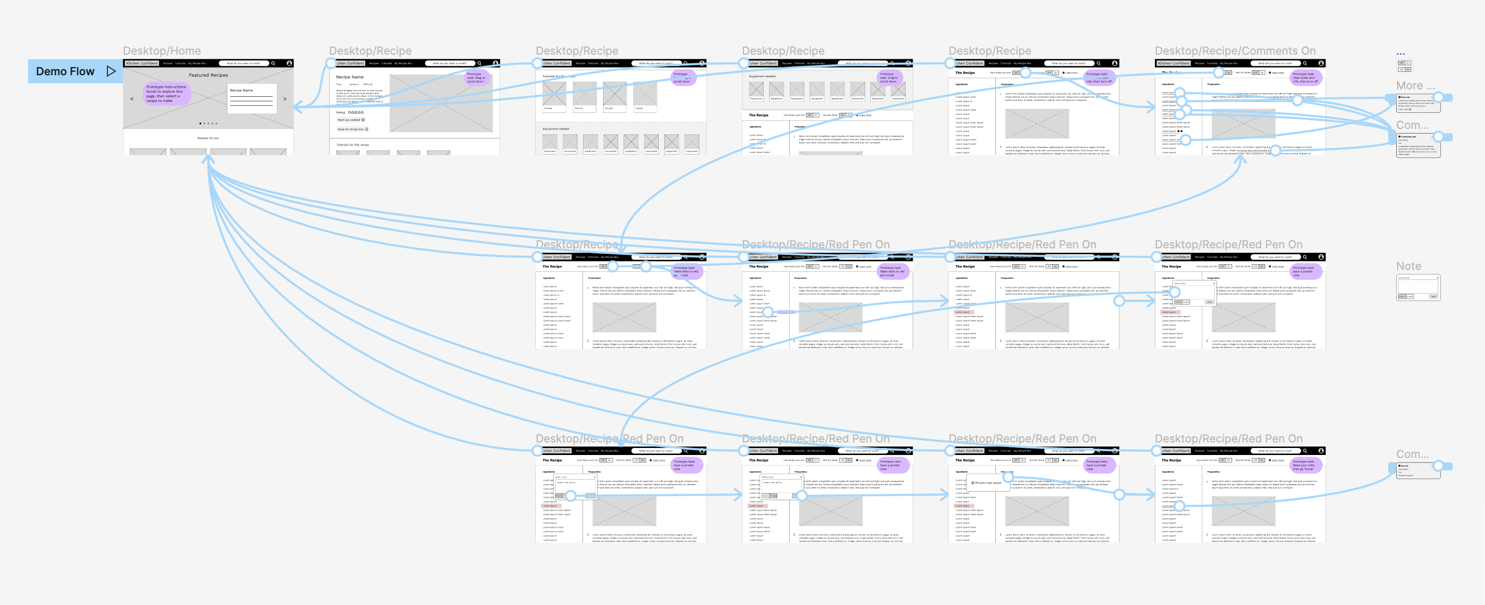
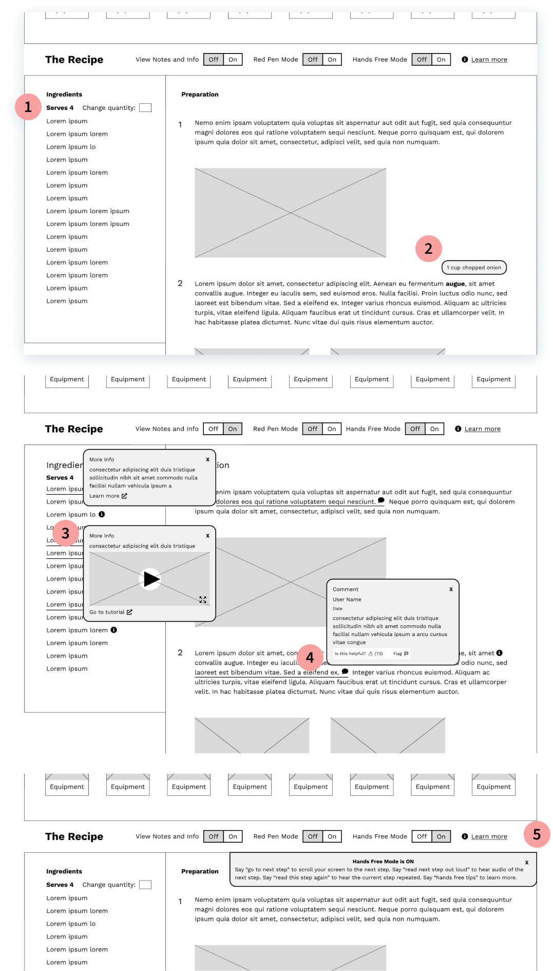
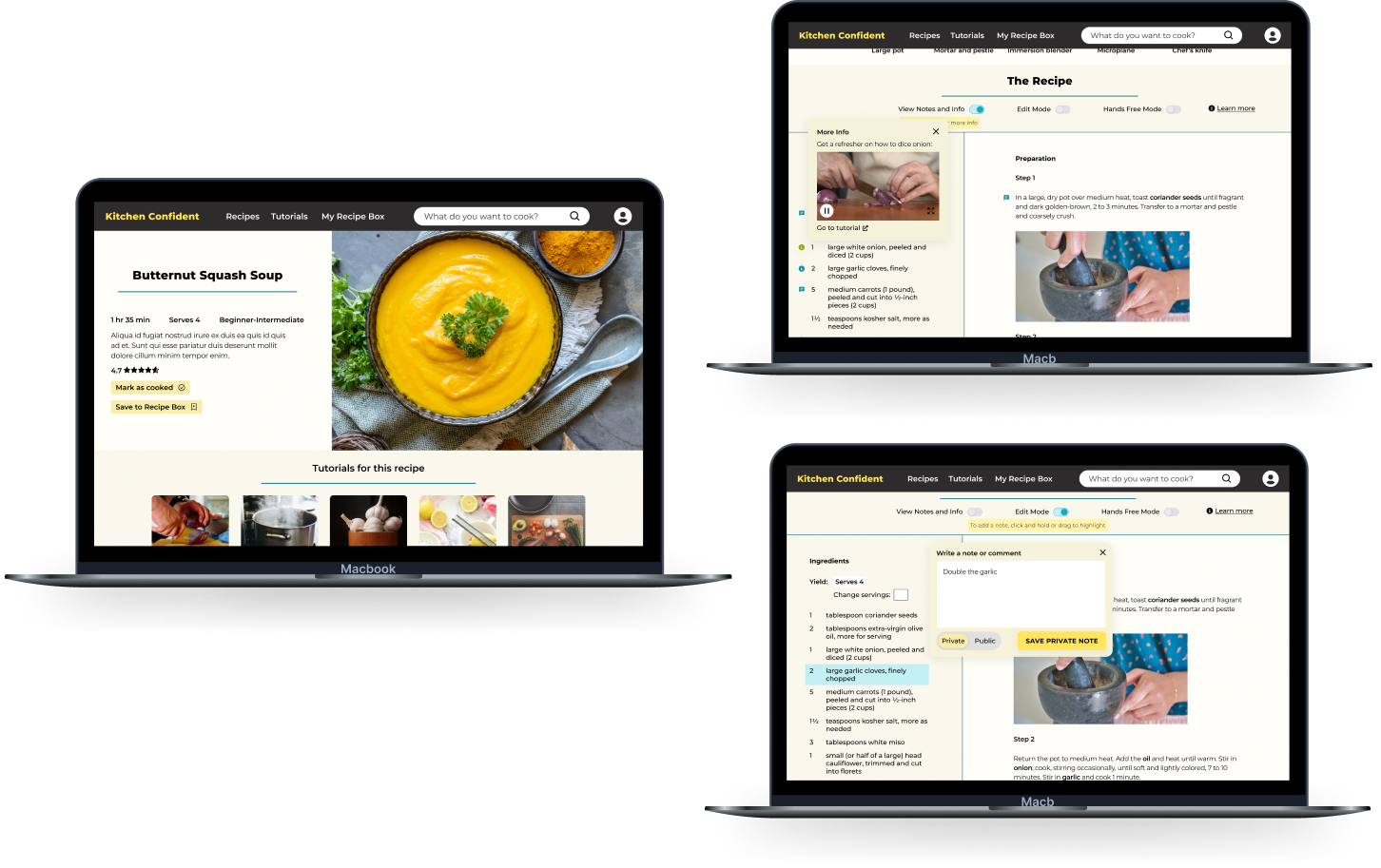
For this high fidelity prototype, in addition to the main user flow, I added the ability to scroll through a carousel of hero images on the home page. I relied heavily on overlays for notes and edits in the View and Edit modes.

High-fi prototype: choosing a recipe, viewing notes, saving a private note.
Screen shot of figma workspace in prototype mode showing connected screens
Click here to try the prototype
-06. Accessibility

Accessibility Considerations

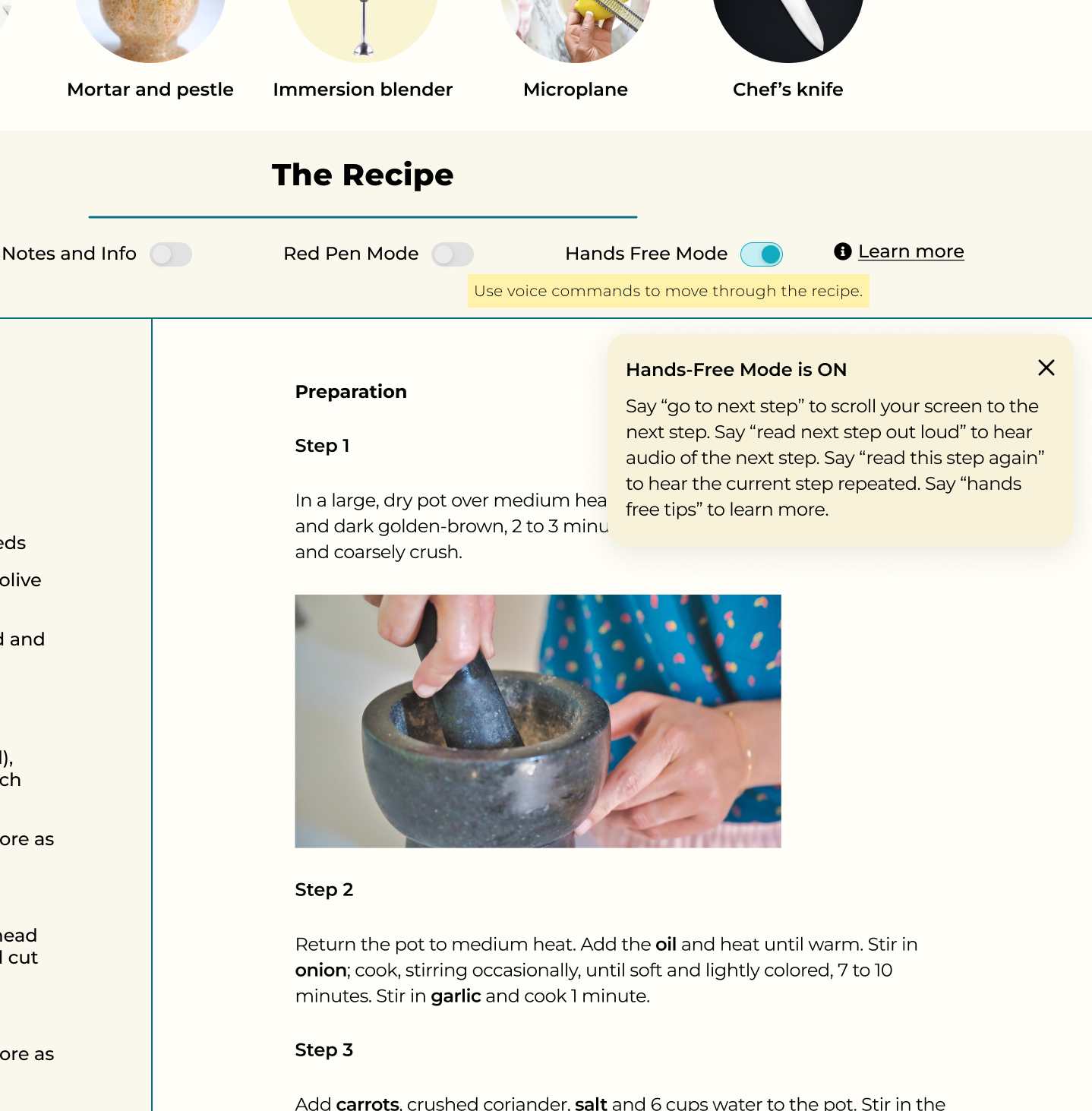
Some users of this site may have vision or mobility impairments. For other users, I needed to consider another part of their situation: their hands are messy because they are cooking! Considering longer-term disabilities as well as this particular temporary context, I designed a hands-free mode of interacting with the recipes on this website. This feature allows a user to use voice commands to move through the recipe. The user can have ingredients or steps of the recipe read to them, or they can simply use voice commands to have the page scroll without using their hands.

I also made sure that my standard must-haves for accessible design were used: proper contrast ratios, readable fonts, and header tags annotated for engineers to ensure screen reader functionality.

Clipping of mockup showing hands-free feature of recipe page
Hands-free mode for accessibility
-07. Conclusion

Takeaways

Impact

Having a more feature-rich recipe and tutorial website will help home cooks feel more comfortable learning new recipes and techniques. Home cooks tend to walk a fine line between wanting variety and ease, so this website will help them continue broadening their repertoire in a manageable way.

What I learned

Users of online cooking sites were very clear about their goals and their pain points when using a recipe online versus from a cookbook. Most interviewees and usability study participants could easily picture the context in which they would follow an online recipe, and knew exactly what they wanted from the experience - sometimes so specifically that they were the ones suggesting exactly what features ought to be included in this project. It was an important lesson in really listening to and engaging with users - often they already know exactly what they want from a product.

Next Steps