Introduction
For many years, my favorite way to see movies has been to enjoy them at a table-service movie theater, with a glass of wine and a delicious burger while I watch. So this is a project that I’m very passionate about on a personal level! Mission Taphouse Cinemas is a (fictional) movie theater chain that offers table service for food and drinks during movie screenings. Movie-goers traditionally order with a waiter to get snacks, drinks, or even a full restaurant meal brought to their seats. I set out to design an app that would help customers with a complete movie theater experience - ticketing and concessions all in one place. For this project, I focused specifically on the concessions side and explored how the process of ordering and paying for concessions could be made more convenient and less distracting.
As a design team of one, I was in charge of the entire design process. This included user research, market research, wireframing, visual design, low-fi and high-fi prototyping, and
usability studies.
(A quick explanation...)
The typical process of ordering concessions at a table-service theater is:
- Arrive early (not required but recommended);
- A waiter comes to your seat to check your ticket confirmation (an email on your phone);
- You can place an order now, verbally, with the waiter...
- And/or you can place orders later, until near the end of the movie, by writing the order on a small paper card that your waiter will come over to pick up.
- The waiter brings your food and drink;
- About 40 minutes before the movie ends, the waiters drop off checks at every table, come back to take credit cards, and then bring back credit cards and receipts once they’ve been charged.
The Problem
Table-service movie theater customers need a way to order and pay for concessions without being distracted from enjoying their movie. Customers want their food and drinks to be brought to their table promptly, and they want to minimize the time that waiters walk in front of them or that they have to look at a bill.
The Solution
The Mission Taphouse Cinemas app lets users order food and drinks to be delivered to their seats during a movie screening. A users pays their bill once the movie has ended. This way, movie-goers can relax and stay focused on the movie instead of trying to pay their bill in the dark, and the number of times that waiters need to block their view will be minimized. The ability to place a pre-order means that customers don’t need to show up extra early to get their concessions quickly.
User Research
Foundational User Interviews
“I think of ordering concessions as pretty essential and integral to the experience.” -Chris, interview participant
I conducted interviews with three individuals who are occasional or frequent movie-goers. I asked them a series of qualitative questions to understand common challenges people experience during the process of ordering movie concessions.
“I’ll... try to order as early as possible because I want limited interruption to the viewing experience once it starts.” -Katie, interview participant
Insights
I organized my interview notes and created an empathy map, and I began to see some patterns emerging among interviewees' opinions. Some insights:
- Concessions are an essential part of the movie-watching experience for many movie-goers
- Customers want their food and drinks to be fresh
- It can be a distraction to have waiters frequently walking through the rows of a table-service movie theater
- When placing an order mid-movie, table-service customers write their order on a card and wait for a waiter to take it. It can be stressful for customers to wonder how long it will take for the waiter to take this order.
- The ability to pre-order at a table-service theater appeals to customers if it helps their food and drinks arrive sooner
User Pain Points
“If the waiter hasn’t even taken my order yet, every minute that goes by is an unknown amount of time before I can get the thing I want.” -Adrienne, interview participant
I distilled my findings down to a handful of major pain points that seemed to come up frequently:
- Servers walking past: Users are often distracted during the movie by servers crossing the screen to pick up orders, drop off concessions, drop and retrieve checks. Users have to move their feet out of the way, and have their view of the screen blocked.
- Paying the check during the movie: Users are distracted when the check is dropped off near the end of the movie. Users have to find their wallets, read the bill in the dark, check for errors and calculate tip - instead of paying attention to the movie.
- Waiting for food: Especially when orders are placed right at the movie’s start time, the kitchen can get backed up and users often wait a long time for their food to arrive.
- Waiting for the server: After writing out an order on a paper card during the movie, users must wait for a server to collect the card and put in the order. Users often find it distracting to wonder when the server will pick up their order card.
User Personas and Journey Maps
After interviewing real people to understand their experience of ordering concessions at movie theaters, I created fictional user personas to capture important needs and frustrations that I could refer back to throughout the rest of my design process. I then created a journey map for each of these personas to further empathize with them.
Personas: Devon and Darrell
Journey Maps
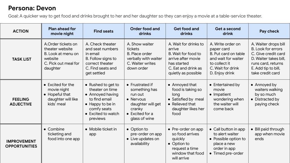
Devon's goal: A quicker way to get food and drinks brought to her and her daughter so they can enjoy a movie at a table-service theater.
Darrell's goal: an accessible way to order food and pay the check so he can focus on the movie without distraction.
Problem Statements
Devon
Devon is a busy working mom who needs a way to pre-order movie concessions for herself and her daughter. Devon doesn’t have time to arrive early to place her order, but still wants to have food and drinks brought to her table quickly.
Darrell
Darrell is a movie lover with a vision impairment that makes it hard to read his bill in the dark. He needs a way to pay the bill after the movie has ended, so he can enjoy the movie without distraction.
Value Propositions
I began to prioritize what user needs should be addressed:
This product will allow users to place pre-orders for movie concessions, or order in person until the movie starts. Pre-orders will be prepared as soon as the user arrives and checks in at their seat, to ensure freshness. Any orders placed in person with a waiter or by writing on a card are added to the same bill in the app. The product will allow users to pay the final check and add a tip once the movie is over. These features will allow busy users who are unable to arrive early to still place an order ahead of time so that they know their concessions will arrive quickly. Paying the total bill through the app once the movie ends will reduce the number of trips that waiters need to make to each table, and will ease any pressure that users with vision or cognitive impairments experience when trying to quickly read a bill and calculate tip in the dark. Removing these distractions will allow users to be more engrossed in the enjoyment of the movie.
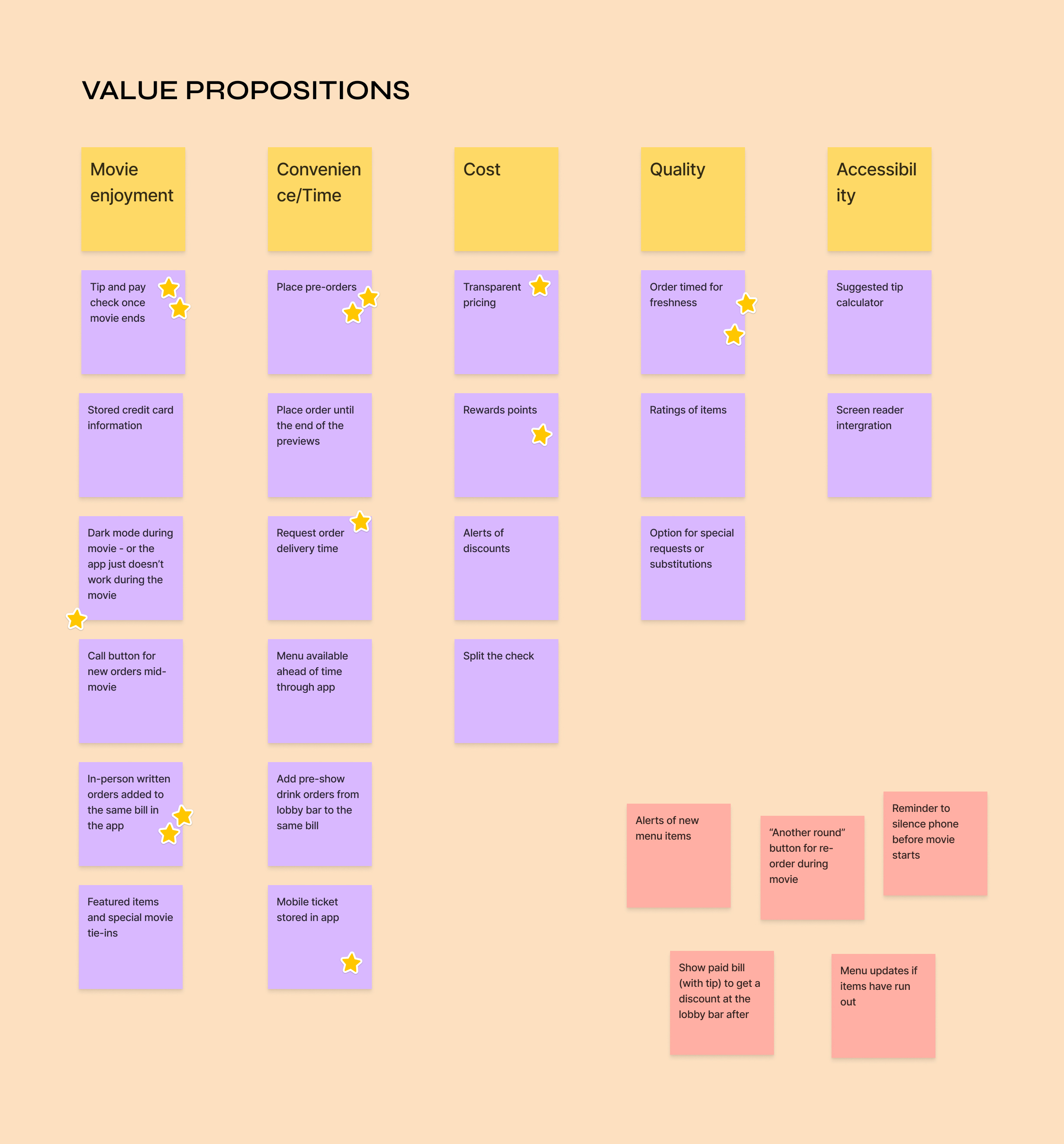
A limitation of the usefulness of this app is that, based on user research, phone use in the theater during the movie is a non-starter. This product will need to only be available before the movie starts and after the movie ends. Once the movie begins, users would be instructed that they could continue to order in person by writing their request on a paper card.
How might we...
- speed up the process of ordering and getting movie concessions?
- create an app that makes ordering movie concessions like ordering takeout?
- create an app that eliminates the distraction of ordering and paying while the movie is on?
- time an order to get concessions to moviegoers quickly and while they’re still fresh?
Competitive Audit
I next conducted a competitive audit to explore how users' needs were already being addressed. Although I didn’t find any competitive apps created specifically for ordering at table-service theaters, I looked at several traditional movie chains - AMC, Regal, and Cinemark - that have integrated concessions ordering into their apps. I also looked at Atom, which can be used to purchase concessions across many theaters. Finally, I looked at Toast Order and Pay, an indirect competitor used by restaurants, not movie theaters, to place in-person but contactless food and drink orders.
In conducting this audit, I found certain gaps in competitors’ products, including:
- Competitors don’t allow users to go directly to a concessions section of the app and place an order separately from purchasing movie tickets
- Competitor apps lack a shopping cart icon, so active carts disappear and the user has to start over
- Competitors have limited descriptions of menu items and few photos
- Competitors have no accessibility settings and information
From there I was able to identify many design opportunities, for example:
- Include a dedicated concessions section of the theater app so users can pre-order their concessions separately from purchasing their tickets
- Add a shopping cart icon so users can navigate away from their order and easily get back to their active cart
- Style the menu to more closely resemble the layout of Toast’s menus for ease of navigation; include descriptions, nutrition information, and photos of menu items.
- Include easy-to-locate accessibility settings and integration with screen reader and voice assist technology
User Flow
It was time to start turning these ideas into a functioning design! I began by creating a user flow to see the steps that a user would need to take to order concessions.
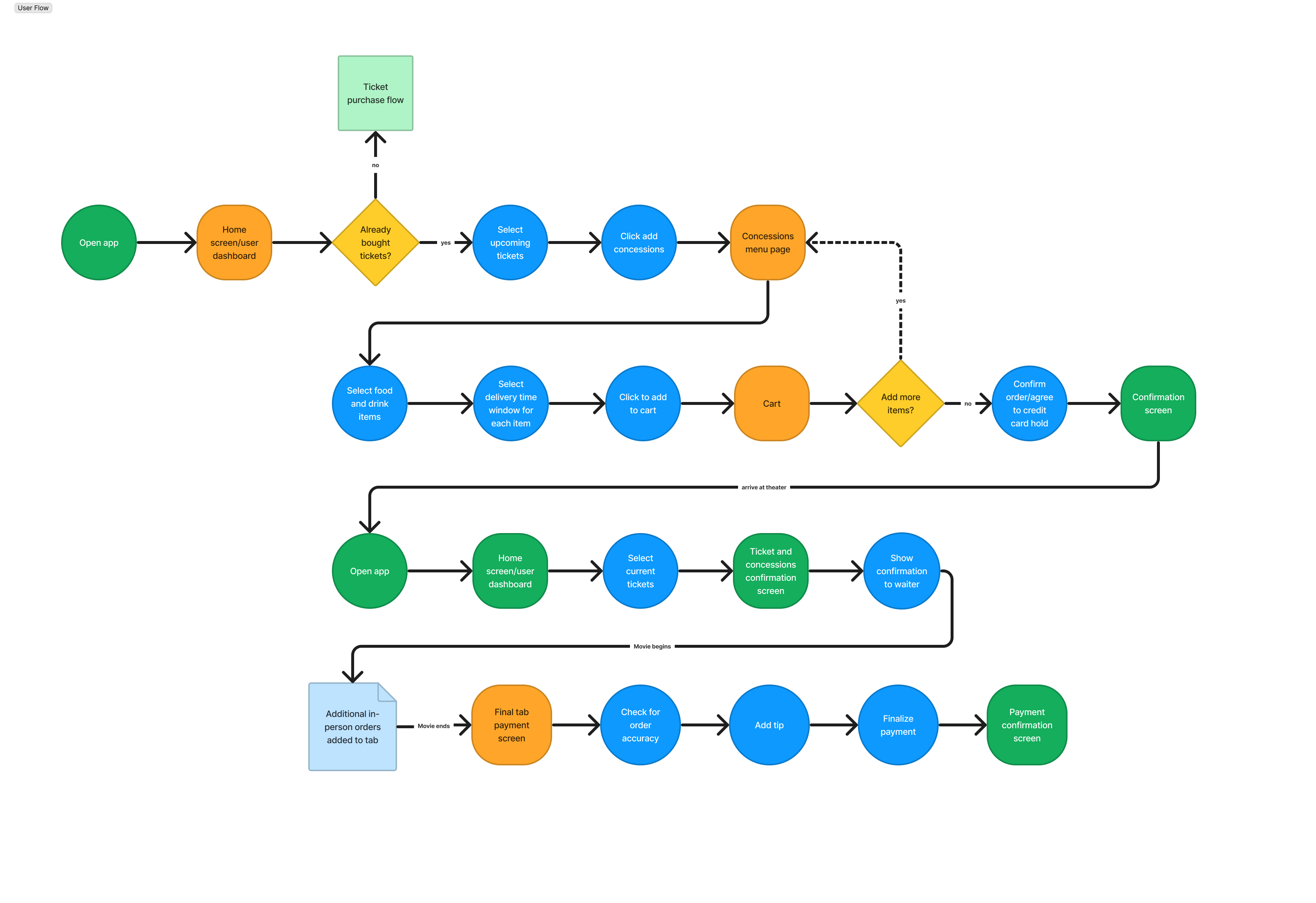
User flow: ordering concessions and paying the final bill
Wireframes
Paper Wireframes
I created a user flow and then began ideating with paper wireframes. I drew screens of the process for selecting concessions items and confirming an order.
Digital Wireframes
Having generated many versions of my designs on paper, I selected my favorite versions and turned them into digital wireframes on Figma.
Low-Fidelity Prototype
This prototype takes users through the basic flow of adding items from the concessions menu and confirming their order. Once the order is confirmed, users will see their order on the dashboard with their movie tickets.
Low-fi prototype: ordering concessions
Usability Study #1: Low-Fidelity Prototype
To test my design, I conducted a remote usability study with five participants. My goal was to learn if the app was designed in a way that would save customers time and improve their ordering experience. Participants were asked to complete the main user flow of adding items to a concessions order and placing the order.
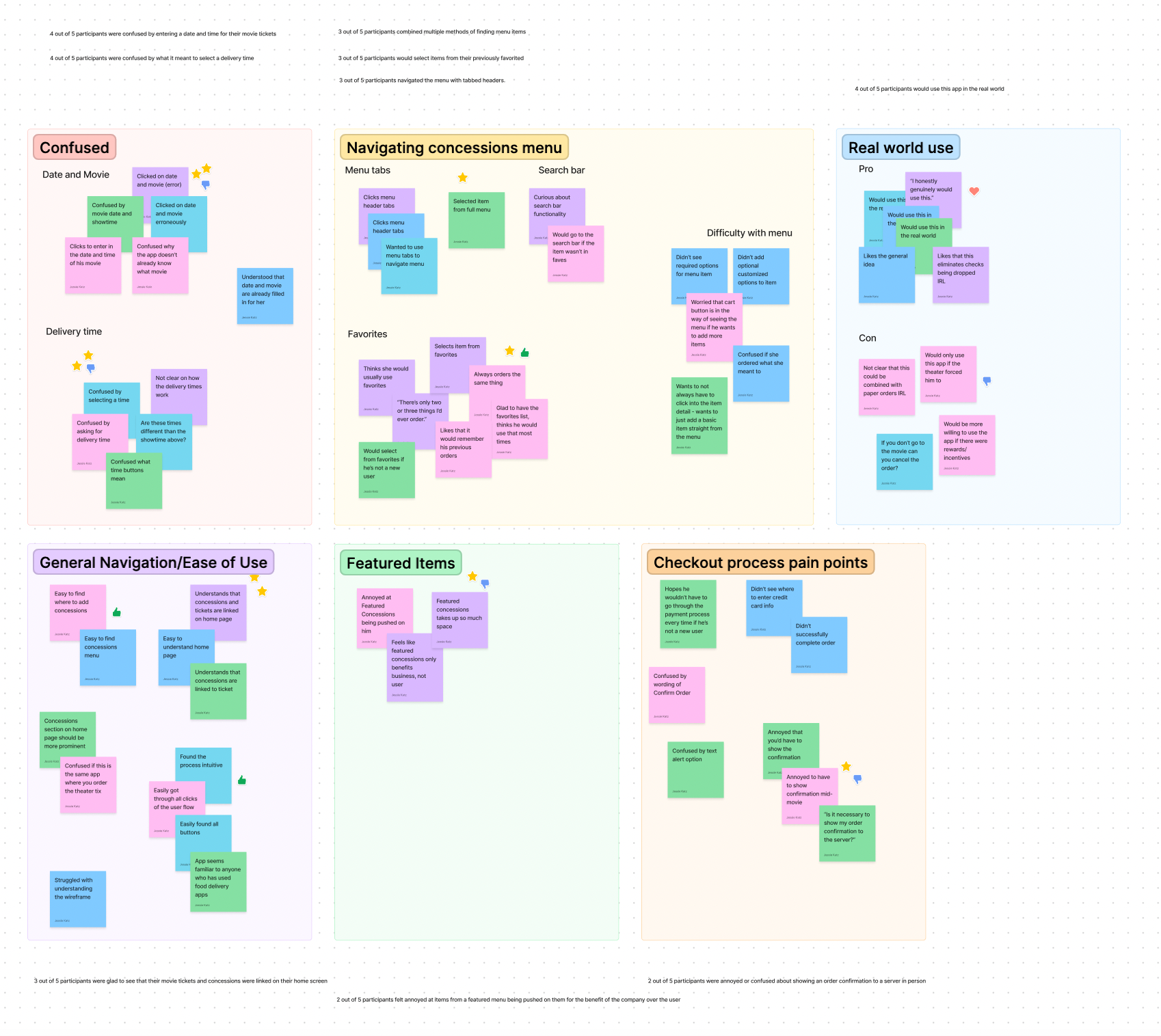
Affinity diagram organizing data from usability study
"I'm confused... why doesn't it already know what movie I'm ordering this for?" -Tim, usability study participant
Patterns and Improvements
I was able to identify several patterns in my data that informed actionable insights.
- Some users expressed confusion about how orders through the app can combine with further in-person orders. I concluded that users would benefit from the addition of onboarding screens to explain the process.
- Many participants were confused when selecting a time for food to be delivered, and didn’t think that this step was necessary - they simply wanted their concessions to be delivered soon after they arrived at the theater. I concluded that I could remove this step and instead, users should be prompted to check in upon arrival, and their order will then be immediately prepared.
- Participants felt unclear about whether they needed to confirm the details of their movie tickets and weren’t sure if the app would understand when and where to deliver their order. They weren’t confident that the order they placed was already linked to their movie tickets. I would need to add a confirmation clearly showing that the order would be delivered to the correct movie and showtime.
Visual Design
Now that I had updated and improved my wireframes, I was ready to start applying a visual style to them. I knew I wanted a dark background to give the feel of a dark theater, and I wanted to use warm yellows and oranges to communicate a feeling of excitement… and buttered popcorn! I referred to the insights gathered in my usability study to simultaneously improve the design.
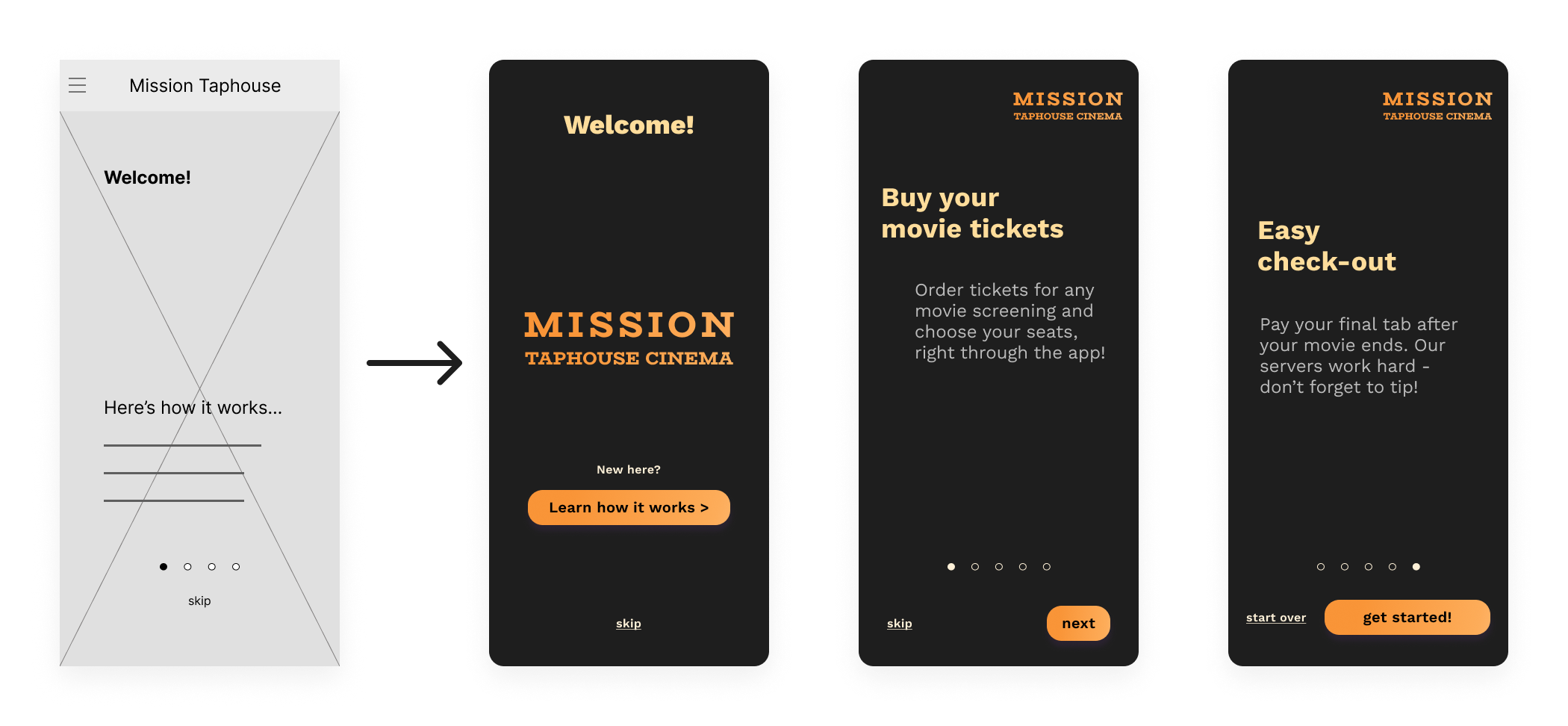
Added onboarding screens with explanation. Leaving these bare bones with the intention to come back and further style them later in the process.
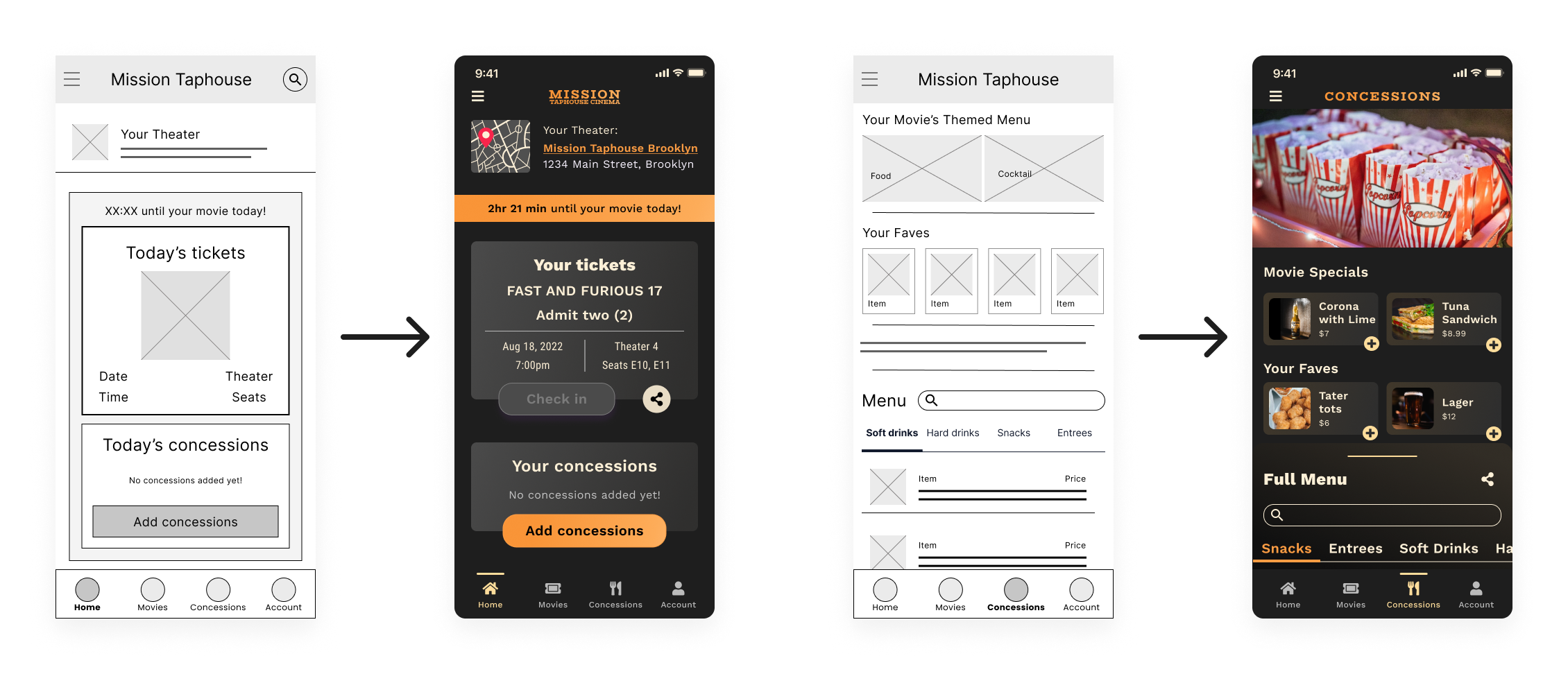
Left: User dashboard with current tickets and concessions. Right: concessions menu with de-prioritized featured items.
Simplified order confirmation flow. Users don’t need to select a specific time to receive their order. The order should just be linked to their movie, and it will be brought to them as soon as possible when they arrive.
Order confirmation page, with instructions to check in to the movie in order to receive the order
Usability Study #2: High-Fidelity Prototype
I conducted a second usability study with my high-fidelity prototype, with the research goal of learning whether my visual design decisions made the app easy and intuitive to navigate. I wanted to find out if the visual elements of the app supported the users’ completion of their goals and their understanding of the app in general.
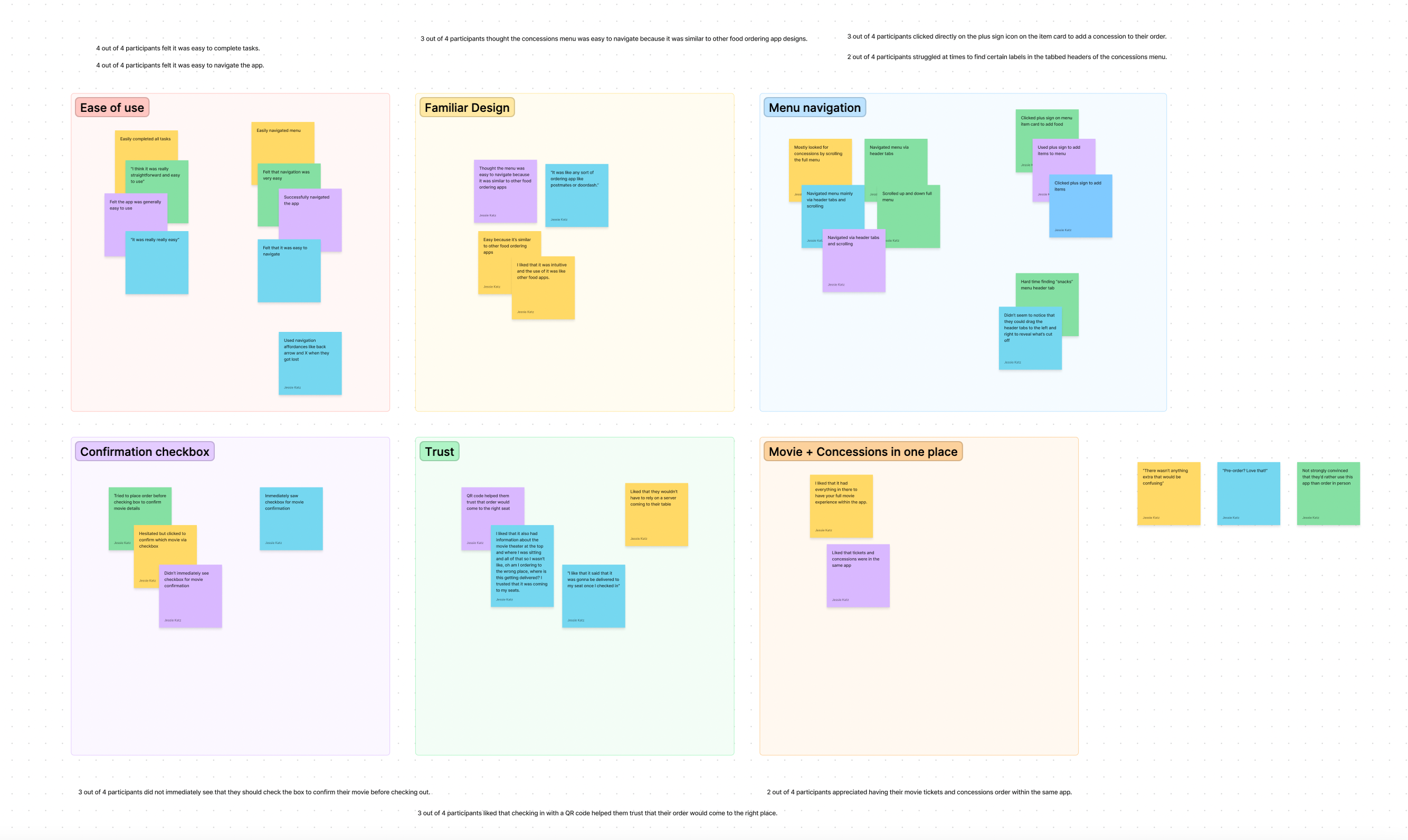
Affinity map organizing data from the second usability study.
Patterns and Insights
“I trusted that it was coming to the correct seats.” -Katherine, usability study participant
I observed several patterns in my data:
- Most participants stated that the app was logical to use and the tasks easy to complete. They generally had no trouble navigating through the user flow, and everyone was able to complete the goal of placing a concessions order.
- Most participants were pleased with the use of a QR code for check-in and the confirmation that their order was being brought to the correct seats.
- Most participants attempted to add items to their order by clicking on the plus sign next to the item. Some expressed frustration that this brought them to an intermediate item detail page instead of immediately adding the item to their order. I needed to create an animation for this plus sign button that would show an item being added to an order without clicking through a detail page.
- Several participants found the tabbed headers of the concessions menu difficult to interact with. I needed to improve the look of this tab bar with a more clear visual design.
- Several participants didn’t see a required checkbox to confirm their movie screening details for their order. I needed to better cue users to notice this confirmation.
Improving the Design
Overall, the second study showed me that the general flow of my design was working and study participants had an easy time navigating the app and understanding how to interact with it. However, there were certain areas that users were confused by, which would need to be improved. At the same time, the overall visual design just wasn’t feeling quite polished enough to me. And although users generally had an easy time understanding the app, I suspected that if the visual design of the user dashboard more directly linked the movie ticket information with the concessions information, the intent of the app would be made more clear from the beginning. I decided to update the design based on findings from my usability study, but at the same time also improve the visual design overall. This meant going deeper into UI research and exploration.
Mood Board
I searched for reference images and created a mood board to guide my visual exploration. I looked for references showing existing UI patterns of food ordering menus, as well as of skeumorphic ticket designs.
Visual Exploration
I wanted to maintain my general color scheme, with a dark background and buttered-popcorn yellow accents. But I wanted the overall feel of the app to be more cinematic, and to feel like it was a new take on a vintage look.
The Final Design Concept
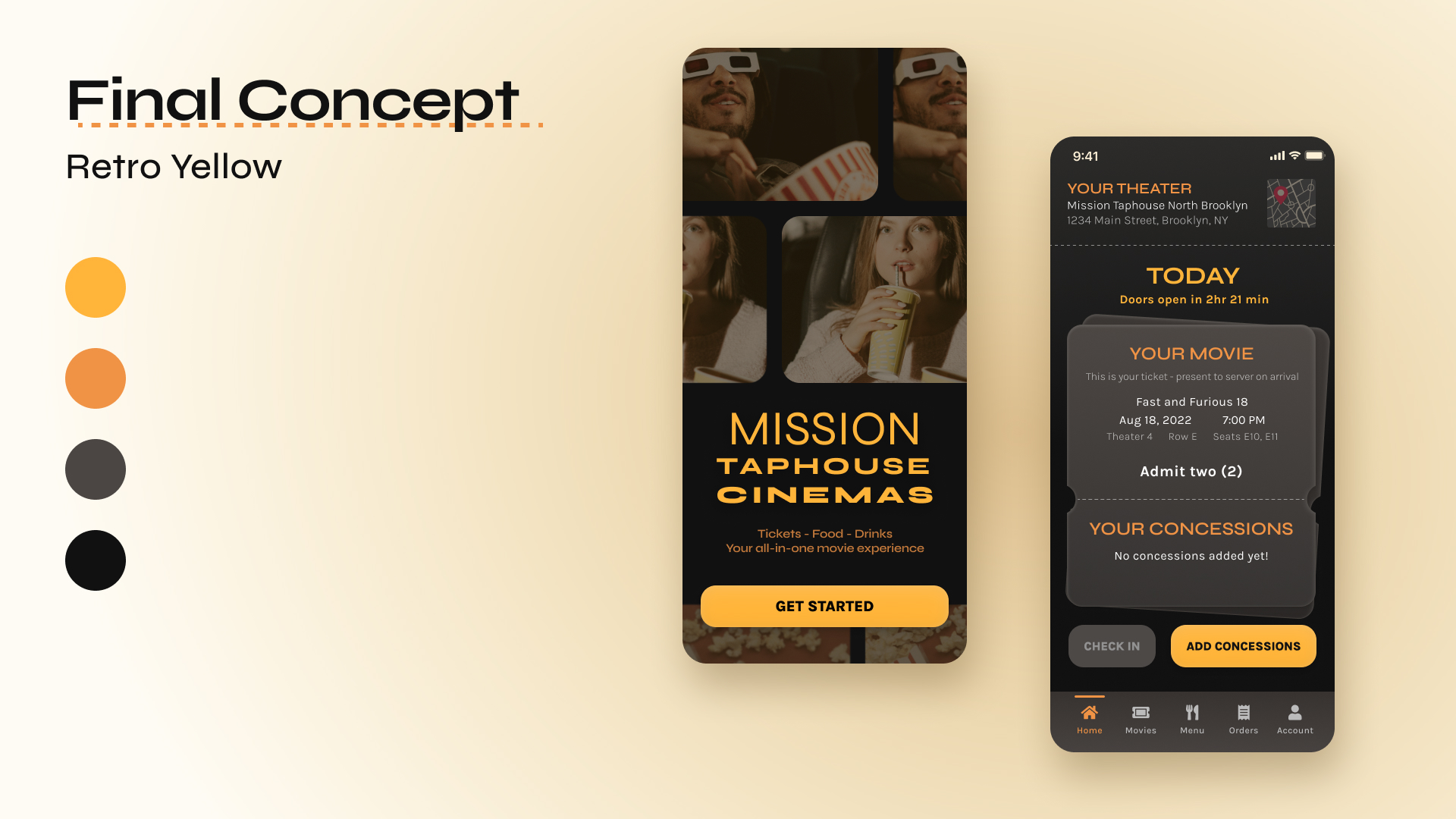
The look: retro, dark... buttered popcorn.
Scaling the Design
I applied this updated look to the rest of the main screens of the app:
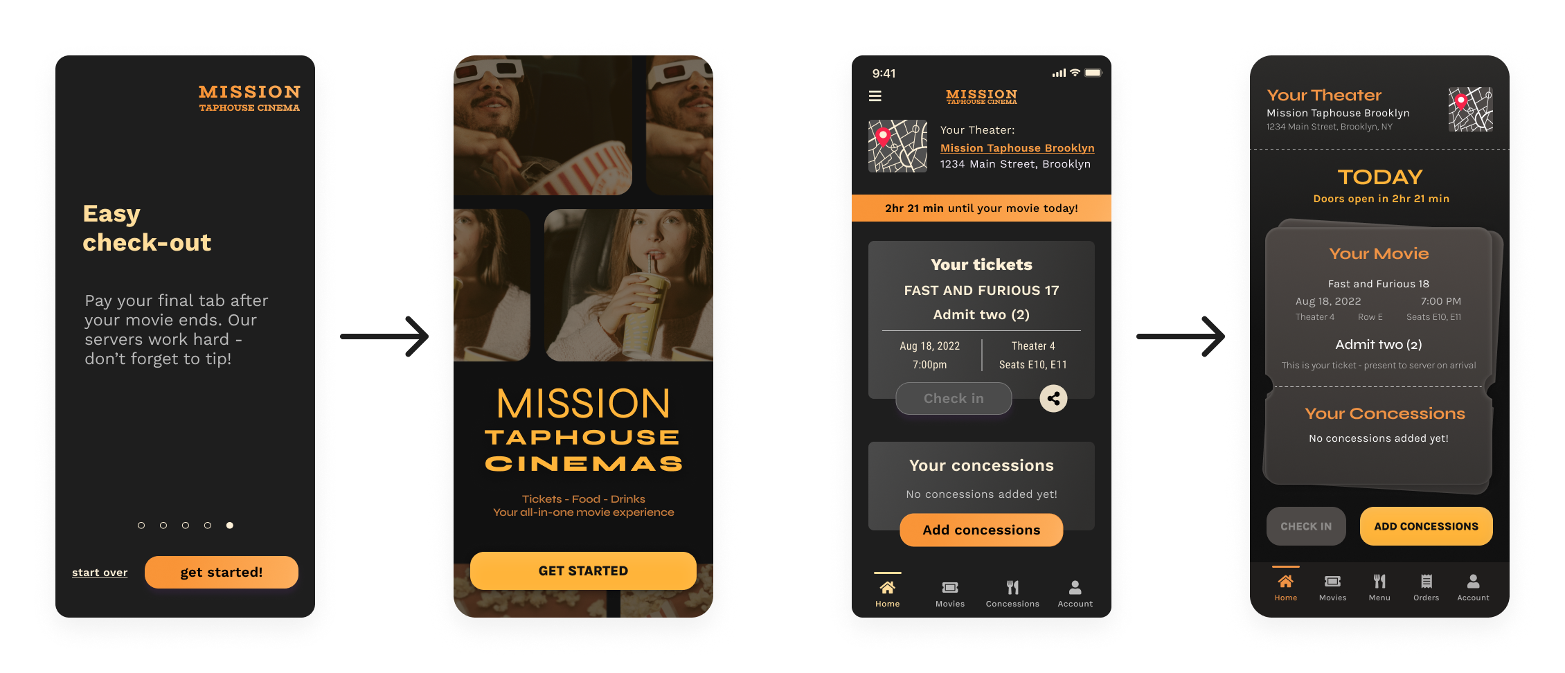
Left: new splash screen/onboarding flow design, using cinematic imagery. Right: new user dashboard/home screen. Skeumorphic ticket shape connects the movie tick and concessions orders directly, to show that the concessions are linked to a particular showtime.
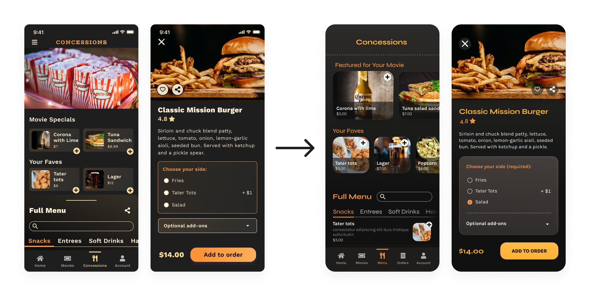
New concessions menu and item detail screens. Subtle shadow at the edge of the menu category tabs indicates that the text continues off-screen and can be scrolled through.
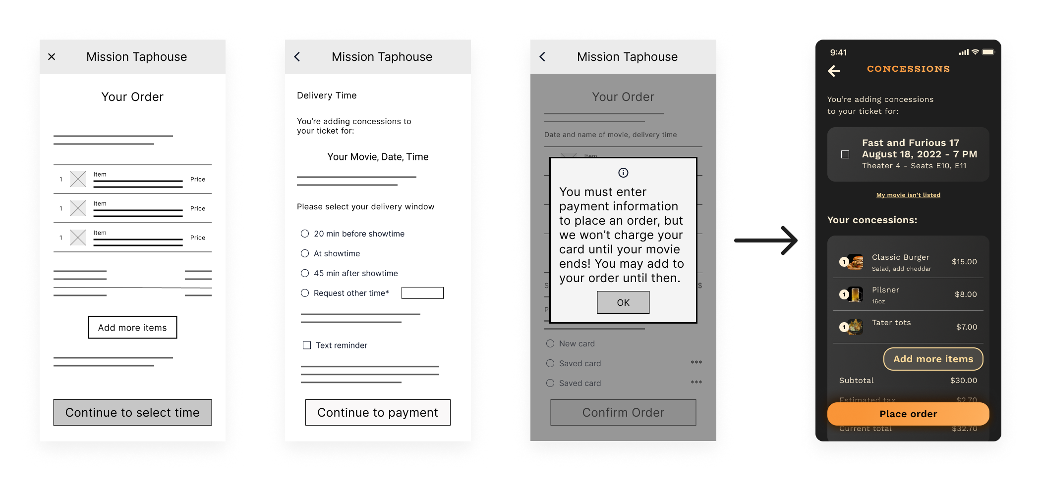
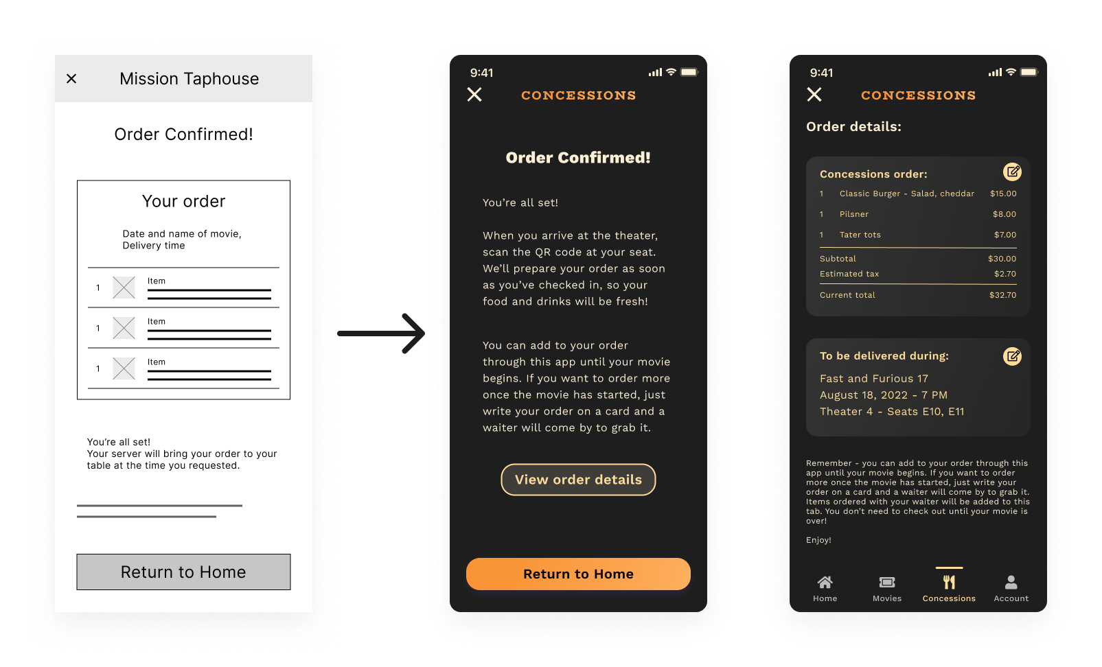
New order confirmation screens. Instead of selecting their movie with a checkbox, users use a radio button to confirm that the app does indeed already know what the movie is.
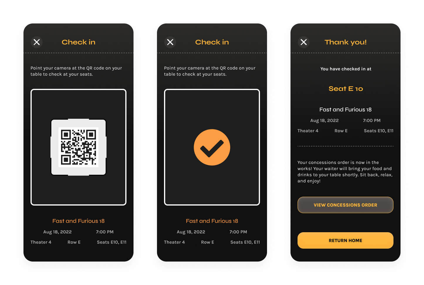
Scanning a QR code at the user’s table on arrival will trigger the kitchen to begin preparing their order. A check-in confirmation page gives the user one more level of confidence that their food is on its way to the correct table.
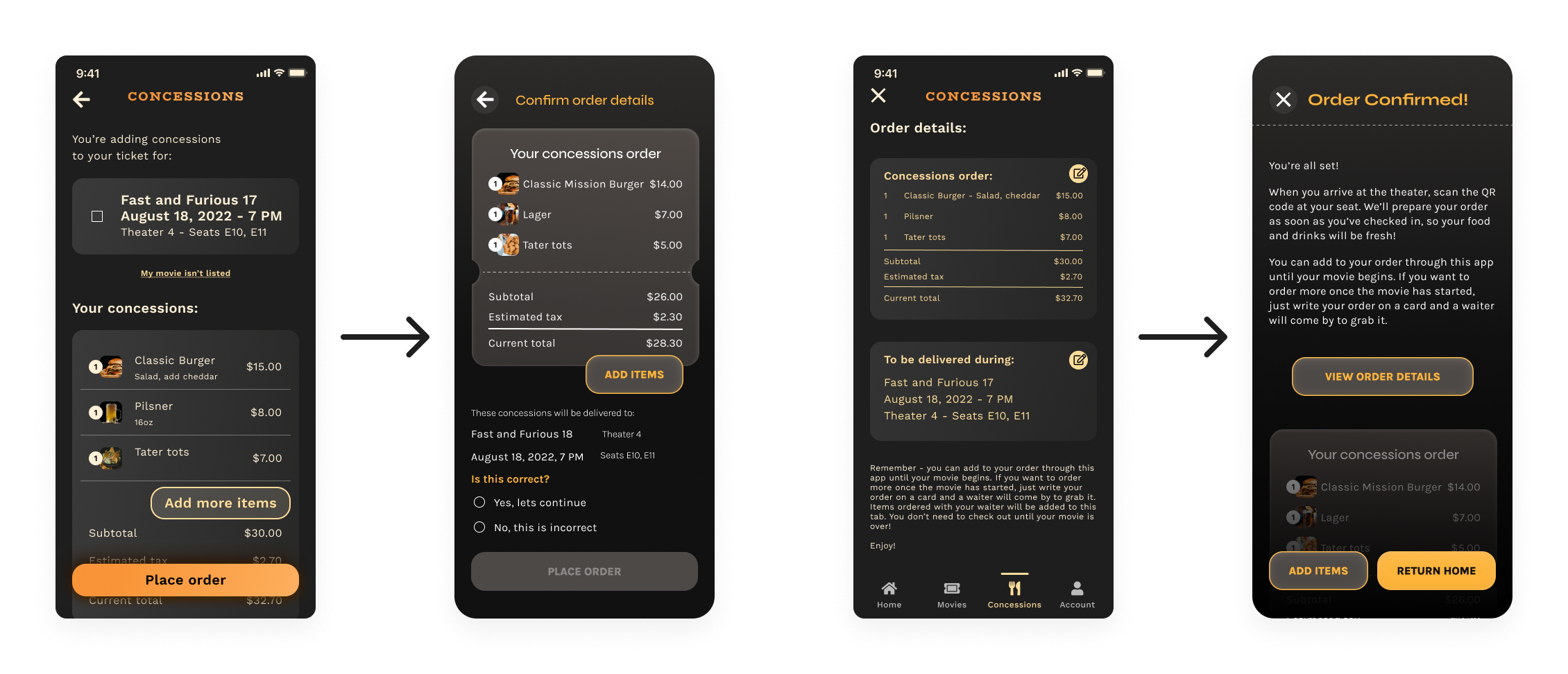
Visual design of the final screens for the main user flow
High-Fidelity Prototype
Now it was time to bring my mockups to life! I created a high-fidelity prototype of the main user flow, linking screens together with animations that would allow a user to understand where they were within the app. I also added to my component library to create animated micro-interactions like button clicks, so users would get immediate feedback from their actions.
Hi-fi prototype of selecting concessions and confirming an order
Looking Back... and Forward
Impact
In the end, I feel confident that this design could improve the overall experience of ordering at table-service movie theaters. I think that my work successfully addresses several pain points that movie theater customers experience. Ordering and paying through an app could cut down on distractions during the movie, and get food delivered to users quickly even if they don’t arrive early. Having ticketing and concessions in the same app will also be very convenient, and give users an enjoyable all-in-one movie experience that could increase loyalty to the theater.
Next Steps
With more time, there are so many more features I’d love to build out, and design problems I’d like to solve. In the future, I’d be very excited to:
- build out a more complete flow of the check-in process
- design screens for the user’s account and rewards points
- build out the checkout flow for a user paying their final bill at the end of the movie.
And there are many more design problems that I’d love to explore solutions for:
- what does the app do if someone tries to use it in the theater while the movie is playing?
- how might we deal with group ordering - how would an item get to the right seat among a group?
- what does it look like if a user has multiple upcoming movie tickets?