Project Overview

Planet is an NFT marketplace for selling and collecting digital art. The app caters to users looking for beautiful artwork, as well as a beautiful user experience while buying, selling, and browsing that artwork.

Project Duration

September-October 2022

My Role

Lead UI Designer

TOP
-00. Background

Introduction

I created this project as part of Dribbble’s four-week UI course in the Fall of 2022. Planet is a fictional startup looking to revolutionize the digital art world with a new NFT marketplace app. In my role as UI designer, I was provided with a design brief and with wireframes, and from there the visual design was up to me. I had three weeks to research, create a visual aesthetic, scale my design, and build a working prototype. At the end of these three weeks, I would need to deliver a set of high-fidelity mockups, a UI library with information on type, color, layout, and components, and a working high-fidelity prototype.
Array of multiple final screens of the Planet marketplace app

The Problem

The users of this app are people who are embracing the world of NFTs and digital art - people with a strong sense of visual aesthetics. These users are looking for beauty and aesthetics not only in the art they buy and create but also in the app experience itself. My challenge, therefore was to appeal to this audience by creating a visual language that was beautiful, inviting, and fresh.

The Solution

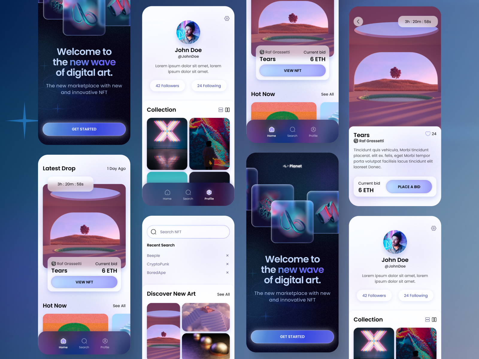
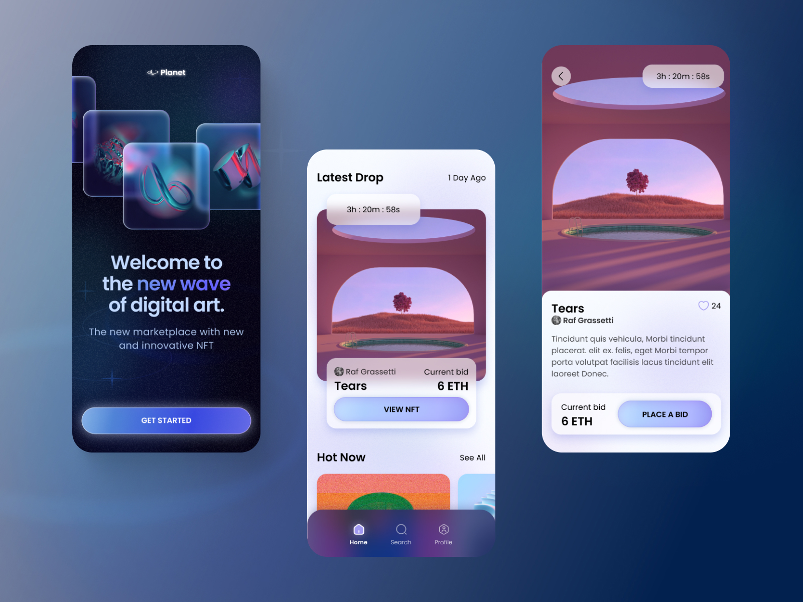
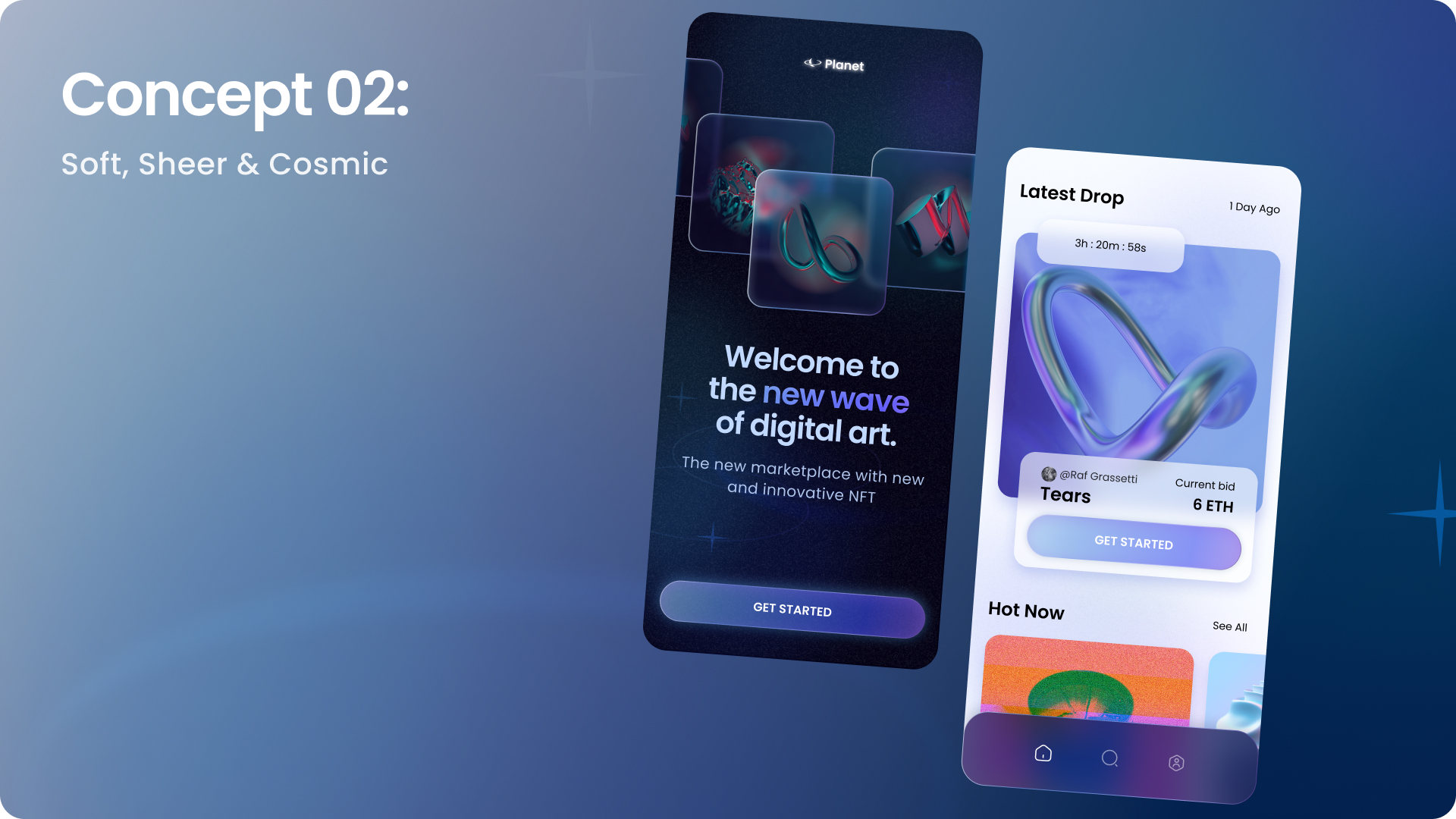
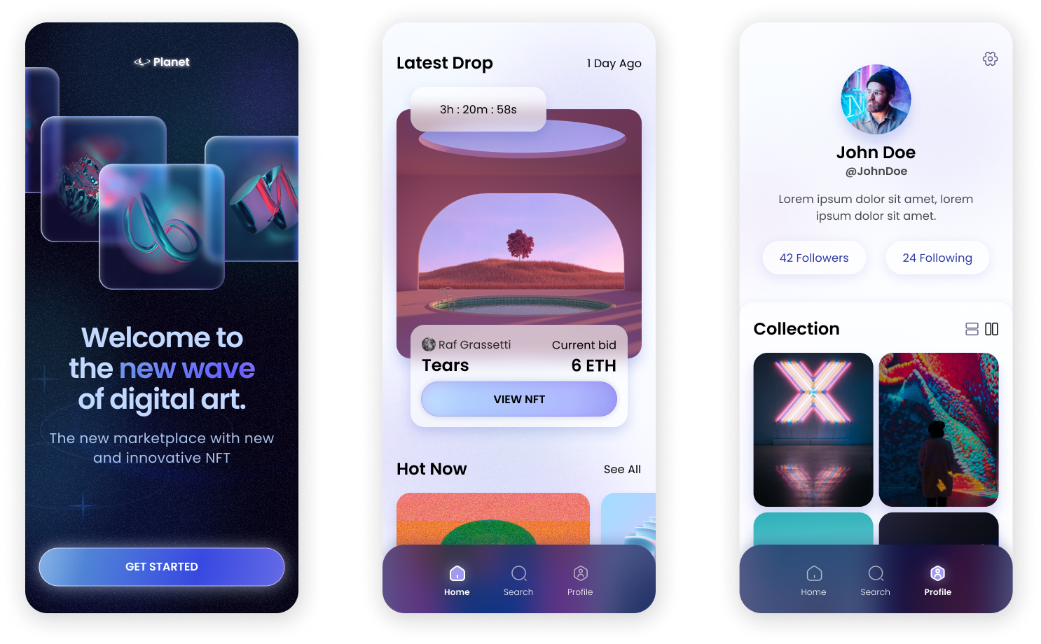
The Planet app I designed is meant to feel familiar enough to fit within the general landscape of NFT marketplace designs, but with a fresh and unique style that doesn’t look copied and pasted. I created a visual aesthetic that is futuristic and cosmic, but with a soft edge meant to feel inviting to users. The style is airy and dreamy, relying heavily on soft gradients, blurs, and transparency, to let users feel like they can joyfully breeze through this vast world of digital art.

Splash screen, home screen, and product detail page
Home screen, artist profile page, and search and discover page
-01. Research

The Competition

I began my research by taking a very quick look at what existing NFT marketplaces look like. There wasn’t much to distinguish these designs from each other - they were mainly white screens with black text, and long scrolls of rectangular cards for artwork. Most of the visual style came from the NFT art, not the app or website design itself. My takeaways from this research were that:
Screen grabs of existing NFT marketplace websites and apps
Existing NFT marketplaces: white background, black text, card grids

Mood Boards

I next looked to other design platforms to begin my visual exploration. I searched Dribbble, Pinterest, and Behance to gather images that inspired me and sparked new ideas. There were two different directions that I wanted to experiment with, so I organized my collection of images to create two mood boards:

Direction 1

The first direction I was interested in exploring was bold, edgy, and exciting, with lots of neon colors, contrast, and hard edges. I leaned towards reference images that used neon green, often with a bright red accent.  I wanted this style to show energy and movement.
Moodboard of image references
Mood board Direction 1: electric green, bold black, kinetic

Direction 2

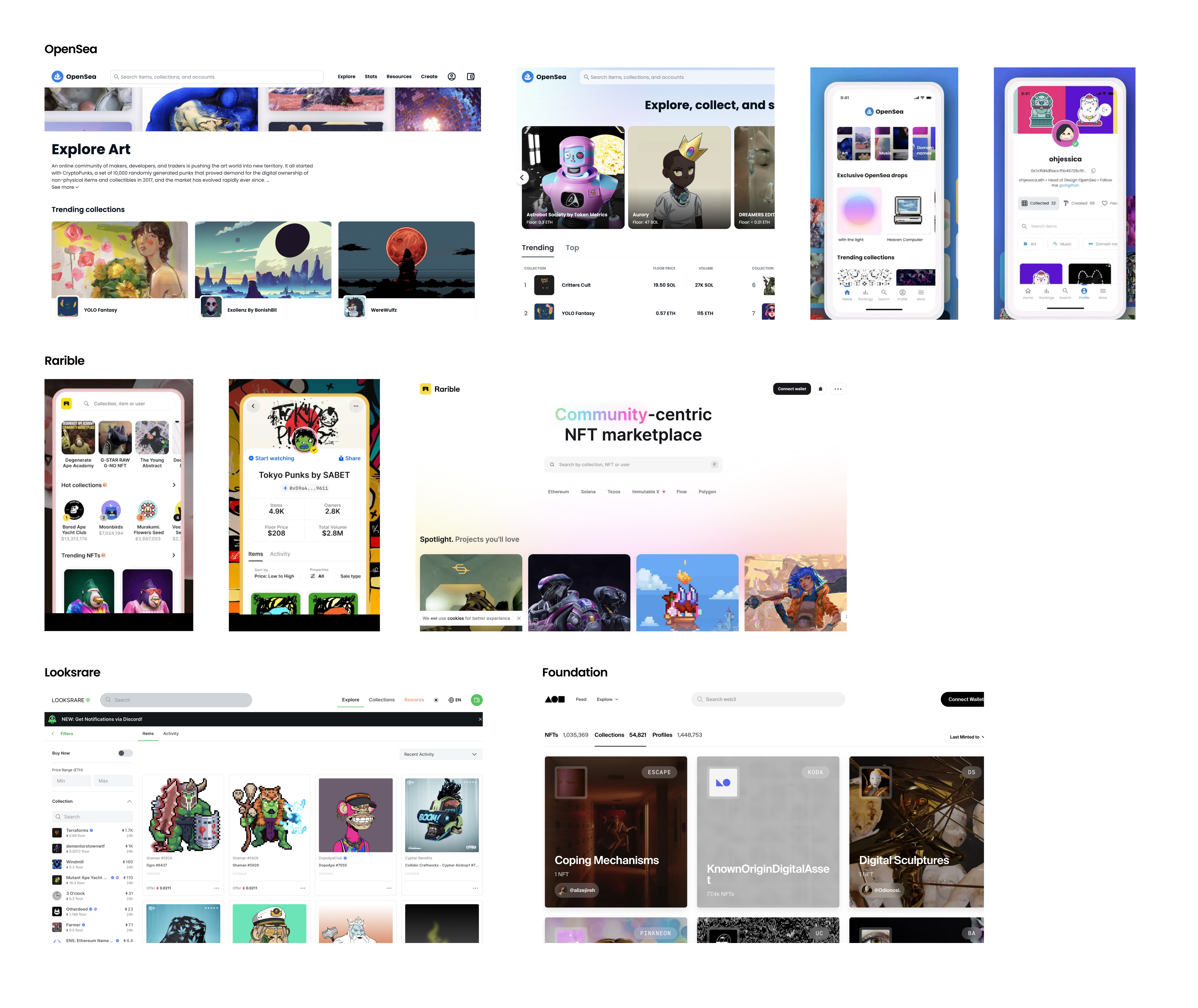
I created my second mood board in a very different direction - I opted to explore designs with soft edges, gradients, and transparent elements. I was drawn particularly to images with a range of blues, purples, and pinks in their color schemes. I wanted to try working with an airy, atmospheric look that would feel light and breathy.

Moodboard of image references
Direction 2: Softer, gradients and blurs, atmospheric
-02. Beginning the Design

Wireframes

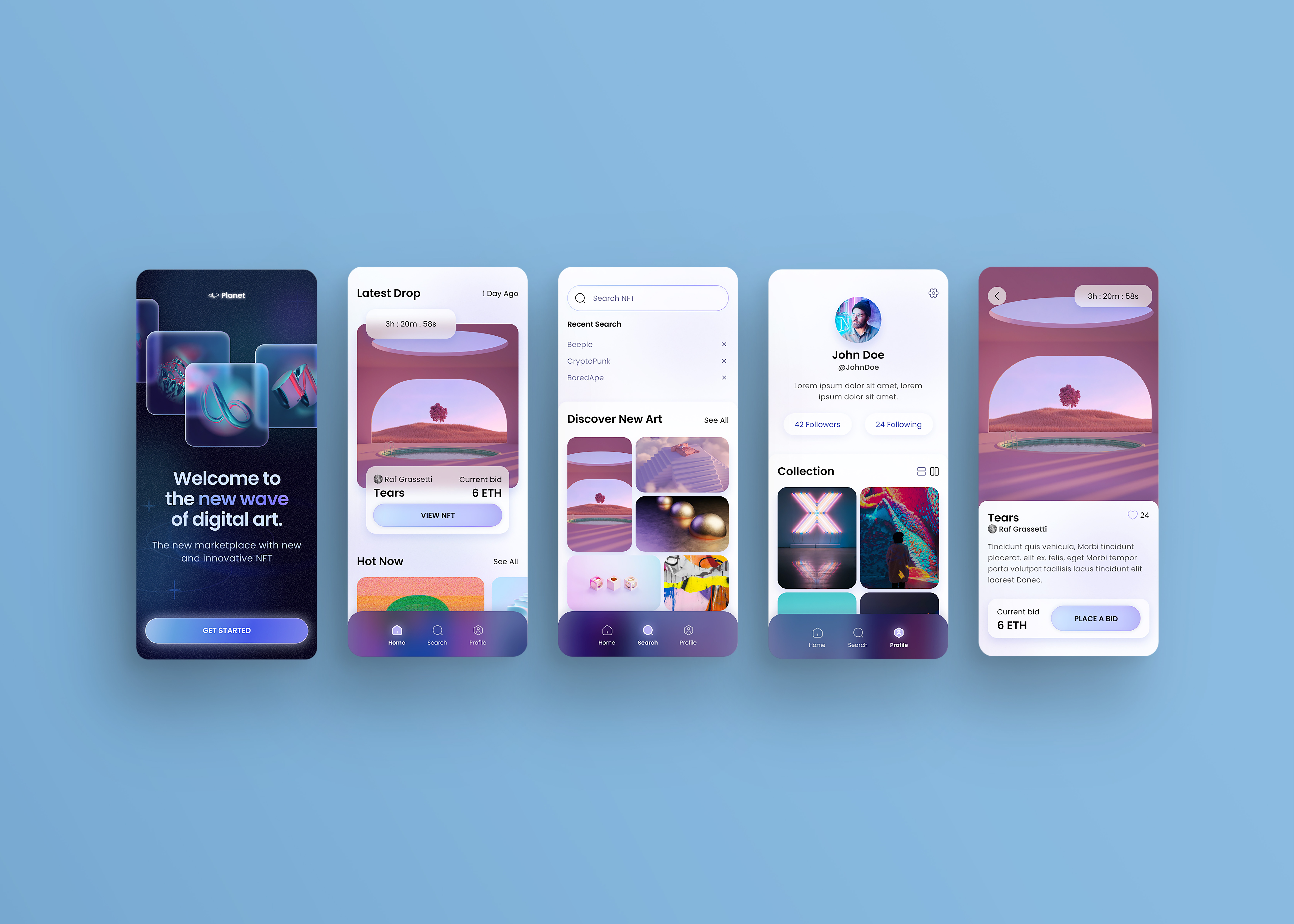
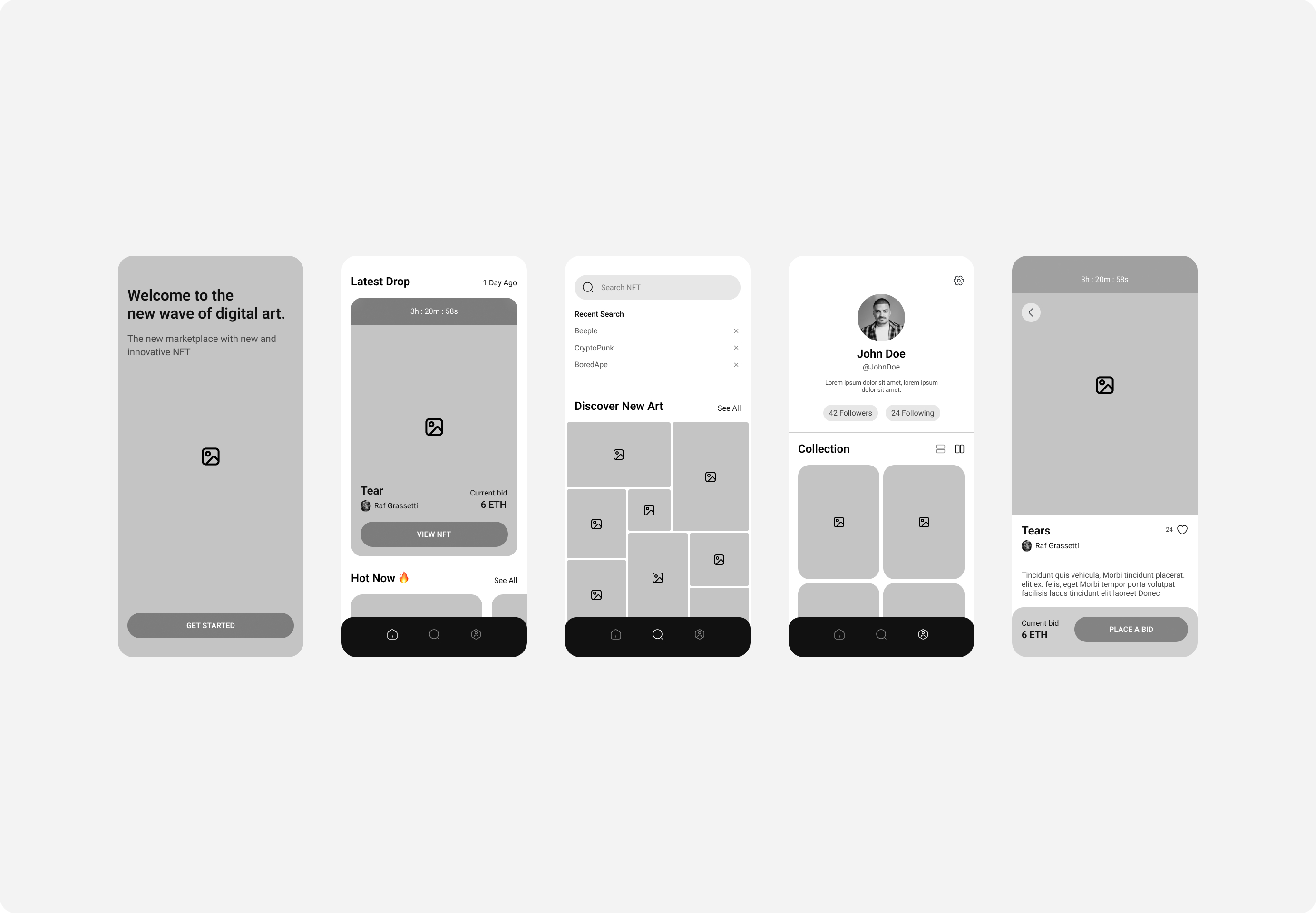
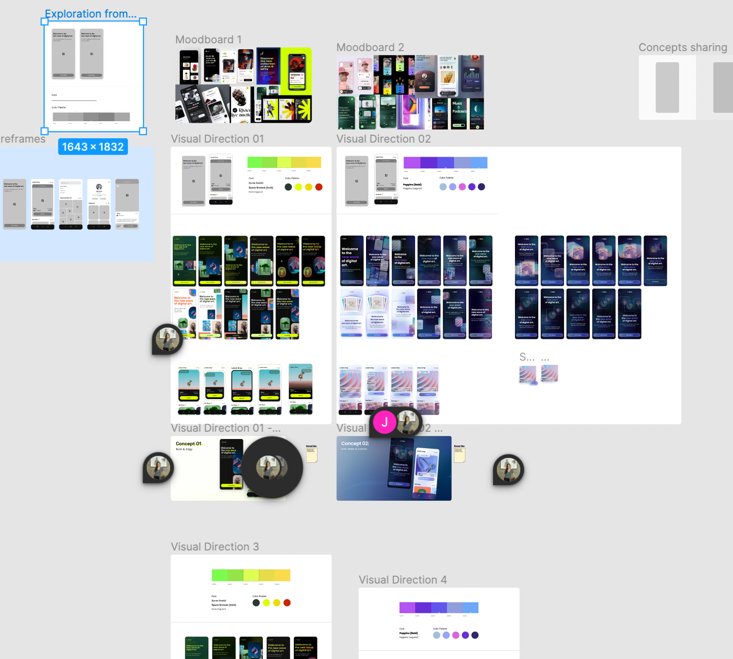
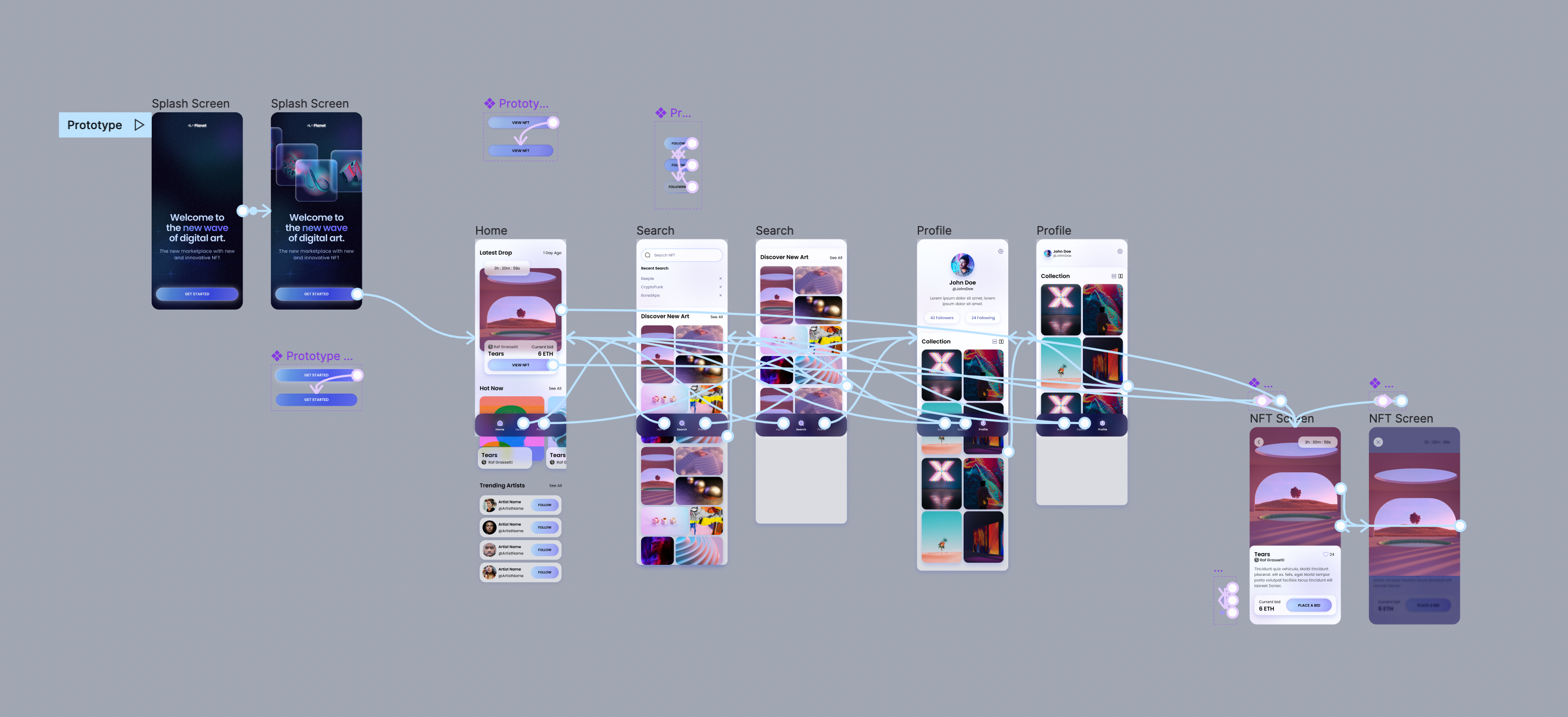
Wireframes of five main screens had been provided for me, and I planned to stick close to the structure provided. Because the splash screen of these wireframes was the most "blank canvas", I would start my visual exploration there, and eventually apply a style to the full set of wireframes.

Wireframes of five main screens of user flow

Visual Exploration

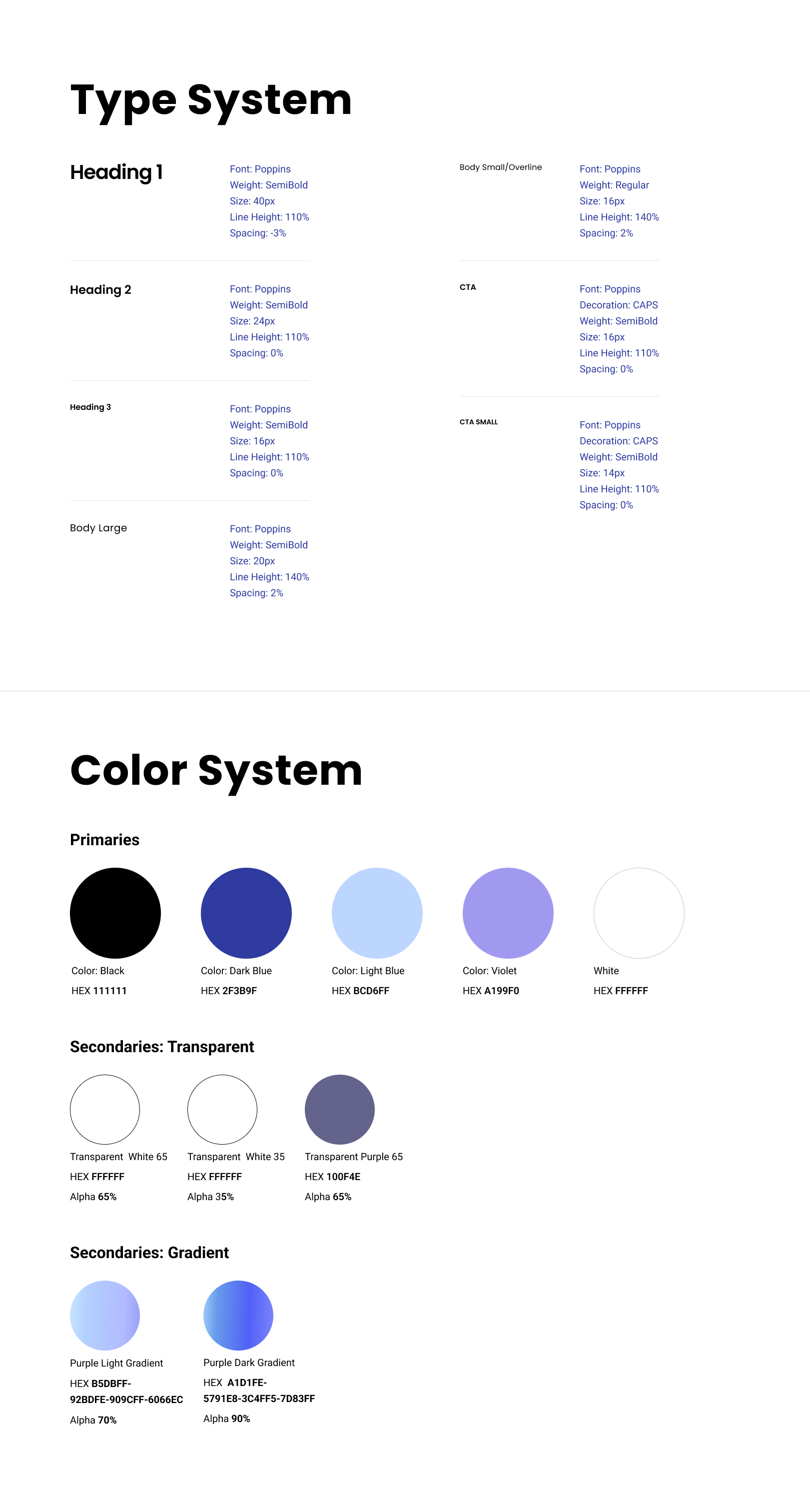
With my two mood boards as inspiration, I created color palettes and selected a handful of typefaces to begin experimenting with. Working with the splash screen, I ideated extensively with different layouts of elements, treatments of images, background colors, and on and on and on. I used Figma as my playground and ran wild! I generated tons of variations of each idea, working my way closer and closer to a look that I felt I’d want to stick with.

Screen shot of Figma workspace showing moodboards and visual experimentation
Action shot! Visual ideation in two very different directions

Direction 1: Bold and Edgy

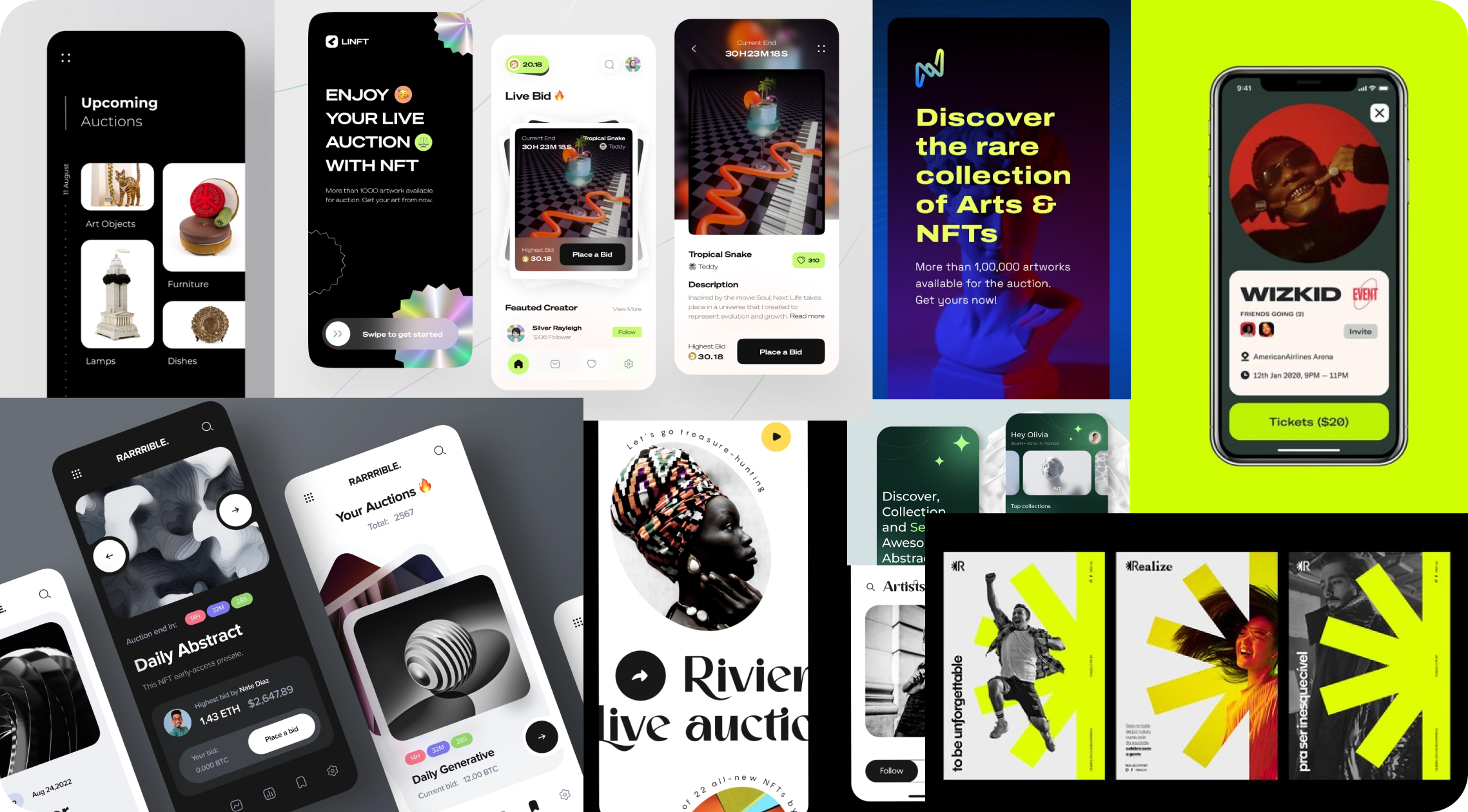
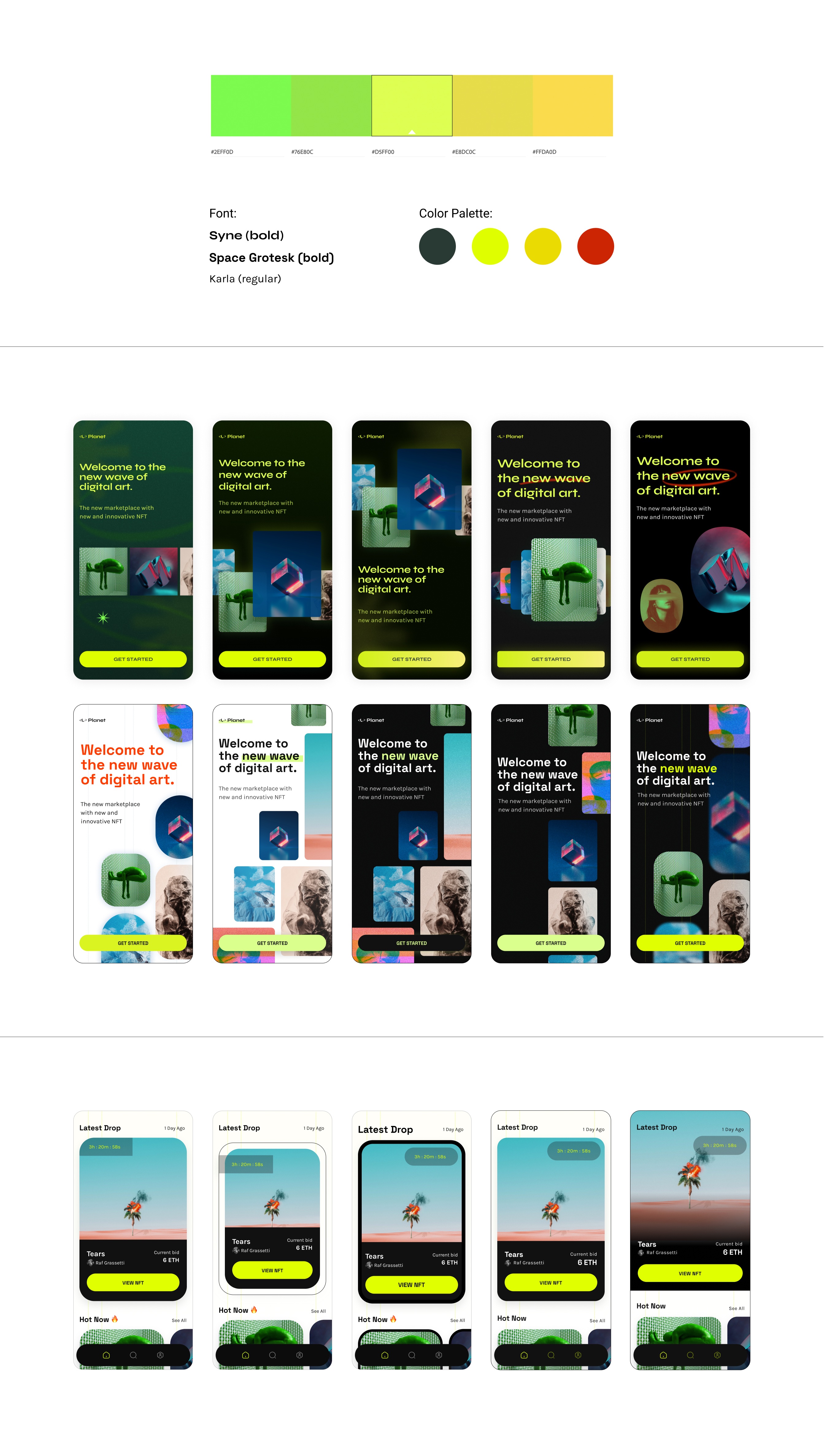
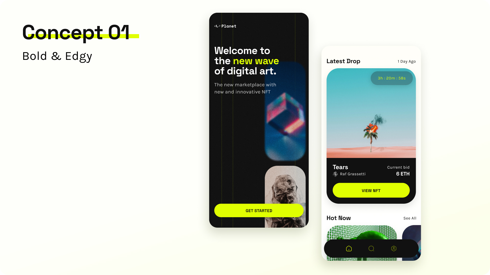
To explore my first direction, “bold and edgy,” I worked mainly with dark backgrounds behind scattered NFT images and used an eye-catching neon green for my call-to-action and my text. I found that with this bright color and high-contrast look, the more I simplified and de-cluttered the design in general, the more successful it was. In my earliest versions I experimented with shapes and textures in the background, neon green glows, gradients, drop shadows, busy clusters of NFT images, etc, etc, etc, etc... but by the end of my experimentation, I had stripped away most of this noise in favor of a much more streamlined look that wouldn’t overwhelm.

Color palette and many app screens experimenting with various versions of bold and edgy concept
Visual ideation playground: Direction 1
Splash screen and home screen showing Concept 1: Bold and Edgy look
Final concept proposal for Direction 1

Direction 2: Soft, Sheer, and Cosmic

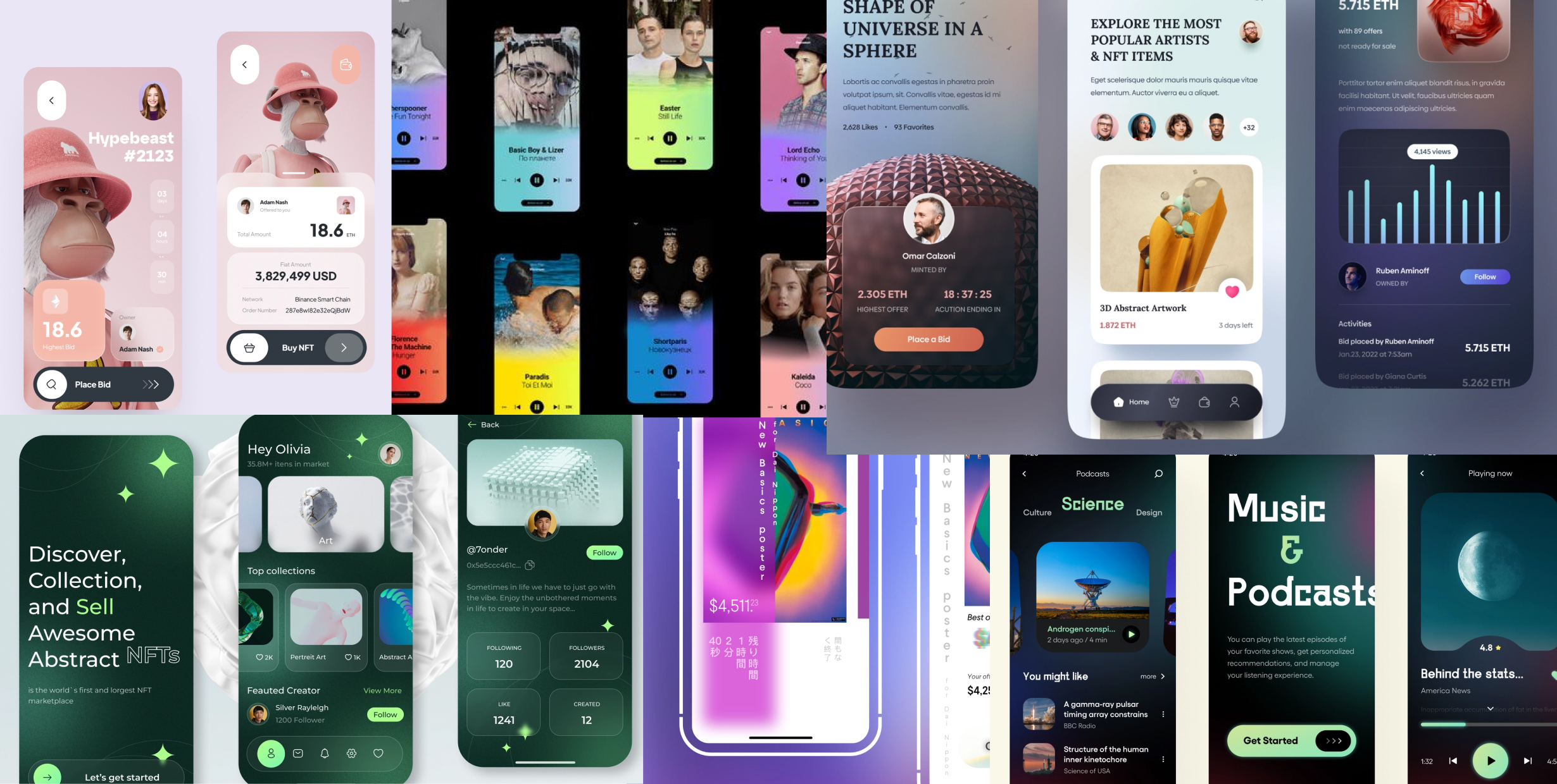
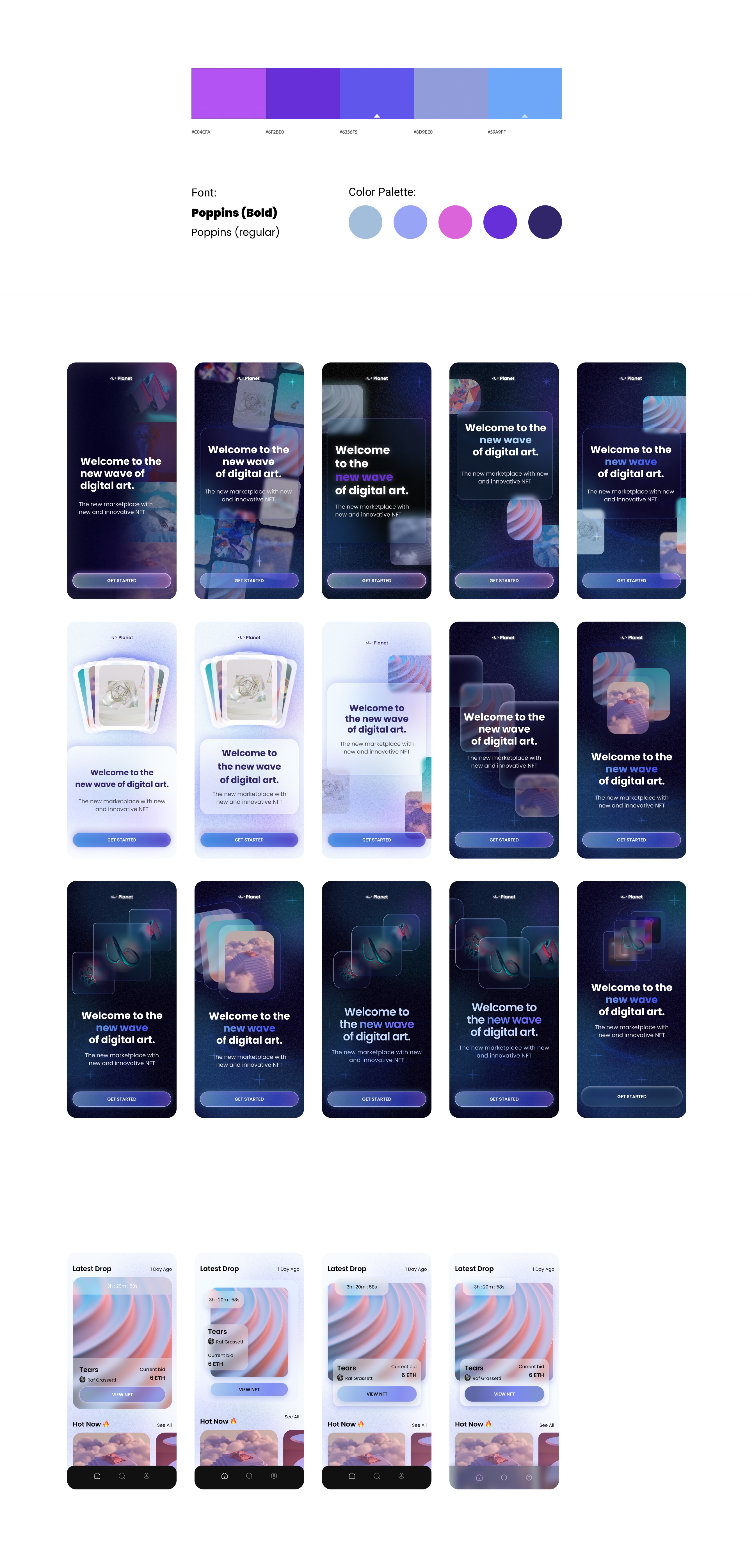
Experimentation with my second design direction, “soft, sheer, and cosmic,” proved much more challenging for me! I knew that I wanted to use a lot of transparency, which meant I needed to layer transparent elements to show off their glassy look without letting the layers feel muddled. I began my experimentation by putting my headline text on a transparent card, with images of NFTs floating behind it. No matter how I laid it out, this felt like I was crowding the text and losing the feeling of airiness that I wanted. I had a breakthrough moment when a design mentor suggested that transparency could be a part of the NFT image as opposed to the headline text. This allowed me to give my headline text the breathing room it needed, and let my spacey background feel more open. The challenge then became a technical one of tweaking the look of the NFT image cards - they needed to be transparent enough to float on top of each other but opaque enough for the image at the center to be visible. It took many rounds of adjusting but I think I eventually arrived at a good balance!

Color palette and many app screens experimenting with various versions of soft and cosmic concept
Ideating on Direction 2
Splash screen and home screen showing design for Concept 2: Soft sheer and cosmic
Final concept proposal for Direction 2

Having developed these two very different concepts, I faced the difficult task of choosing which one I would use for the Planet NFT app. I was torn! I polled a handful of friends and classmates, and was struck most by a classmate’s suggestion that if the second direction had been a bigger challenge for me, why not keep at it? I couldn’t help but agree - I was more excited about sticking with the direction that would challenge me to push myself further.

-03. Scaling the Design

Applying the Style

Having chosen a direction, I began applying this style to the rest of my wireframes. I had focused my visual ideation on a splash screen with a dark background, but I wanted the rest of the screens to be in light mode. To unify the look, I gave my light background some subtle grainy purple areas, which I tweaked many times to make sure that the text on top of them would still be readable. I carried the blue-purple gradient from my splash page CTA through the rest of the screens, adjusting it slightly to look good against a light background, and changing the CTA text to have a higher contrast ratio for readability. Contrast and accessibility were also major factors in designing cards with text that would lay on top of NFT images on my home screen and NFT detail screen. I wanted to continue using semi-transparent elements wherever possible, but I was careful to keep a balance for readability.
Screen shot of Figma workspace applying visual design to each app screen
Action shot: scaling the design in Figma

UI Library

While working through the process of applying my visual style to each screen, I also began building a UI library. Again, keeping readability and accessibility in mind, I kept my typography as legible as possible. With so many gradients and blurs and transparent overlays, I knew that I needed to keep my type simple. I stuck with my original choice of Poppins for all of my text elements. I also kept my color palette as limited as I could, and went through several rounds of edits to my blue-purple gradient until I arrived at a single look that I was happy with on every internal screen.
Type system and color system

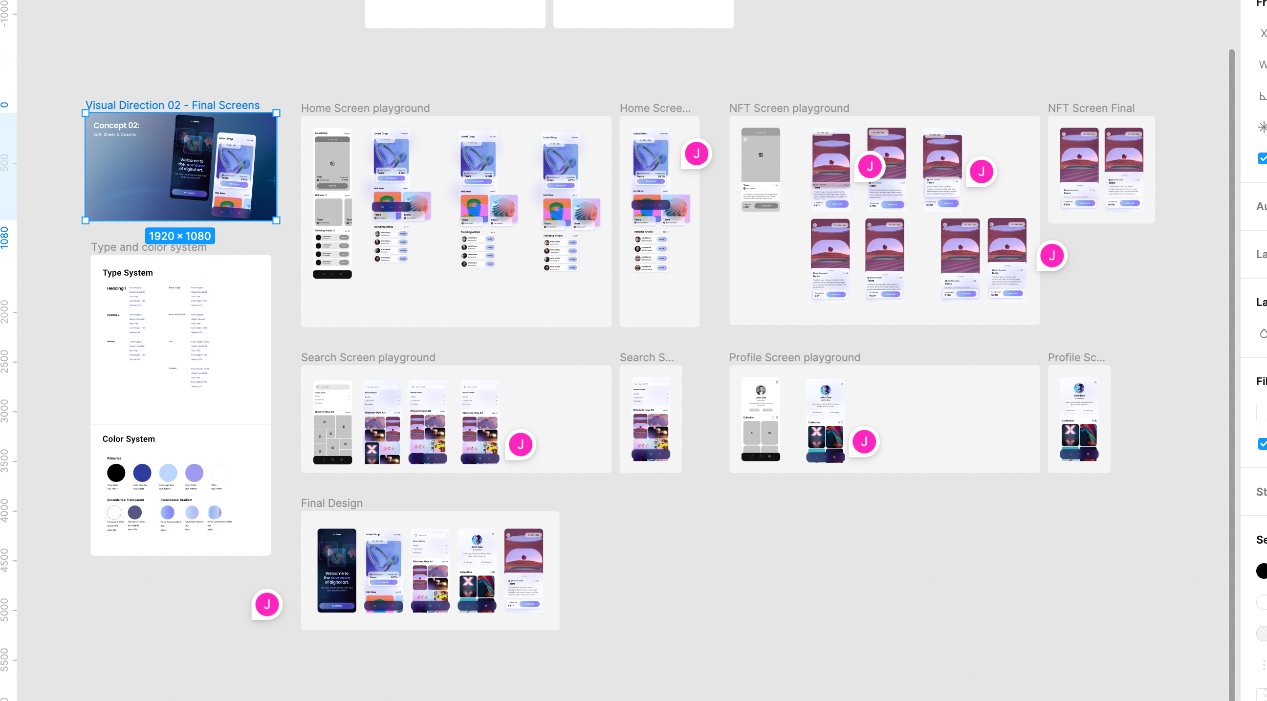
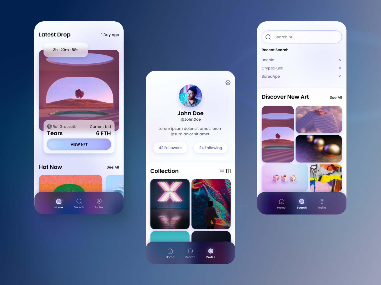
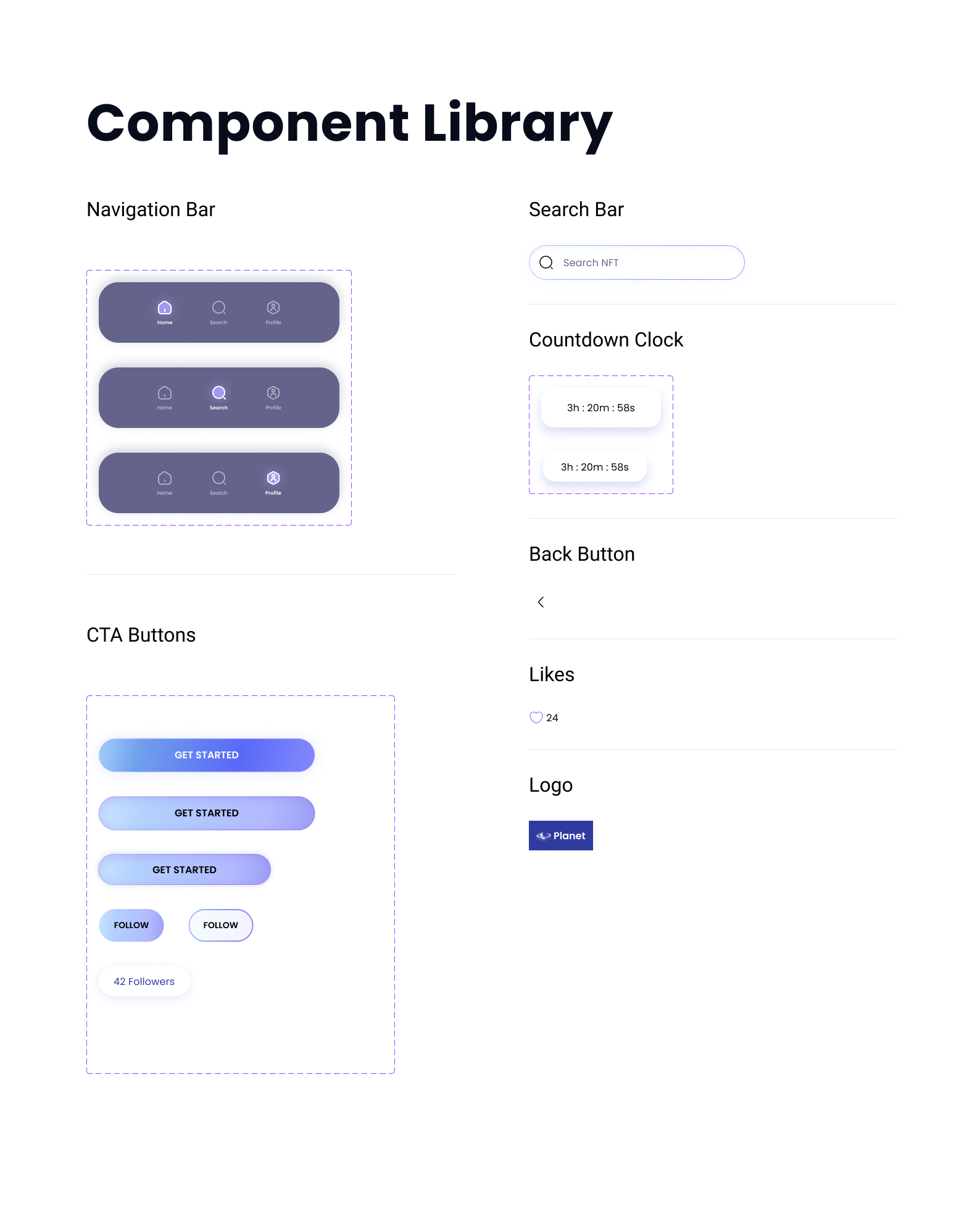
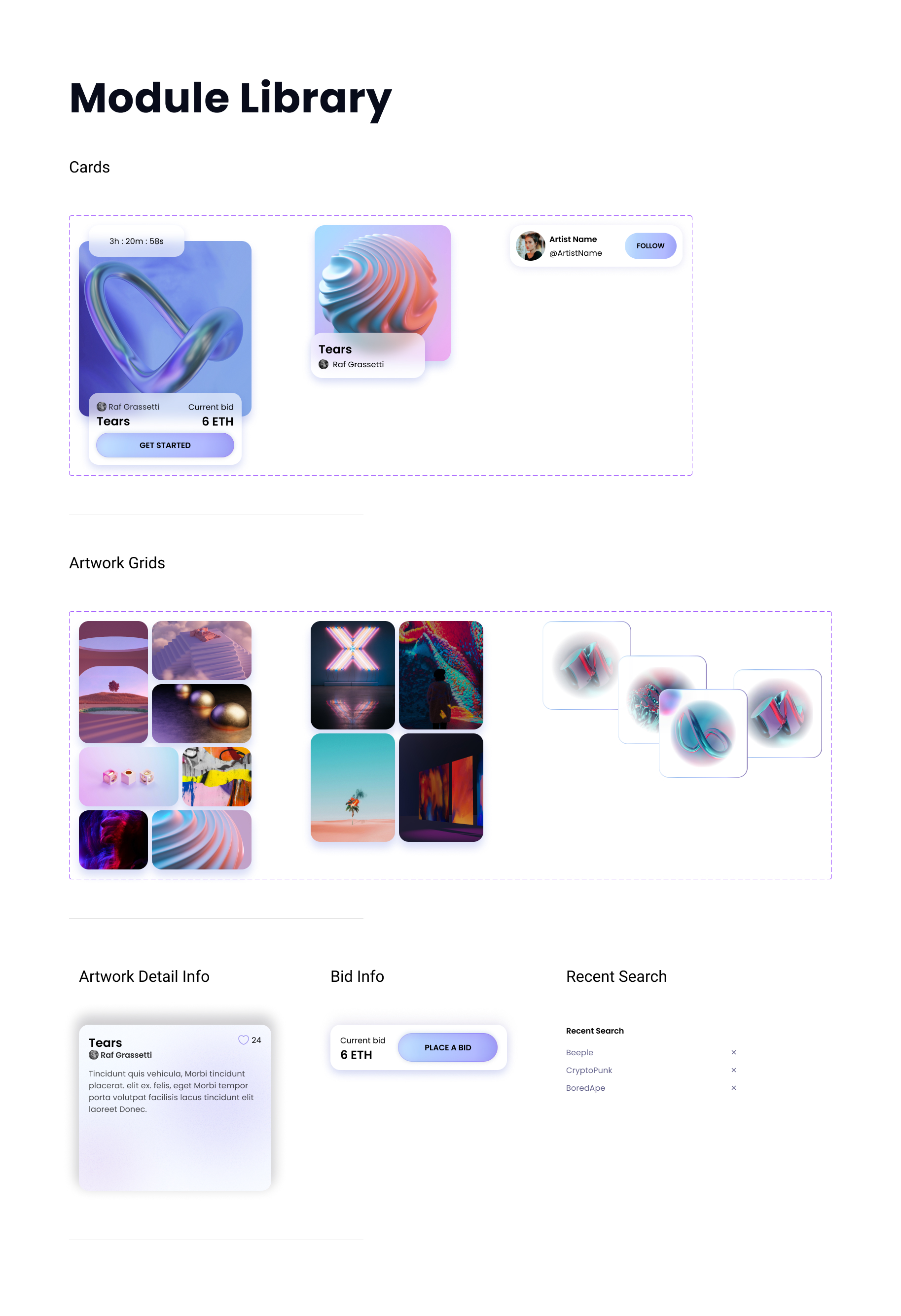
To make my design scalable, I began creating components that I could reuse throughout the different screens. I made components for elements like my navigation bar and CTA button that would be used in many places, as well as modules of more complex elements like NFT cards and grids of artwork. Although the scope of this project only included five main screens, these components would make it possible to continue scaling the design to more screens in the future.

Component library with buttons and other repeated elementsModule library with cards, clusters, and other repeated elements
-04. Final Design

Final Screens

Final designs of splash screen, home screen, and artist profile page
Final designs: Splash screen, home screen, and artist profile page
Final designs of search and discover, artwork detail page, and expanded artwork view
Final designs: search and discover, artwork detail page, and expanded artwork view

Prototype

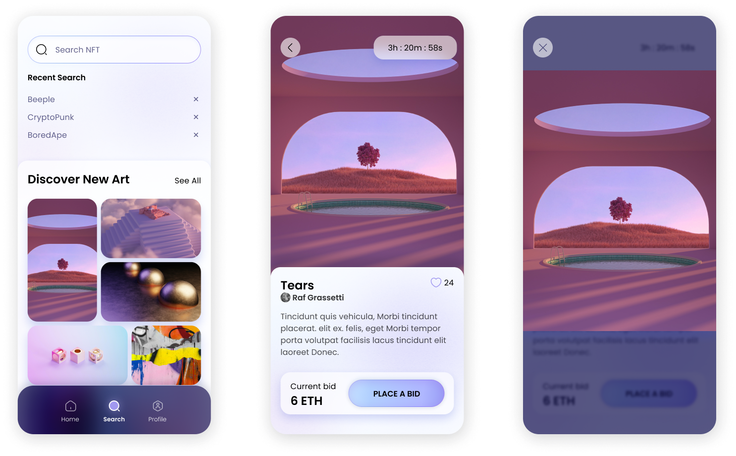
When I was happy with the look of my screens, I set out to bring them to life with a working prototype. I built the main interactions of this user flow focusing on simple, clean movements that would match the smooth feel of the visual design. With a fairly simple flow of only five main screens, I wanted to focus on small details that would make the whole thing feel real. I built micro-interactions to give users immediate feedback, like seeing a button pressed down, or seeing the "like" heart animate when clicked.

Screen shot of Figma workspace showing screens connected by prototype nodes
Putting it all together in Figma
Writing about this work in a step-by-step case study can make it seem like a linear process, but of course, it’s anything but linear. Seeing how each screen looked as part of a prototype meant noticing areas that weren’t working together visually, or elements that were becoming muddled when they moved. So while I worked on the prototype, I continually cycled back through my process to make more edits and keep improving the overall style. For example, I realized that the  icons and text in my nav bar weren’t readable enough over a moving background. I raised the opacity of the inactive icons, added a fill color to accent the active icons, increased the size of the text labels, and slightly upped the opacity of the background color - all edits that made the prototype more legible, and that I think improved the look of the design as well.
Low-fi prototype: ordering concessions
-05. Conclusion

Takeaways

Having come to the end of this project, I’m happy with the shape that my design has taken, and I’m glad that I decided to challenge myself and push my technical skills. Throughout the design process I tried to keep in mind the why of what I was doing - what a particular look would communicate to the user. I wanted to create a visual experience that would feel spacious and light, and show a user the vast open world of digital art that they could explore. I think that the visual language I created gave the design the airy, inviting look that I was aiming for.

With more time to work on this project, I’d love to continue adding to the prototype to bring it to life even more. I’d be very interested to build out a user flow to place a bid on an artwork, and I’d love to experiment with an animation to demonstrate the search function.