Project Overview

Neighborly is a mutual aid organization that aims to decrease food insecurity by connecting people who are able to do volunteer deliveries with people who are in need of groceries. The Neighborly website is a responsive site that gives general information about the program and provides an easy way to request a grocery delivery and sign up to volunteer. The accompanying mobile app is focused on volunteering. Volunteers can easily select a delivery request to complete and then are given simple instructions on what to buy, and where to deliver. By focusing on direct connections among community members, the app and website aim to encourage solidarity between neighbors and strengthen an understanding of how easy it can be to help each other.

Project Duration

November-December 2022

My Role

Lead UX Designer - UX Researcher - UI Designer

TOP
-00. Background

Introduction

This project was created as a way to explore designing for social good. In the early days of the Covid pandemic, several mutual aid groups sprung up around my neighborhood to provide assistance to people who, for whatever reason, didn't have reliable access to food, medication, household necessities, and more. I volunteered with one of these groups and helped shop for and deliver free groceries to people in my community. I was inspired by the mutual aid method of circulating resources within a community, and the solidarity that was encouraged between neighbors. This app and website look at one way that UX design can be used to make it even easier to give help when we're able and ask for help when we need it.
Splash image of app home screen, list of delivery requests, and delivery request detail screenSplash image of mobile web home page, volunteer info page, and new volunteer signup page

The Problem

According to the USDA, more than 34 million people in the United States are food insecure. Where I live, in Brooklyn, New York, almost 400,000 people are experiencing food insecurity, and many of them are not eligible for food assistance programs. Many mutual aid groups are working to address this issue with grocery delivery programs. These projects require a good deal of coordination on the part of organizers, who must train volunteers, do outreach to those in the community needing aid, and carry out the logistical work of matching volunteers with recipients.

The Solution

This project aims to create a hub that will connect volunteers with those in need of aid, with less direct involvement needed from organizers. This project is meant to be a simple and efficient way for volunteers to sign up for and complete a grocery delivery whenever they find themselves with a bit of free time - anyone can be encouraged to help out without needing to clear their schedule. The focus is on direct connections between members of the community. By making the process straightforward and nonjudgmental, we can normalize asking for help when it’s needed, and providing help when we are able.

Splash image of many screens of Neighborly mobile app
-01. Empathize

User Research

Research Goal:

Understand how mutual aid organizations are currently addressing food insecurity, and what are their successes and difficulties with this work.

Research Process:

To begin empathizing with my user, I conducted interviews with four residents of Central Brooklyn who at some time had been involved in mutual aid organizations and most of whom had specifically participated in mutual aid work addressing food insecurity. I set out to understand:
  1. What is the system of matching volunteers to requests for help?
  2. What is the volunteer process like, and what are the difficulties that can be improved upon?
  3. How is information about needs communicated between recipients, organizers, and volunteers?
  4. What are the barriers to addressing food insecurity on a community level?

Research Findings

I organized my findings from this research into an empathy map and distilled my data down to understand user pain points and needs. I then created user personas to help guide my design decisions throughout the rest of the process.

User Goals

User Pain Points

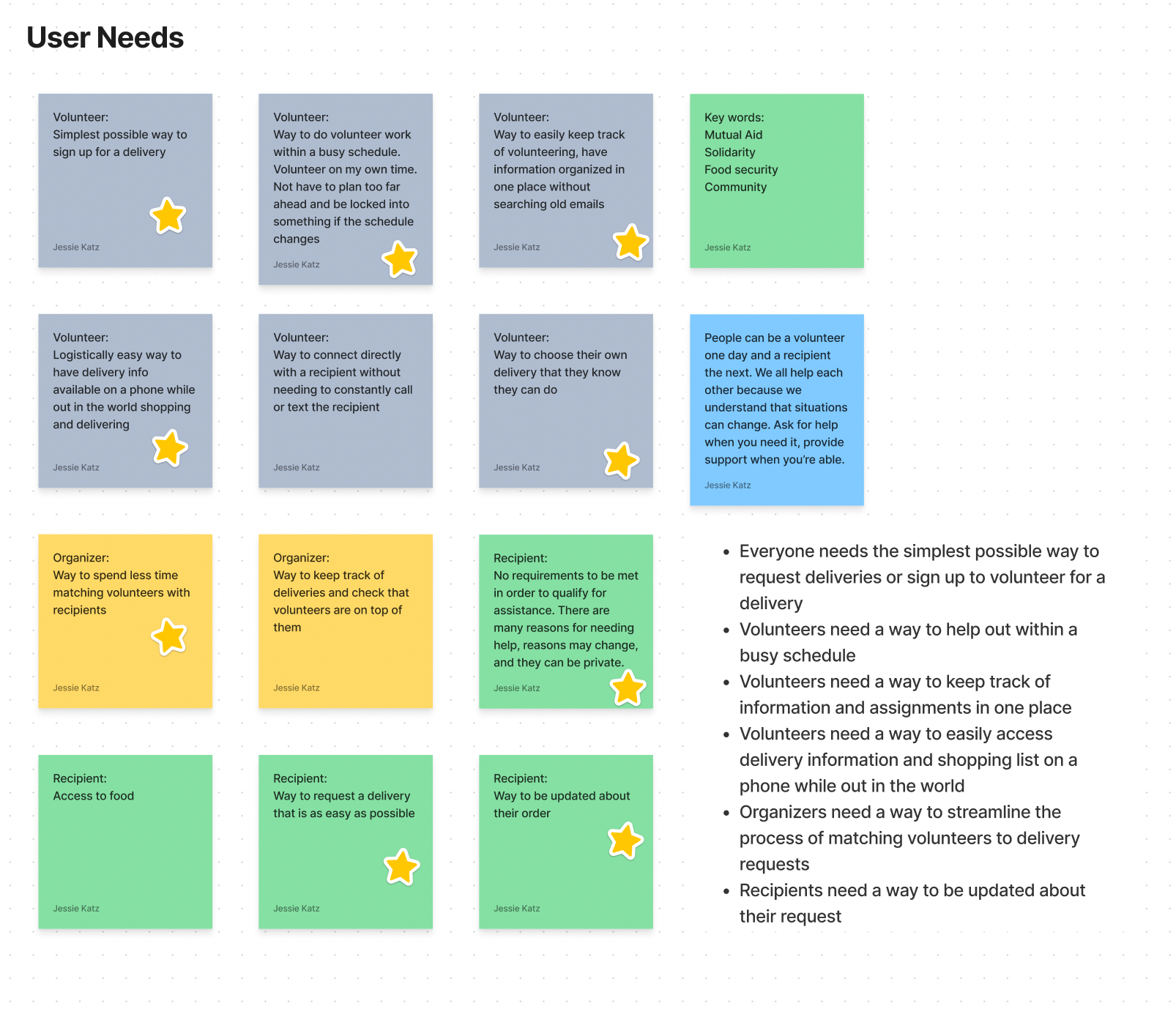
Organizers: Takes a lot of high-level organization to match volunteers with recipients, and this takes time

Volunteers: No centralized place for volunteer information and assignments

Volunteers: No centralized place for volunteer information and assignments

-02. Ideate

User Needs

To begin my design, I ideated on what it was that my users needed. I referred back to what I had learned in my interviews, and I brainstormed user needs based on my user personas.
Digital notes of brainstorms of User Needs
Ideating on user needs in FigJam

How Might We

I continued my ideation by coming up with How Might We statements. During this process, I focused especially on the ideas and ideals behind mutual aid and community involvement.

How might we...

Digital sticky notes of How Might We brainstorm
"How Might We" exercise in FigJam
-03. Wireframe and Prototype

Wireframes: Mobile App

Paper Wireframes

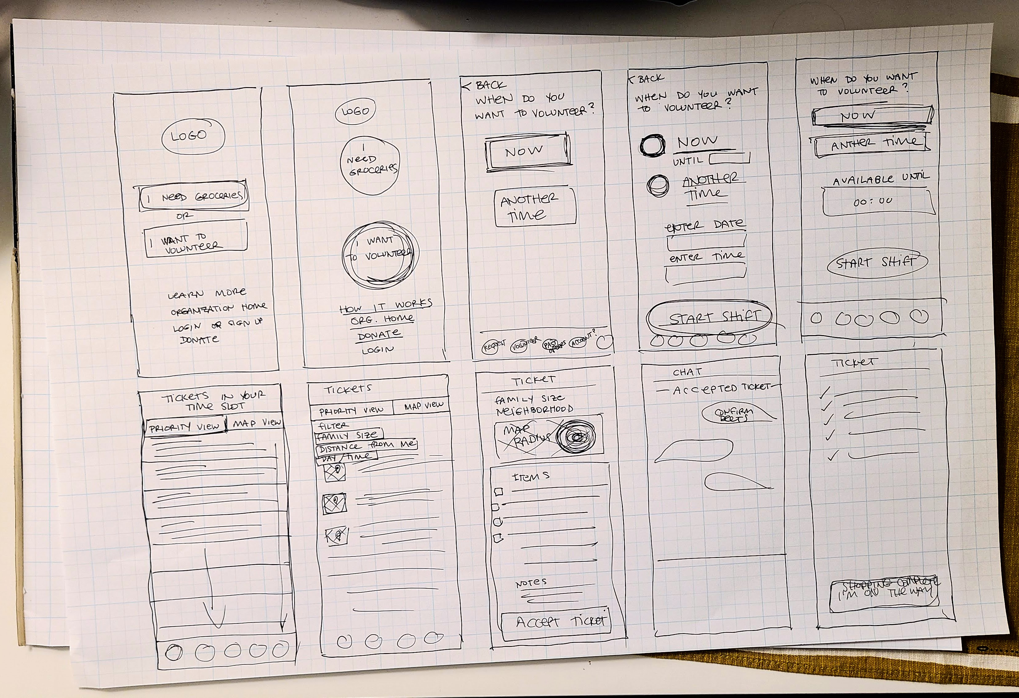
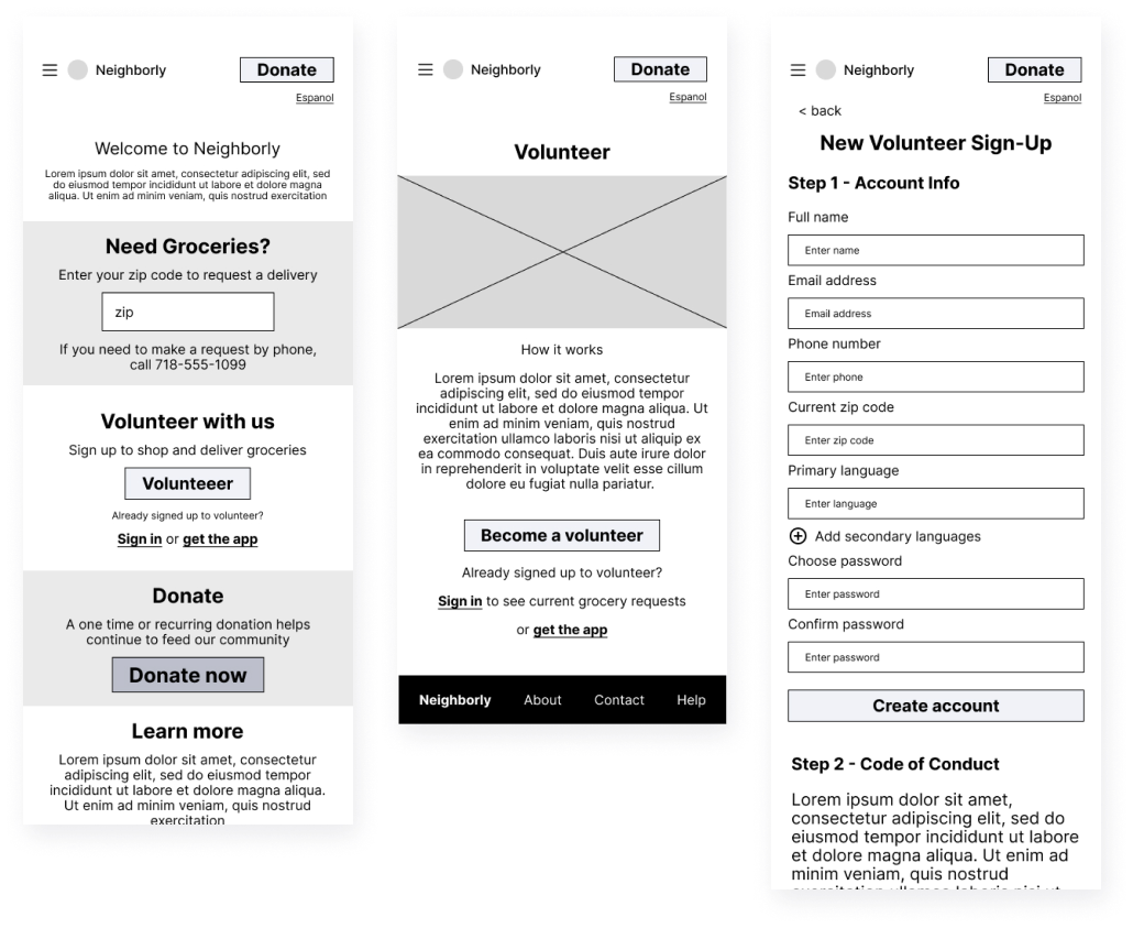
I began designing with many rounds of paper wireframes. I began very broadly, and after each round, I selected my favorite wireframes and my favorite elements and then ideated further on these in the next round. Taking a mobile-first design approach, I began by thinking about what the absolute necessities would be to include in a dedicated mobile app. Considering my different users’ needs, it was clear that a mobile app was most useful specifically for people who currently wanted to volunteer. Other users could reach their goals with a website accessed from their homes, but volunteers needed something that would be easy to use both at home and out in the world while shopping and doing deliveries. They needed a way to have all of the necessary information in one place, easy to access no matter where they were.

Hand drawn paper wireframes of mobile app screens

Digital Wireframes

Volunteer Home and Ticket Detail

Digital wireframes for mobile app showing list of delivery requests, and delivery request preview page, with annotations below
  1. Volunteer Home screen shows all currently requested deliveries. A volunteer can look through to select one or multiple orders to claim.
  2. Sort and filter: Volunteers may wish to sort or filter by priority, distance from their home, or by family size. A volunteer without a car may need to select for smaller families (which will therefore have smaller and easier-to-carry grocery orders). Volunteers looking for a specific day to do a delivery can sort by requested delivery days.
  3. Clicking on a card on the volunteer home screen will open a preview of that delivery request, and a volunteer can decide if they’d like to claim that delivery order.
  4. When submitting a request for a grocery delivery, recipients will indicate time slots to receive a delivery.

Task List for Claimed Delivery

Digital wireframes for mobile app showing delivery request screen, and chat window to confirm delivery time, with annotations below
  1. Once a volunteer claims a delivery order, they are shown a list of tasks to complete.
  2. The first task after claiming a ticket is to confirm a delivery time. The volunteer is prompted to directly message the recipient to confirm a time.
  3. The volunteer messages through a chat feature within the app. The recipient can receive these messages as regular SMS texts. Once a time is confirmed, the volunteer can return to their task list and continue.

Shopping and Delivery

Digital wireframes of mobile app showing shopping list and CTA to deliver the order, with annotations below
  1. When a volunteer is ready to shop, they can use the checkboxes on the included shopping list to make sure they’ve gotten every item requested.
  2. After the volunteer clicks on the button to indicate that they’re finished shopping, they are prompted to deliver the groceries to the address provided, and mark that the delivery is complete.

Low-Fidelity Prototype: Mobile App

This prototype follows the main user flow of viewing a grocery order, claiming that order, confirming the delivery time via in-app messaging, using the shopping list to buy groceries, and delivering the groceries.
Low-fi prototype: Claim, shop, and deliver an order
-04. Test

Usability Study

I conducted a moderated usability study with four participants to test this low-fi prototype. Participants, most of whom had experience with similar mutual aid work, were asked to complete the main user flow. Most participants had trouble with many of the same features. I organized their feedback into several actionable insights:

1. Users need to select a delivery time window without leaving the main flow.

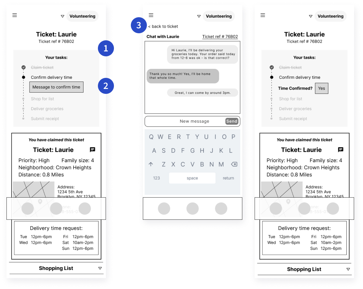
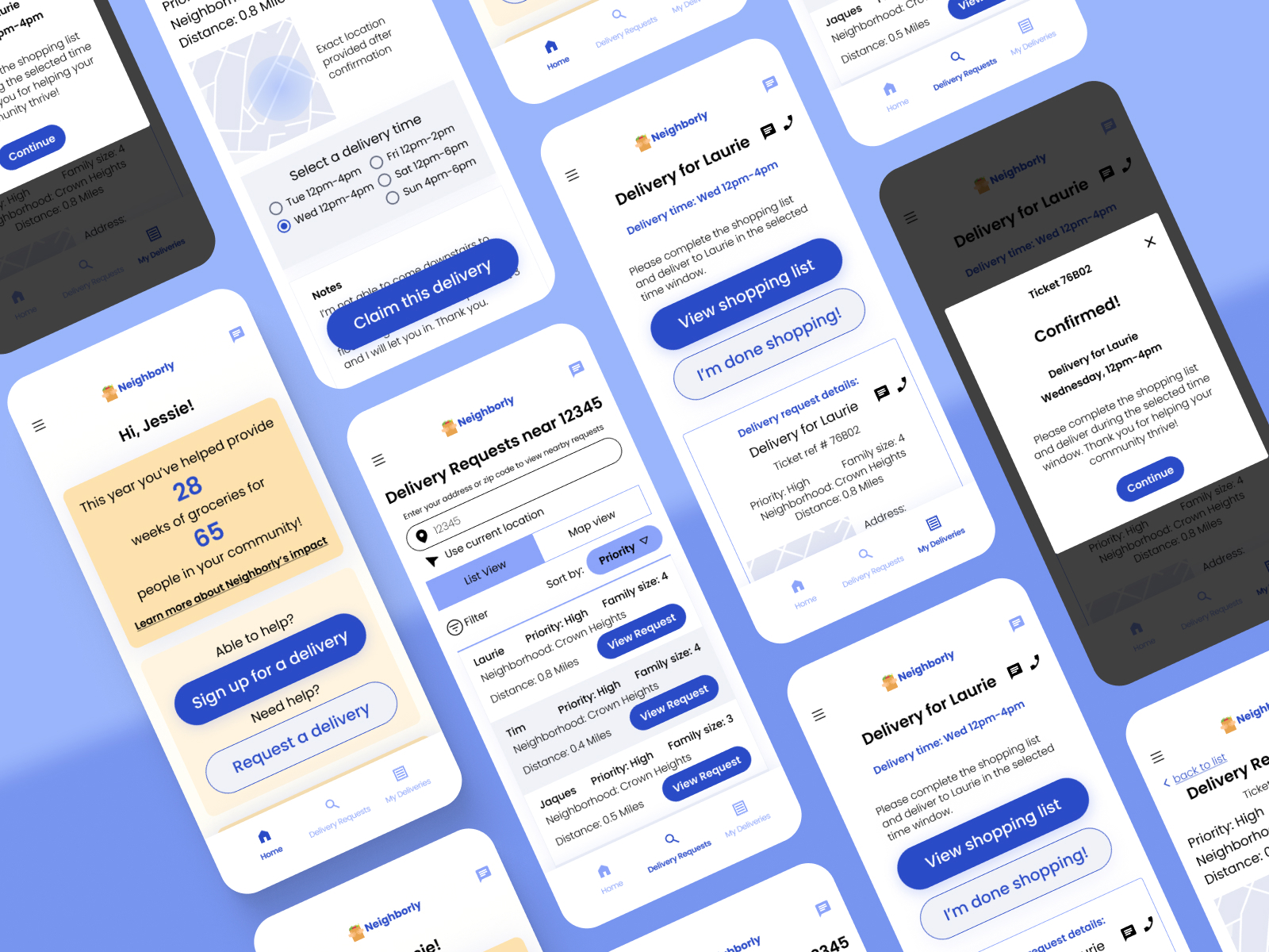
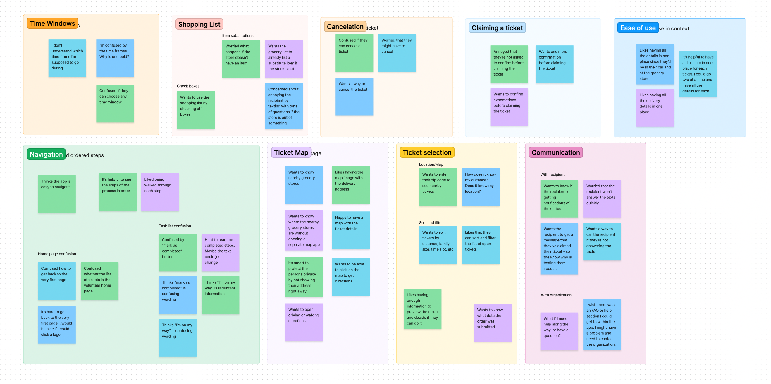
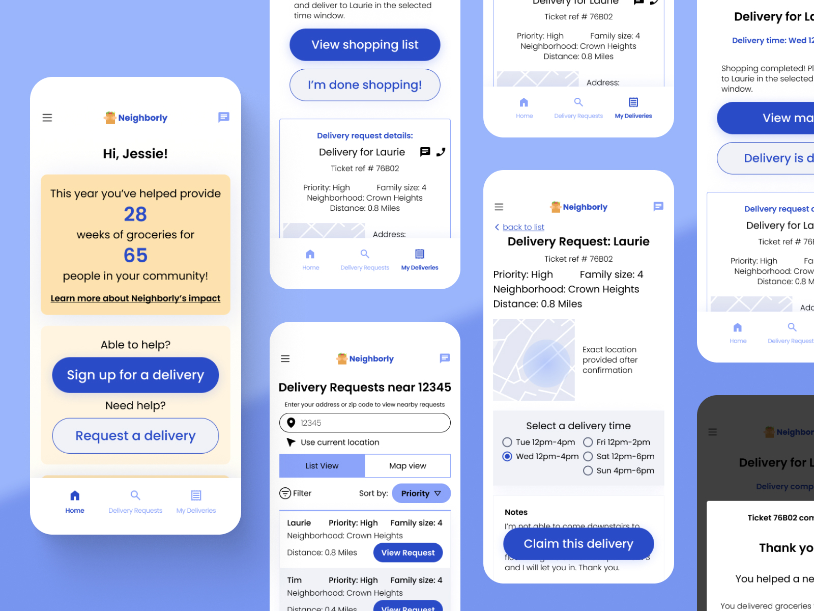
Users struggled to navigate to a chat window and back to confirm a delivery time. Users felt like they were leaving the linear flow and getting lost. Users were frustrated that they would have to use a direct message and wait for a reply, instead of allowing the app to automate this step.

2. Users need a map visual in a neutral color.

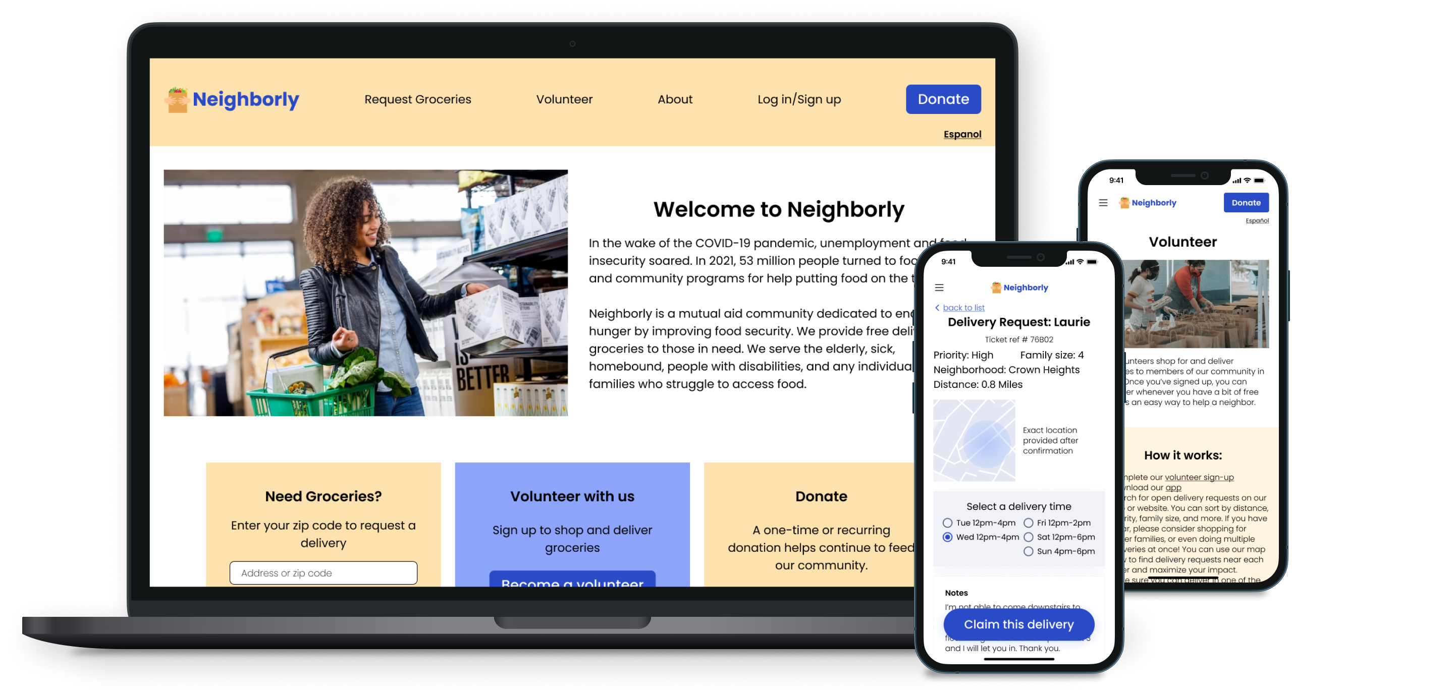
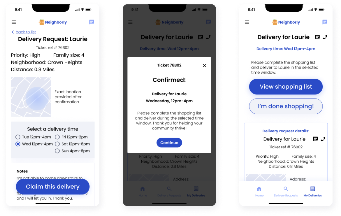
One user noted that the red circle used to show the recipient’s approximate location on the app could imply that the area was dangerous. It is crucial that the imagery not imply any judgment on a neighborhood.

3. Users need notes and special requests to be more visible when previewing a delivery request.

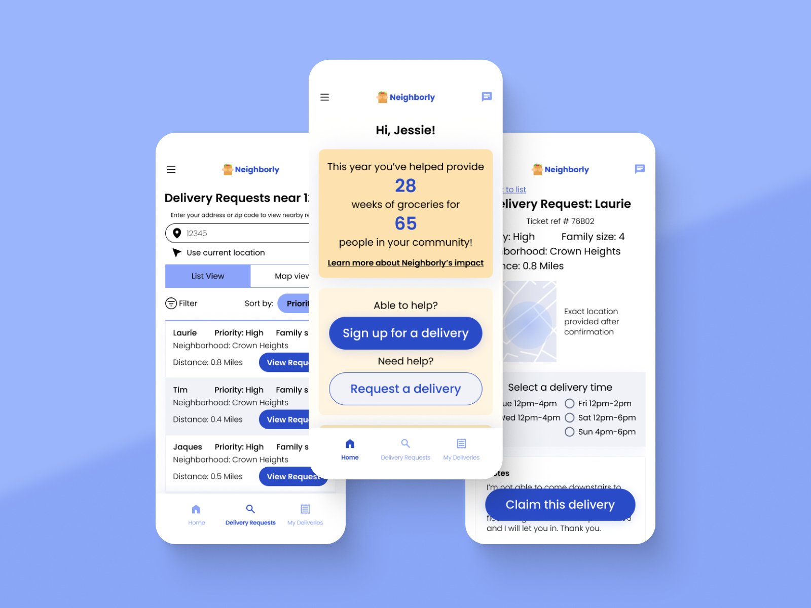
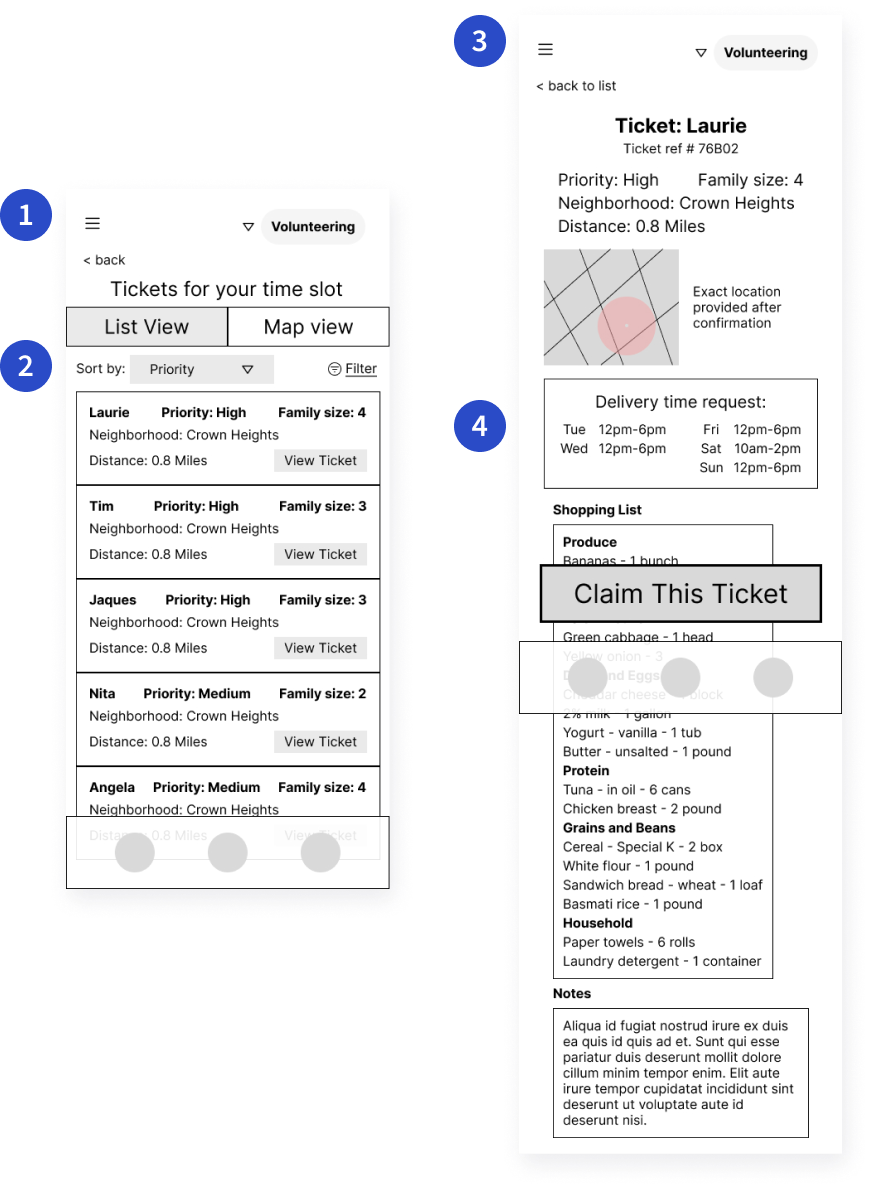
Because the notes section was below the shopping list in the ticket preview, many participants didn’t notice the request to be able to carry groceries up the stairs. Users need to be aware of this type of special request before they claim a delivery.

4. Users need a way to tell the app their location.

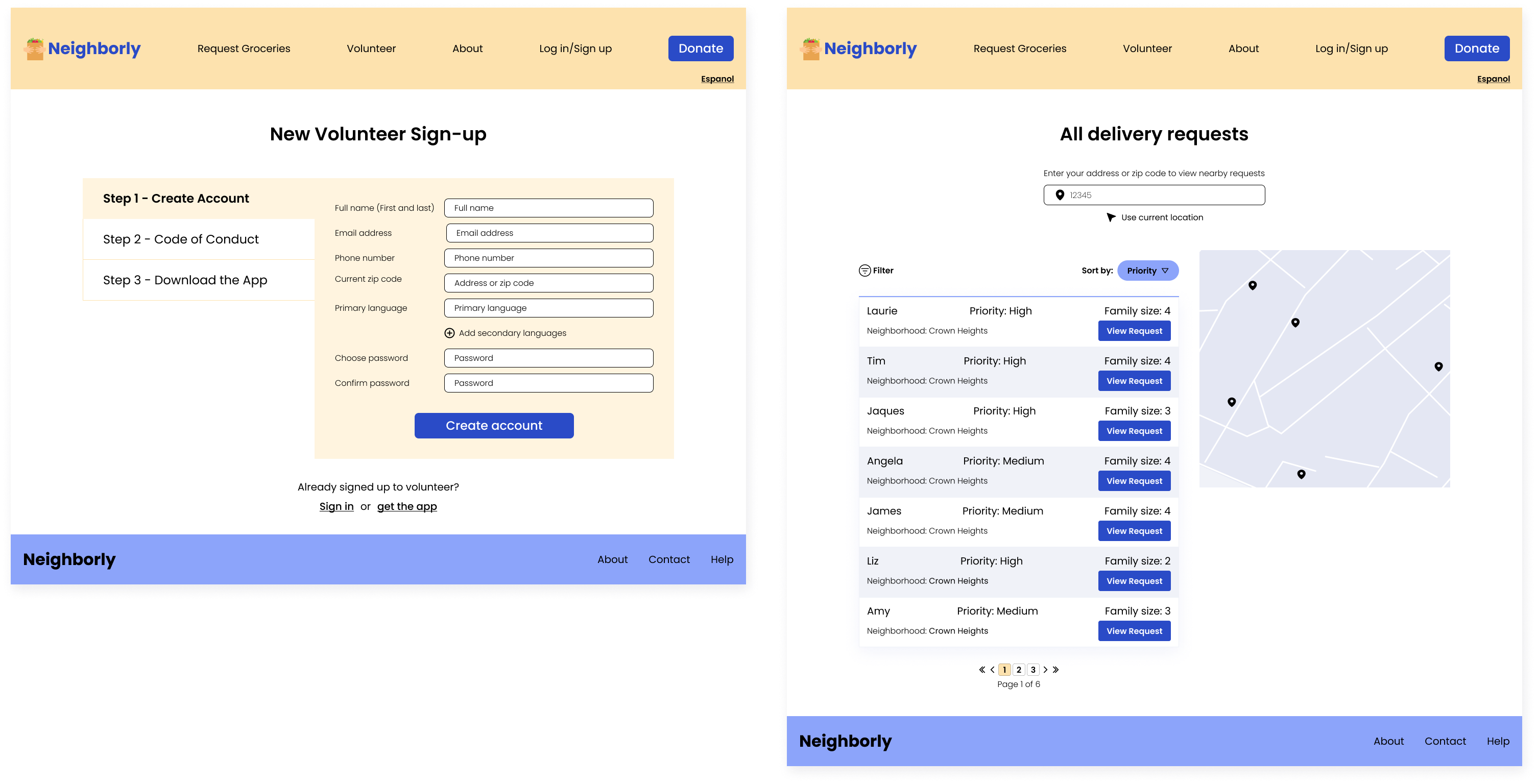
Because order request cards listed a distance from the user, participants assumed that the app knew their location. Users need to explicitly enter their location or enable location services before this information is available.

Affinity map organizing findings from the user research study
Affinity map organizing findings from user research study

Updating the Wireframes

List of Delivery Requests

Before image showing wireframe of list of delivery requests, and after images showing high fidelity mockups

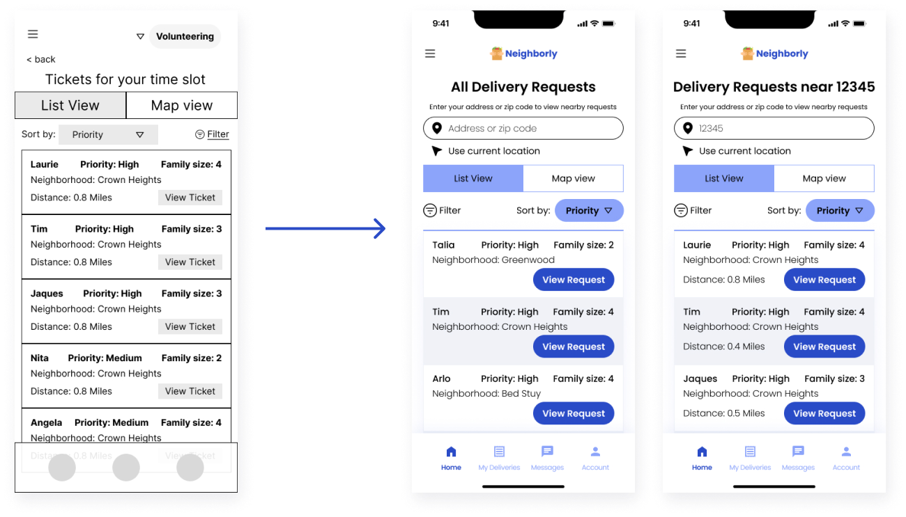
To address the issue that users needed a way to knowingly give the app their location, I added a field to enter an address or zip code. Once this is entered, the list of open requests will show nearby results and indicate their distance from the user.

Claiming a Delivery

Before and after images showing wireframe of ticket preview screen and high fidelity mockup of this screen

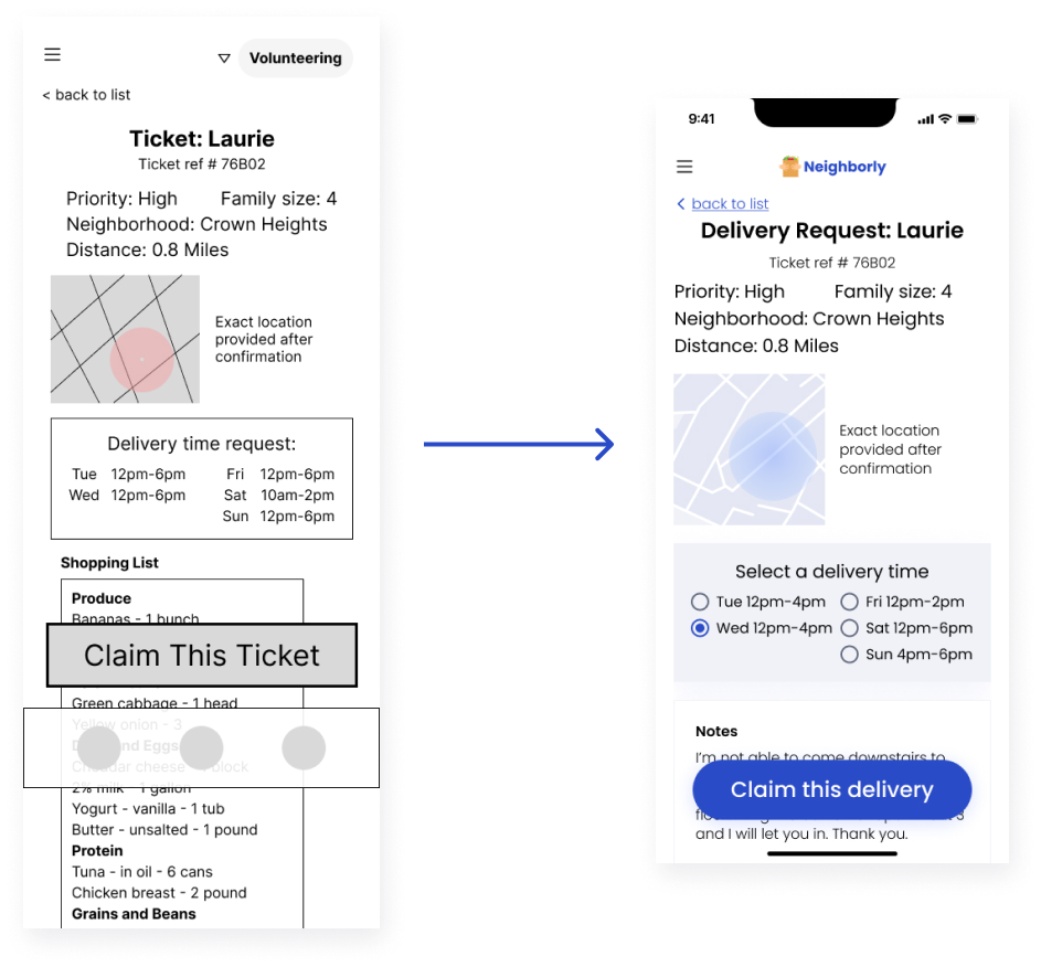
To address the insight that users saw the red area on the map as an implication that a place was “bad” or dangerous, I simply used a neutral blue color that would not imply any judgment. I addressed the issue of user confusion around confirming delivery times by making the delivery times a required selection with a radio button. Volunteers now simply select a time before claiming a delivery, and the recipient is automatically notified. I also moved the “Notes” above the shopping list so volunteers would be made aware of any important requests before agreeing to a delivery.

Shopping and Delivery Flow

Before and after images showing wireframe of delivery task list and high fidelity mockup of delivery task CTAs

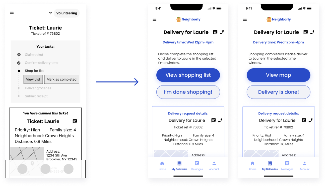
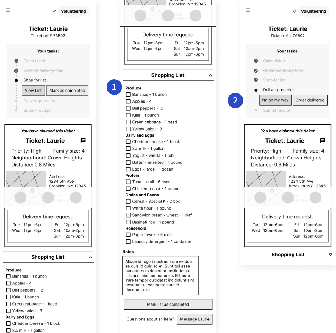
Removing the confusing step of messaging the recipient meant that the overall flow was simplified enough that I wouldn’t need to show a list of tasks. The only tasks once a ticket is claimed are to shop for groceries and delivery the groceries. I replaced the task list with simple CTA buttons that prompt a volunteer to the next step of the flow.

-05. Refining the Design

High-Fidelity Mockups: Mobile App

In creating the visual design of this app, I focused on simplicity and legibility. I relied on white space to keep the design uncluttered and easy to read. I used a color scheme of blue and light yellow to convey a trustworthy and professional look but to also feel friendly, upbeat, and optimistic.
High fidelity mockups of mobile app including user sign in screen, user home screen, and list of delivery requests
Final app mockups for main user flow: sign-in, user home page, list of delivery requests
High fidelity mockups of mobile app including screen to claim a delivery, claim confirmation screen, and shopping CTA screen
Final app mockups: claim a delivery, claim confirmation, shopping CTA
High fidelity mockups of mobile app including order delivery CTA screen, delivery confirmation screen, and final screen to upload a receipt or view more requests
Final app mockups: delivery CTA, delivery confirmation, upload a receipt

High-Fidelity Prototype

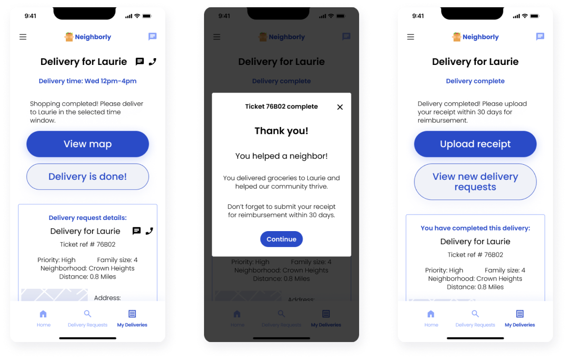
The updates that I made to my original design, particularly removing the need to chat to confirm a time, allowed for a more simplified user flow. I was able to rebuild my prototype to be much more linear and logically flowing.

High-fi prototype: choosing a recipe, viewing notes, saving a private note.
Click here to try the prototype
-06. Responsive Web Design

Information Architecture

Responsive Web Sitemap

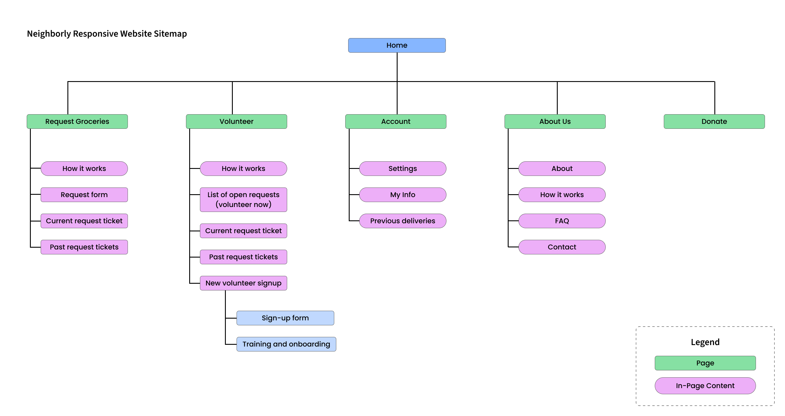
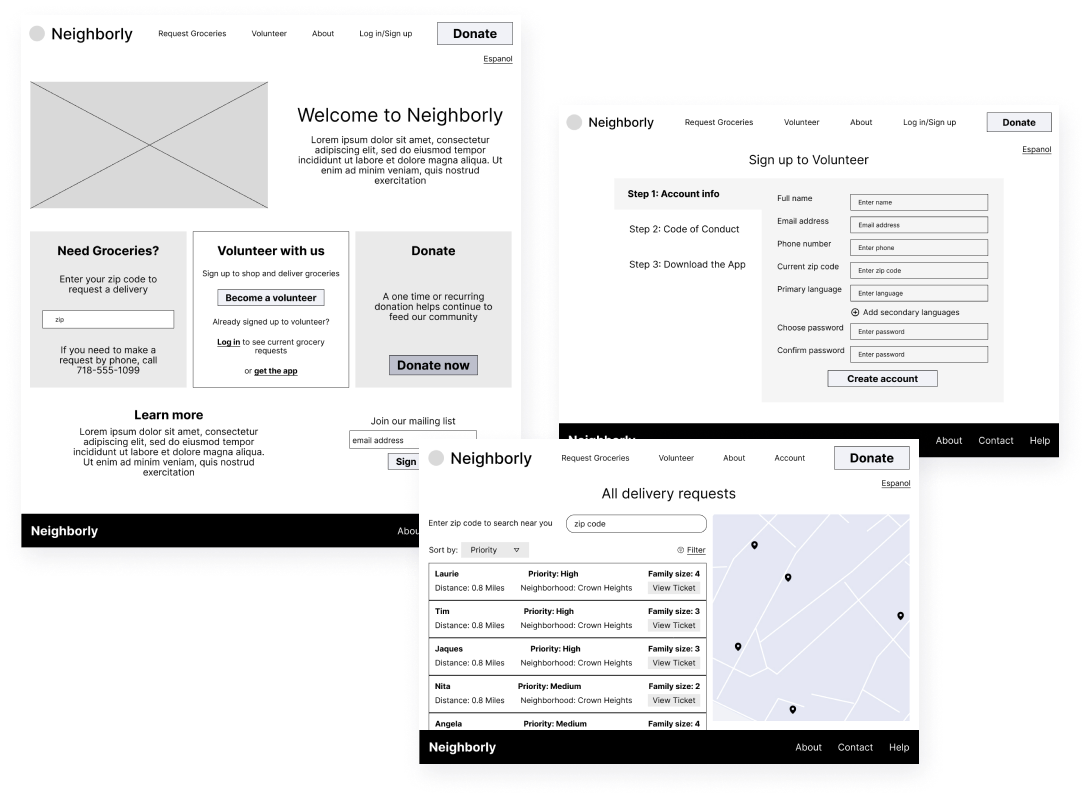
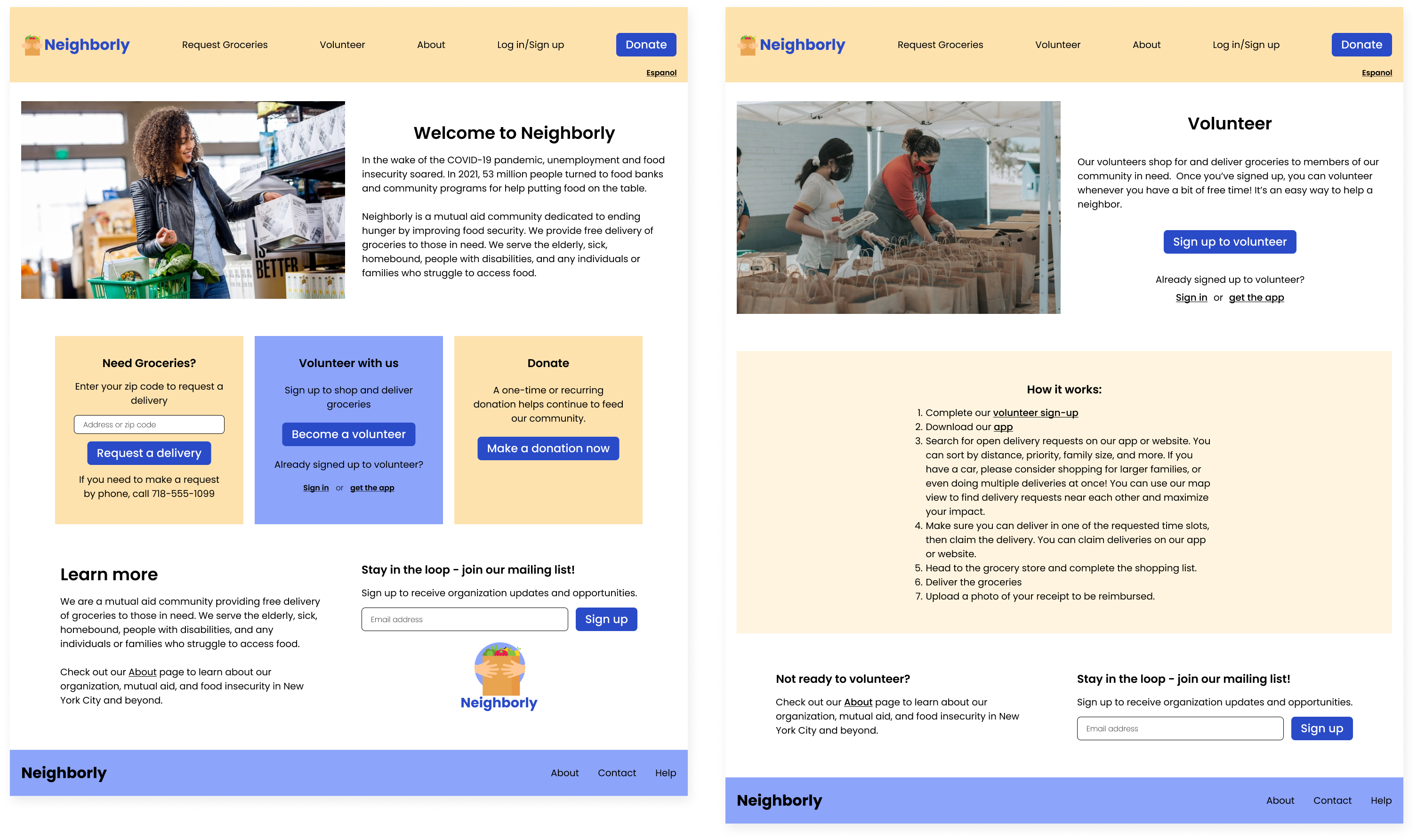
Now that my mobile app was in a good place I moved on to the design of a responsive website. While the app was primarily a tool for volunteers to streamline the process of helping with grocery deliveries, the website would need to have more information for visitors not already involved in the organization. Crucially, the website would also be where someone could go when in need of food assistance, and this needed to be easy to find. I built a sitemap for the website to be a very straightforward hierarchical structure that would be easy for all users to navigate.

Sitemap showing information architecture of responsive website

Paper Wireframes: Responsive Website

I began the design of my responsive website by rapidly ideating with paper wireframes, first for mobile screen sizes and then desktop. At the forefront of my thoughts was the intention to make it as easy as possible for someone experiencing food insecurity to find assistance on the home page. I chose a very simple single-column layout for the home page of my mobile site and explored ways to make the necessary information clear and easy to find.

Hand drawn paper wireframes of main mobile web screens

Digital Wireframes: Responsive Website

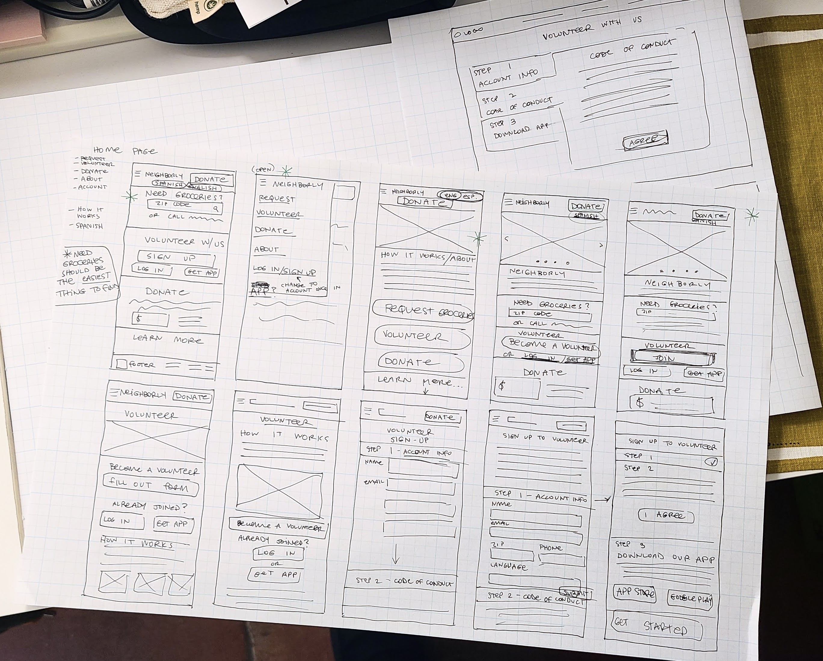
While the focus of the app was on volunteers actively ready to help with grocery deliveries, the volunteer section of the website would be more focused on getting people involved in the first place. I focused my design of these wireframes on signing up as a new volunteer. Once signed up, a user would continue to use the website to fulfill grocery deliveries, but would be encouraged to use the dedicated app for that part of the process.

Digital wireframes of desktop website including Neighborly home page, volunteer signup form, and list of delivery requests with map
Desktop web wireframes: Neighborly home, volunteer signup, list of delivery requests
Digital wireframes for mobile web showing Neighborly home screen, volunteer information screen, and new volunteer signup form
Mobile web wireframes: Neighborly home, volunteer info, volunteer signup

High-Fidelity Mockups: Responsive Website

High fidelity mockups for desktop web showing Neighborly home page and volunteer information page
Desktop web mockups: Neighborly home, volunteer information
High fidelity mockups for desktop web showing new volunteer signup form and list of delivery requests with map
Desktop web mockups: Volunteer signup, list of delivery requests
High fidelity mockups of mobile website showing Neighborly home page, volunteer information page, new volunteer signup form, and new volunteer code of conduct page
Mobile web mockups: Neighborly home, volunteer info, volunteer signup

High-Fidelity Prototype: Responsive Website

Click here to try the mobile prototype
Click here to try the desktop prototype
-07. Conclusion

Accessibility Considerations

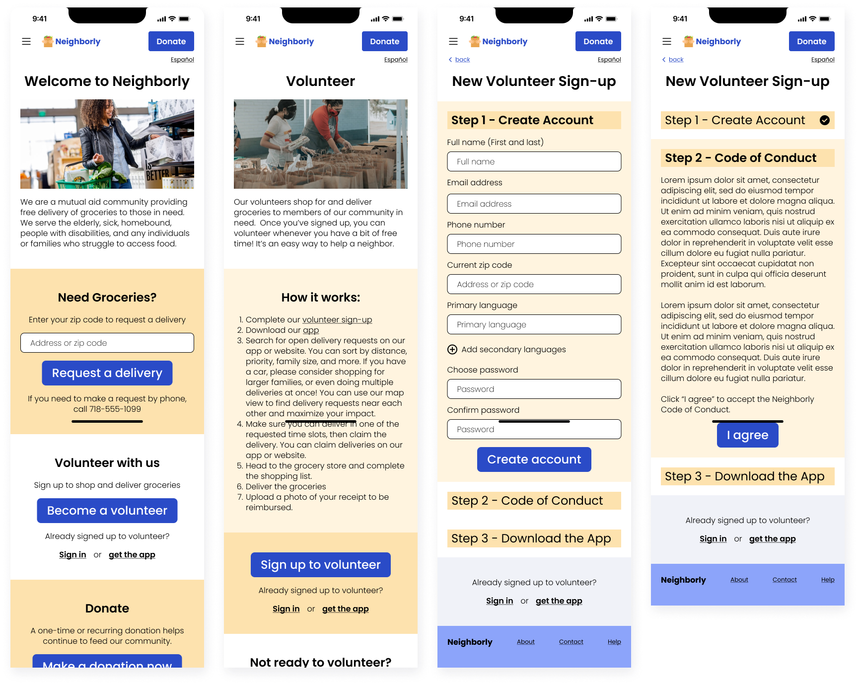
Taking accessibility into account is always important to me in my design work. Creating an accessible experience felt particularly crucial for a project that aimed to foster a sense of community solidarity. To encourage equal respect and care among neighbors, the design needs to be inclusive of everyone in the community. I created many parts of the app and website with a focus on equity and inclusion:

Takeaways

Impact

According to the USDA, more than 34 million people, including 9 million children, in the United States are food insecure. Where I live, in Brooklyn, New York, almost 400,000 people are experiencing food insecurity, and many of them are not eligible for food assistance programs. Many mutual aid groups are engaged in programs that address food insecurity, and this design focuses specifically on grocery delivery within communities. This app and website aim to connect members of the community who need help with those who can help - with the understanding that these personal situations are often changing. By making this process as simple and efficient as possible, I hope to minimize the barriers to giving help. This project can make it easy for anyone to help out a neighbor, any time they have just one or two free hours. Facilitating this type of volunteer work with a straightforward process can help improve food security, decrease hunger, and build stronger and more connected communities.

What I learned

The most important lesson I took away from this project was to continually go back to the WHY. At every step of my process, I reminded myself to think about the principles of mutual aid and to consider how my design was working within the goal of increasing food security from a local, community-oriented mindset. It was very important for me to remember that the groups of users I was considering to be distinct - volunteers, recipients, and organizers - were in fact fluid. Sometimes we need help, and sometimes we can offer help, and those situations do not define the “type” of user we are. I needed to build an app that would be useful to any member of a community who shared this mindset, regardless of their current circumstances.

Next Steps

Splash image of many high fidelity screens of Neighborly mobile app