Redesigning a Nonprofit’s Website to Reflect Its Evolving Mission
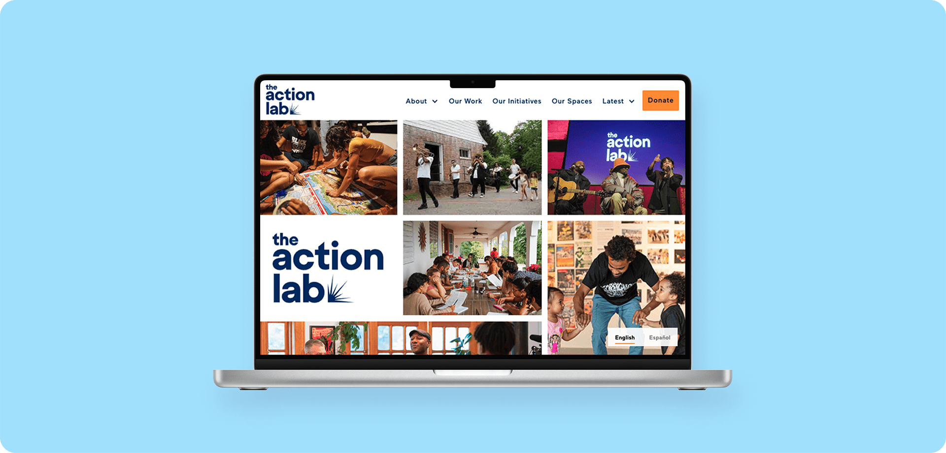
The Action Lab’s website serves as a vibrant, bilingual platform that centrers their community organizing work. The redesigned site integrates event management, multilingual content, and automated workflows while empowering staff to independently maintain and update their digital presence.
Overview
Designer & Webflow Developer
The Action Lab
Figma | Webflow | Airtable | Weglot | Mailchimp | Google Analytics
Introduction
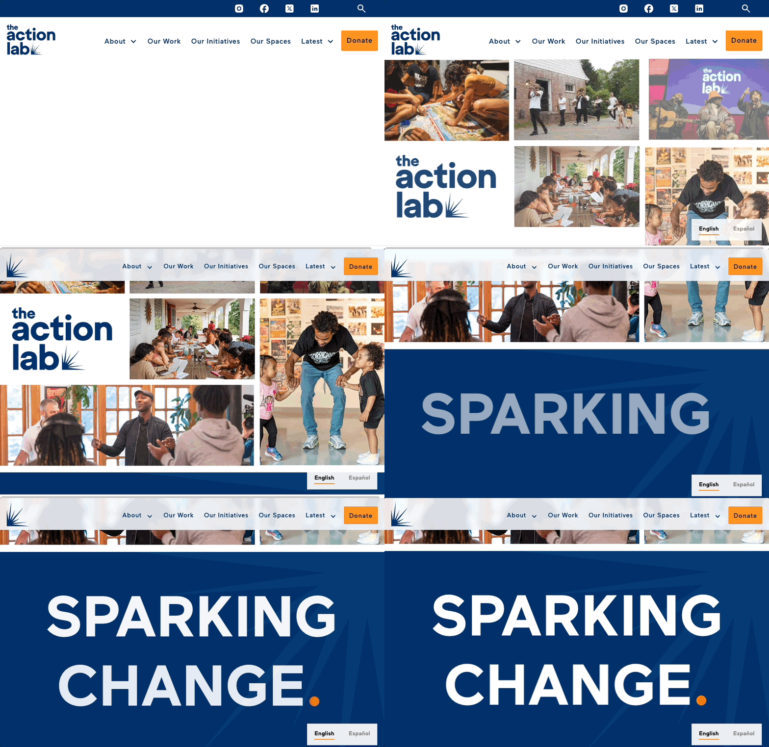
The Action Lab needed a website that matched their vibrant community work and made it easier to showcase their diverse initiatives. I redesigned their digital presence from the ground up, creating a bold, colorful platform that prioritizes their events and updates, clearly communicates their mission, and makes ongoing site management simple.
Key features:
- Visually vibrant design with bright colors, dynamic imagery, and subtle animations
- Intuitive information architecture that clarifies the organization's focus
- Streamlined events, updates, and publications management utilizing Webflow CMS collections
- Clear calls to action throughout the site
- Spanish language accessibility via Weglot integration
- Automated integrations with Airtable and Mailchimp to streamline newsletter signups and contact management
Post-Launch Outcomes:
Based on Google Analytics data, as well as newsletter and event sign-up numbers, the redesigned website has demonstrably led to significant positive outcomes:
- 21% increase in mailing list signups from last year, according to Mailchimp analytics
- High event participation, including an event with over 400 sign-ups within one month
- Strong user engagement across the site, including long session durations on text-heavy pages
- Increased client autonomy with frequent self-managed site updates
- Streamlined operations and time saving through automated newsletter and contact management
- Positive qualitative feedback from site visitors and from within The Action Lab organization
The redesign resulted in a platform that not only serves as an information hub but actively facilitates community engagement—truly living up to The Action Lab name.
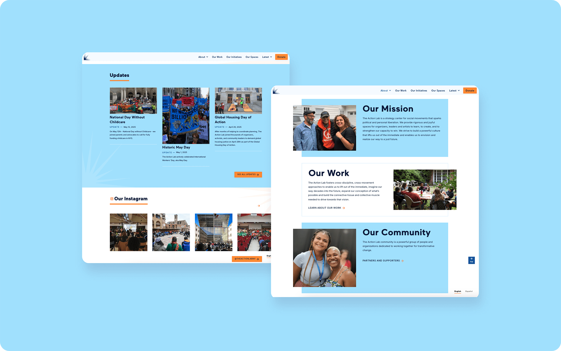
The Problem
Problem Statement
The Action Lab's existing website wasn’t reflecting the organization's dynamic nature and commitment to arts and culture. The Wordpress implementation was difficult to maintain, visually underwhelming, and structurally misaligned with their evolving organizational focus. The Action Lab needed an easy-to-update site that properly communicated their message. And visitors to the site needed an online experience that was engaging, energizing, and accessible.
User Story: The Site Visitor
“As a community-minded progressive, I want to see action that fosters conversation and progress so I feel confident that my involvement can help me understand how to build a better world.”
User Story: The Client
“As a staff member at The Action Lab, I want an intuitive platform to showcase our diverse programming and easily update content so that our community stays informed and engaged with our evolving initiatives.”
How Might We...
… transform The Action Lab's digital presence to better represent their community work?
… build a website that staff can easily maintain and update?
… create an online experience that energizes visitors and encourages involvement?
The Context
The Action Lab approached me during a transition period. They were revamping their mission around three "core commitments"—learn, strengthen, and create—and reorganizing their programming within a new initiative-based structure.
Their WordPress site hindered their ability to communicate their evolving mission and engage their audience. They needed intuitive navigation and a platform staff could easily update with events and community actions.
Before:

Key requirements:
- Embody their energetic, joyful, creative spirit rooted in arts and culture
- Convey their impact to potential participants and donors
- Fully functional Spanish-language version for New York and Puerto Rico communities
- Easy content management without technical assistance
Challenges
Organizational Structure in Flux
The Action Lab was actively redefining their organizational structure during the redesign process, redefining both their initiatives and broader conceptual categories. This required a flexible information architecture that could evolve alongside their thinking.
Content Management Complexity
Staff needed to frequently update events, news, and program information without technical assistance. The existing system was cumbersome and often required developer intervention for even minor changes.
Content Density Management
The Action Lab team, being highly academic, produced extensive written content for the website. Finding ways to make this content accessible and engaging without overwhelming visitors became a critical challenge, as research consistently shows users rarely read extensive text online.
Visual Identity Balance
They wanted a vibrant, culture-focused aesthetic while maintaining professionalism and clarity for their diverse audience of community members, potential funders, and partner organizations.
My Approach
Discovery and Audit
I began with a comprehensive audit of the existing website, identifying structural issues, content gaps, and opportunities for improvement. Key findings included:
- Confusing navigation with redundant menus
- Lack of calls to action beyond to “read more”
- Lack of clarity when calls to action did exist, particularly for donations
- Slow load times due to unoptimized images
- Visual identity that didn't reflect their community work
- Limited visibility for upcoming events
I conducted stakeholder interviews with organization leadership to understand their vision for the organization and specific needs for the website. This helped clarify their new organizational structure and how it should be represented digitally.
Information Architecture
Based on the client’s input and my audit, I developed a streamlined sitemap that reorganized content around their new guiding principles and provide intuitive navigation to users seeking specific programs or events. This involved clearly defining the hierarchy of information and planning how different content types would be interconnected. I also provided guidance on the type of copy and assets needed for each section.
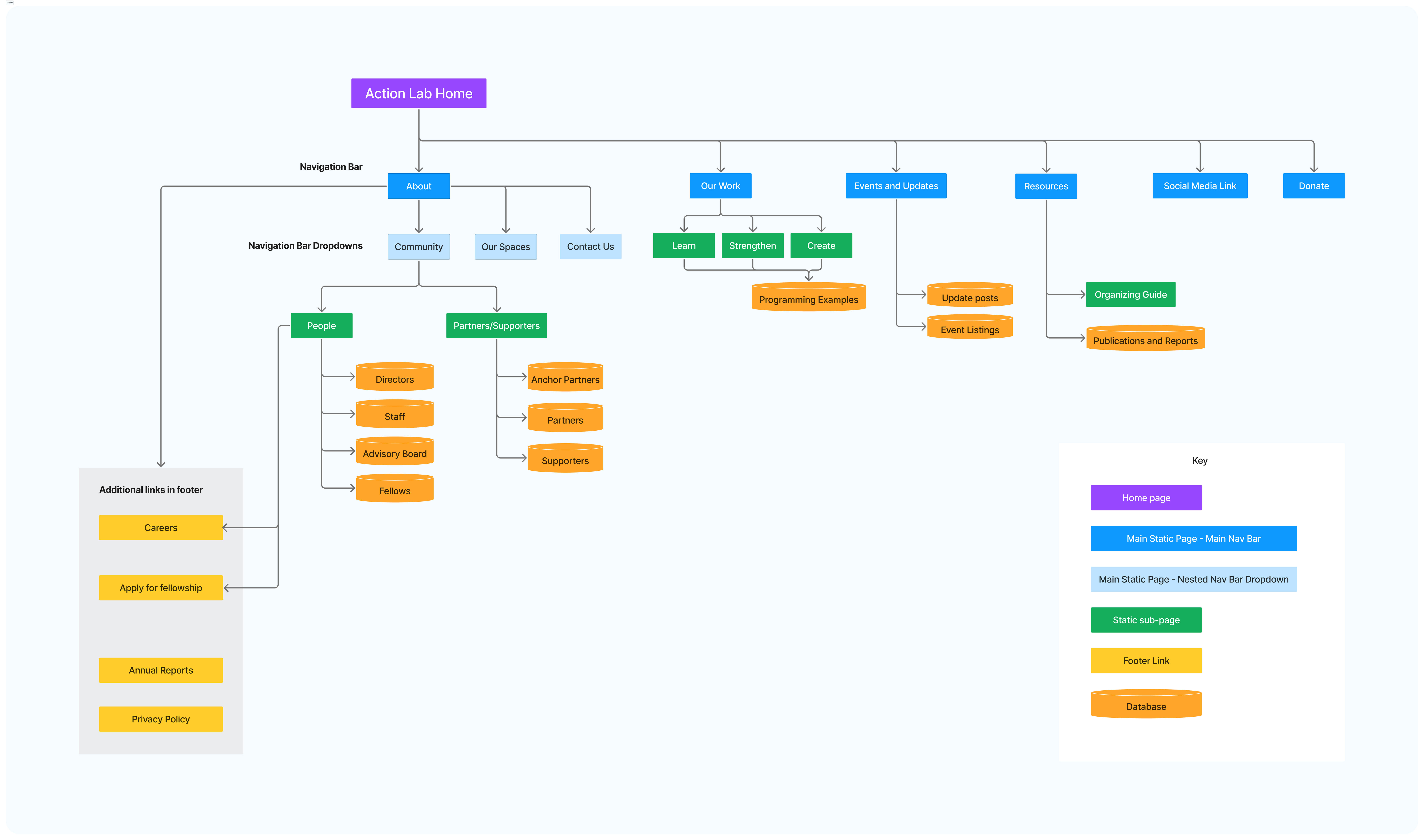
The new structure prioritized:
- Clear pathways to upcoming events and actions
- Coherent organization of programming within the new conceptual framework
- Simplified navigation with consistent patterns throughout the site
- Prominent donation and engagement opportunities
Wireframing
I created wireframes for key pages to establish content hierarchy and functional requirements before diving into visual design. This step was crucial for aligning stakeholder expectations and ensuring the structure would support all necessary content types.
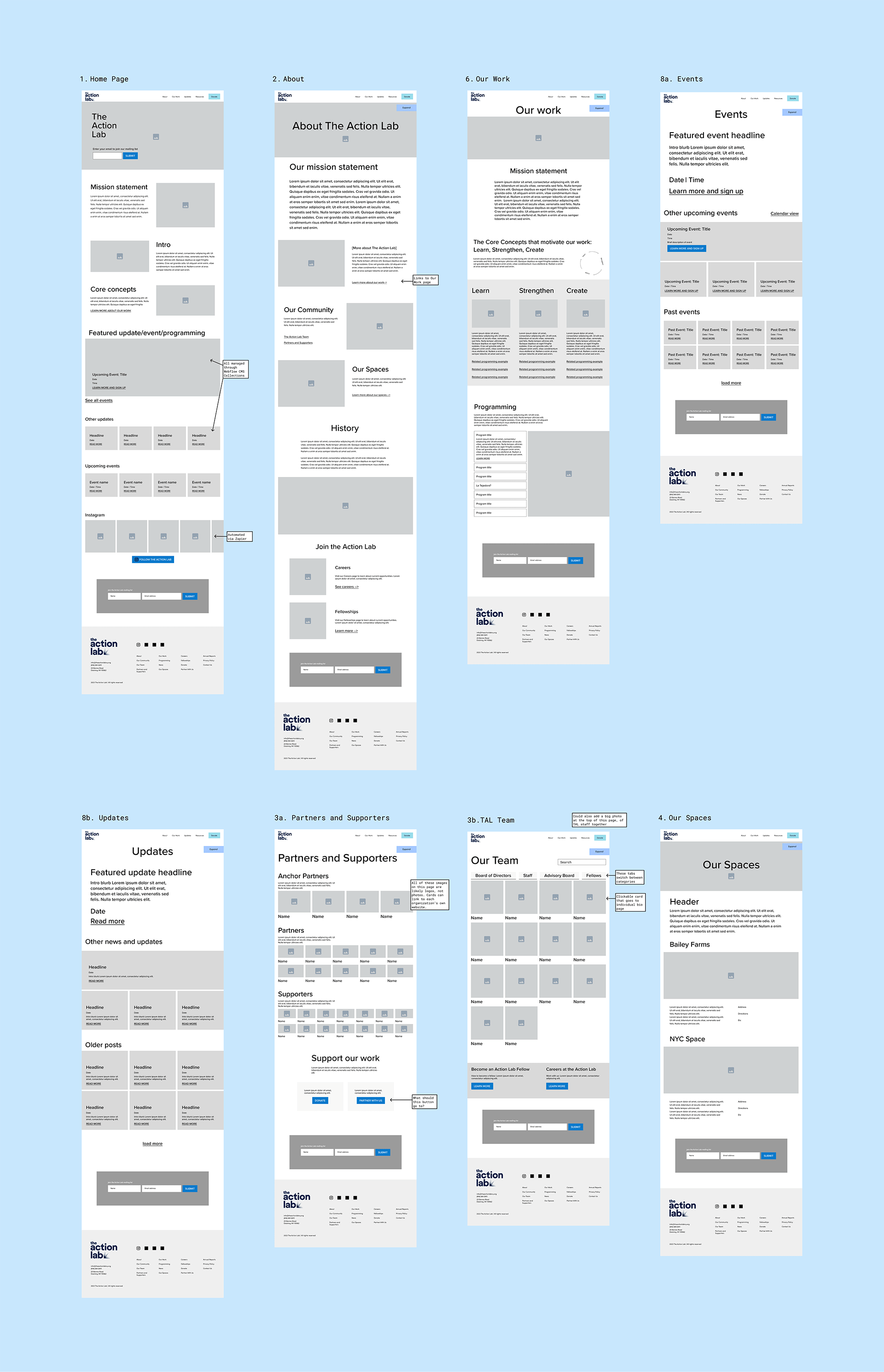
The wireframes addressed specific issues from the audit:
- Homepage with prominent upcoming events and clear mission statement
- Streamlined "About" section
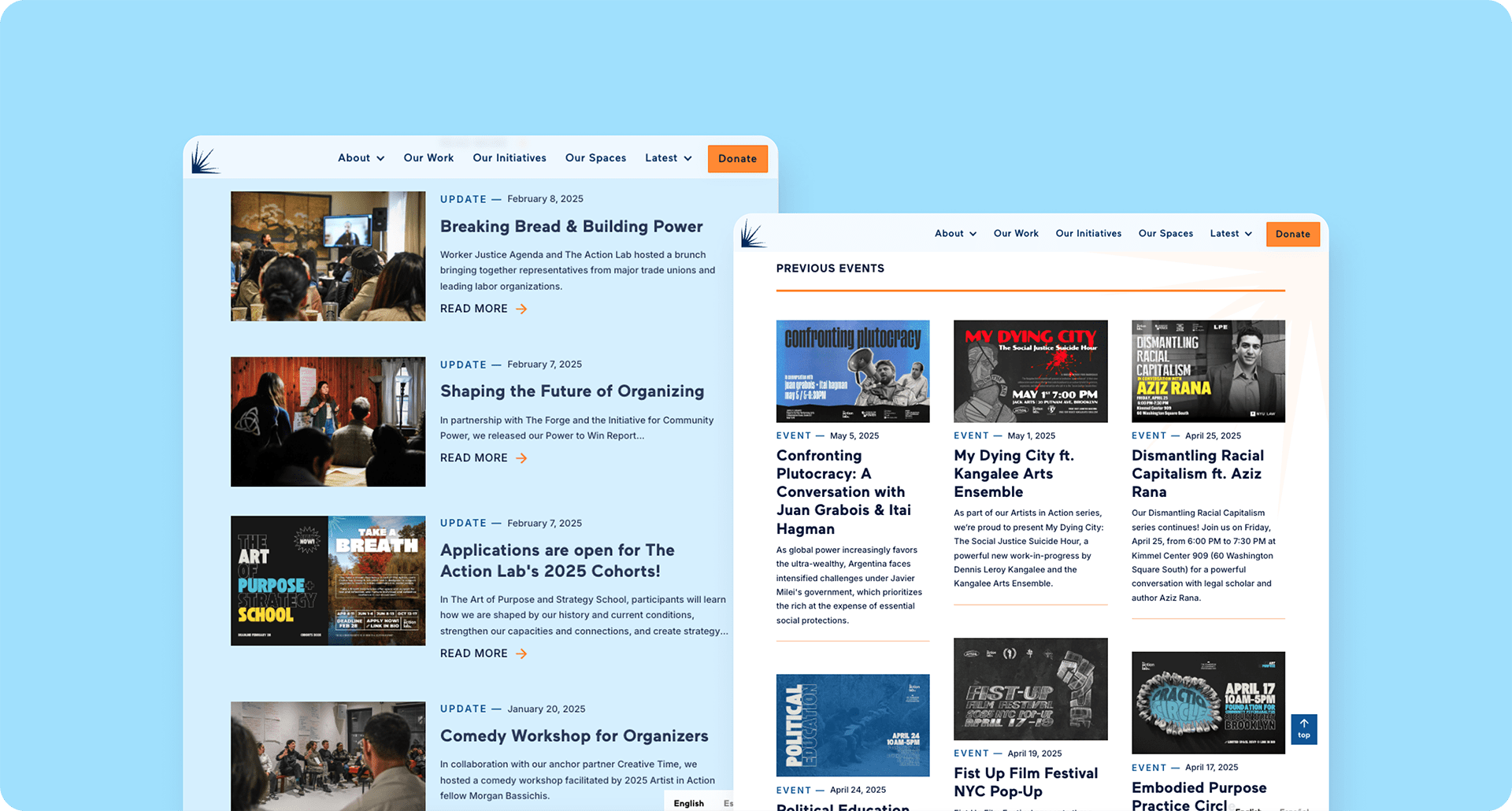
- Clear event listings distinguishing upcoming and past events
- Coherent presentation of their new organizational framework
Visual Design
To address The Action Lab's desire for a more vibrant, arts-focused aesthetic, I created mood boards exploring different visual directions while retaining elements of their existing brand identity (particularly their blue color palette and existing font and logo).
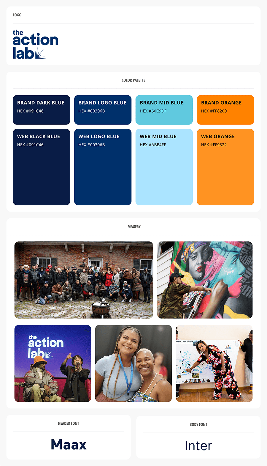
The final direction incorporated:
- Bold, energetic typography
- Vibrant color accents complementing their existing blue and orange brand colors
- Abundant whitespace for readability and focus
- Dynamic layouts with subtle animations to convey action
- Prominent use of photography showing community engagement
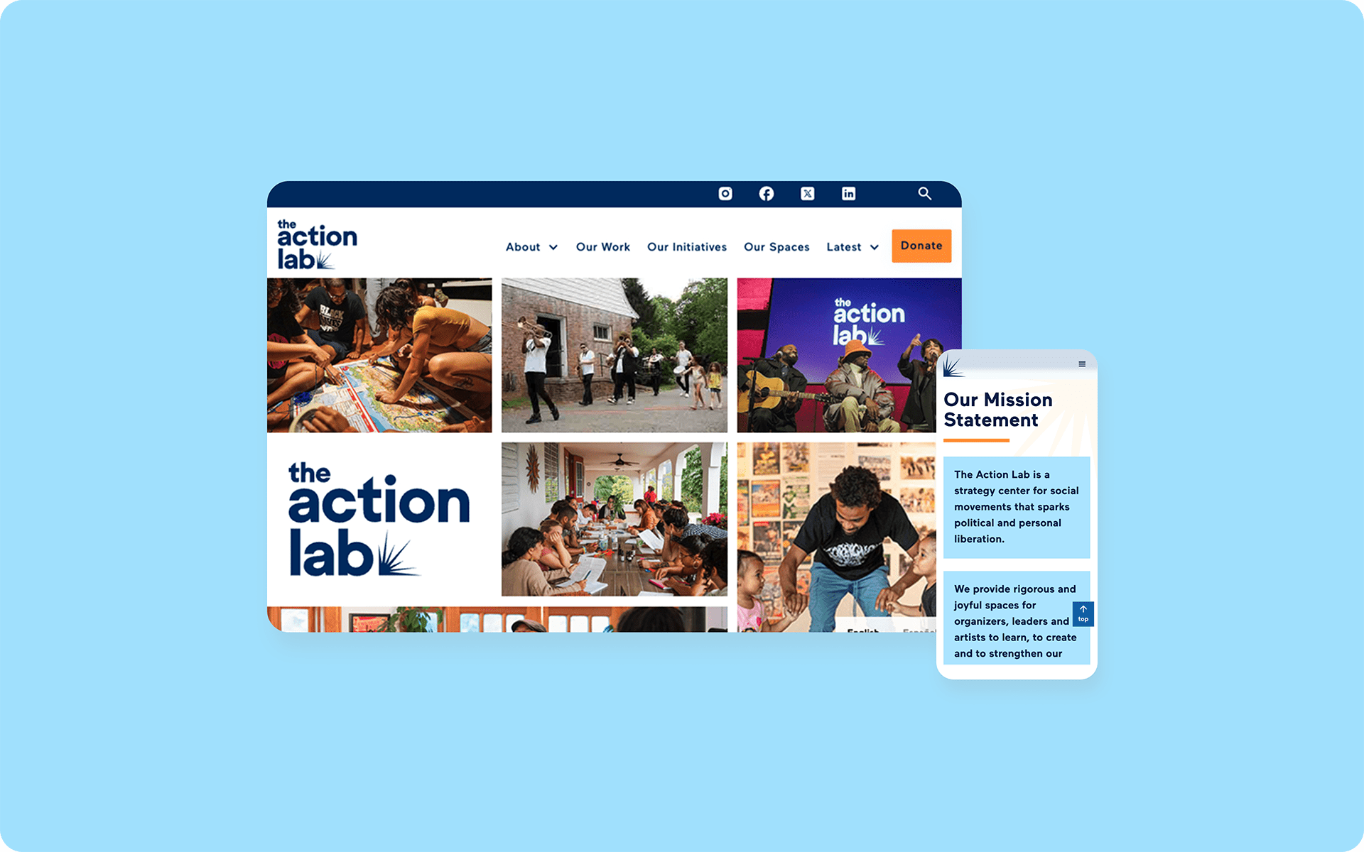
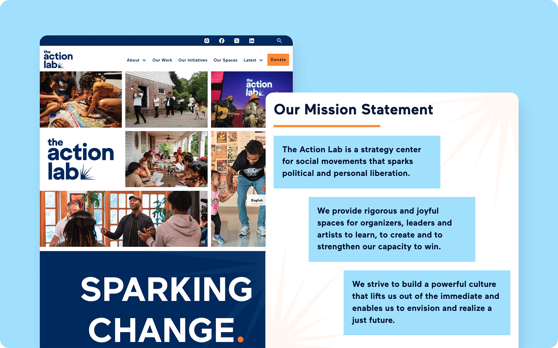
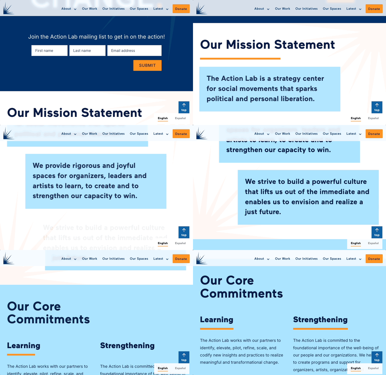
- “Highlight boxes” to visually break up long text passages

Development in Webflow
I built the entire site in Webflow, focusing on:
- Creating a robust CMS structure for events, updates, and initiatives
- Developing custom components that staff could easily reuse
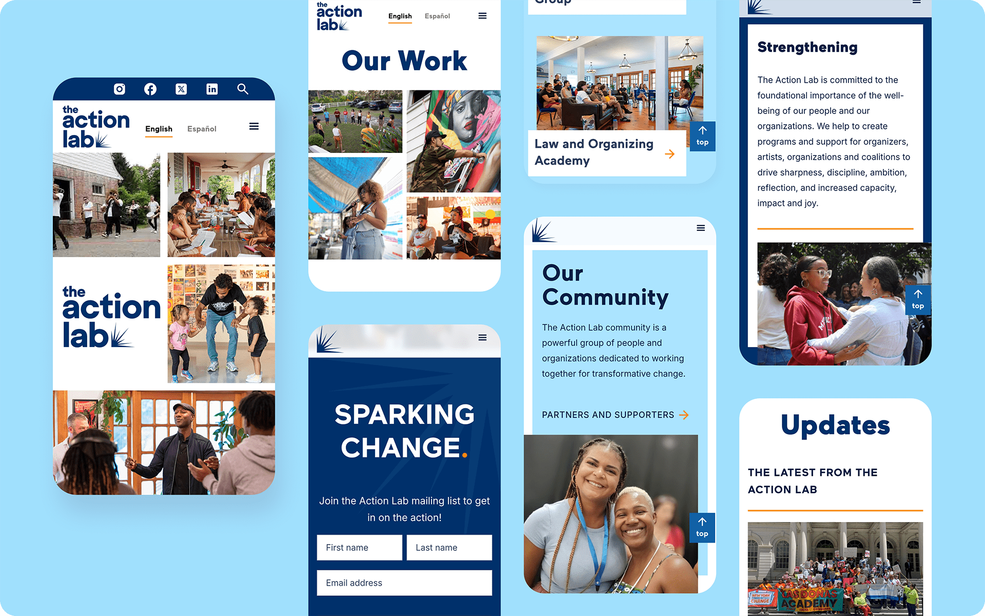
- Ensuring responsive design across all device sizes
- Implementing careful performance optimization for fast load times
- Building a foundation for the various integrations needed
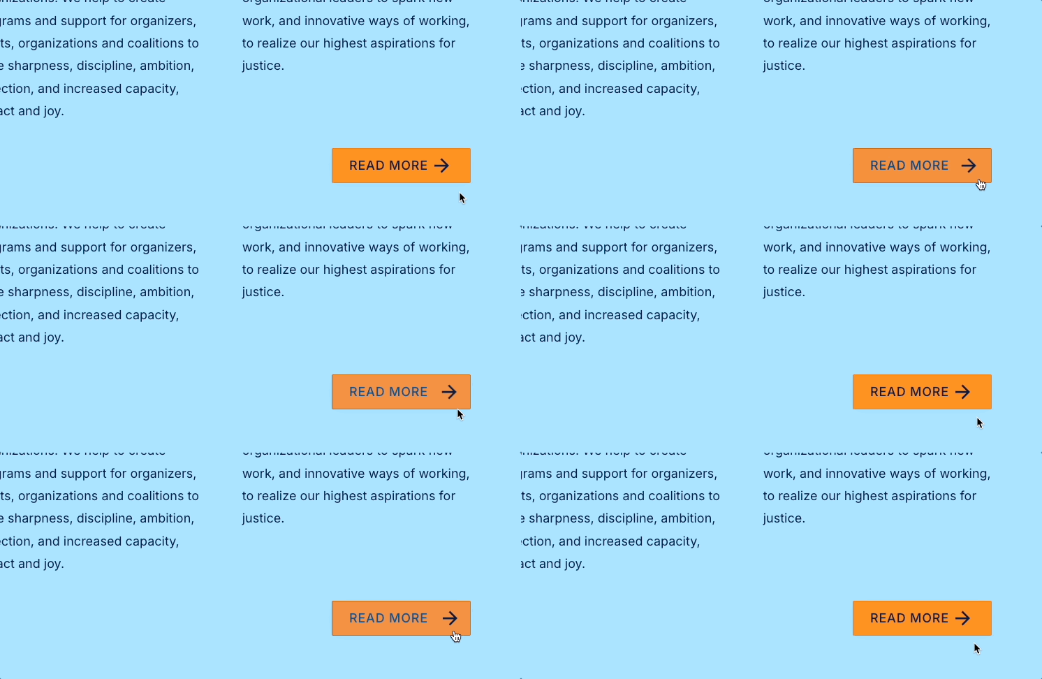
- Subtle animated elements using forward movement to reinforce the theme of action and progress

Integrations and Automations
To create a truly functional ecosystem that would support The Action Lab's operations, I implemented several key integrations:
- Weglot for Translation Management: Configured for human-reviewed Spanish translations that maintained cultural sensitivity and nuance
- Airtable as a CRM: Set up Zapier automations to capture form submissions with detailed tracking of sources, timestamps, and engagement metrics
- Mailchimp Integration: Created workflows to sync Airtable contacts with Mailchimp and configured automated confirmation emails for various signup types
- Analytics Implementation: Implemented Google Analytics with custom event tracking to measure user engagement
These integrations transformed the website from a standalone platform into a central hub for The Action Lab's digital ecosystem, streamlining their operations and improving their ability to engage with their community.
Training and Handoff
The final phase included comprehensive training sessions for staff members who would maintain the site. I created documentation—both PDFs and video walkthroughs—covering:
- Content management workflows
- Image optimization best practices
- Translation management
- Integration maintenance
- Common troubleshooting scenarios
The Outcome
The redesigned Action Lab website successfully transformed their digital presence from a static information repository to a dynamic platform that truly represents their community-focused mission.
Key achievements include:
- A visually engaging design that showcases the organization's commitment to arts, culture, and community action
- Intuitive navigation structured around their new organizational framework
- Fully bilingual functionality that maintains message integrity across languages
- Simplified content management that empowers staff to keep information current
- Seamless integration with their existing data management tools
- Improved performance and mobile responsiveness
- Clear pathways to engagement and donation
Google Analytics data reveals strong content engagement metrics. The "About" and "Our Work" pages show lengthly user engagement times despite their text-heavy nature. This indicates that our "highlight box" strategy—breaking up text and adding visual interest—has successfully encouraged visitors to read the content rather than quickly abandoning these pages.
In addition to these positive engagement metrics, initial qualitative feedback from staff and community members has been overwhelmingly positive. They particularly appreciate the site's improved clarity, visual energy, and ease of use.
Looking Forward
I established a monthly maintenance partnership with The Action Lab to ensure their digital presence continues to evolve and perform optimally. This ongoing relationship delivers significant value:
- Sustained Site Performance: Proactive measures to maintain optimal speed, responsiveness across devices, and functionality
- Enhanced SEO: Regular technical audits to improve search engine visibility
- Data System Integrity: Monthly checks of all integrations to ensure seamless data flow, catch potential errors before they impact operations, and maintain the reliability of automated processes.
- Continuous Improvement through Analytics: Ongoing monitoring of website performance via Google Analytics to identify areas for potential optimization
The Action Lab continues to evolve, and their new website provides a flexible foundation that can grow with them—ensuring their digital presence will remain as dynamic as their community work.
More Case Studies

A Scalable Site for a Growing Business
