Creating a Searchable Database of Care Providers

The Birth and Early Parenting Resource Directory is a website that helps new and expecting parents find perinatal care providers. It offers a centralized, searchable database with filtering options based on criteria identified through research, making it easier for parents to connect with the right providers.
Overview
UX Designer
User research | Design | Usability testing
Additionally assisted with:
Hiring | Securing grants | Project management
Nurture RVA
A Richmond, VA-based organization supporting childbearing people through pregnancy, birth, and early parenting. Nurture provides accessible, affordable resources to promote physical and emotional well-being during this critical time.
- Organization leader/project manager: Leslie Lytle
- Back-end developer: Bob Nearents
- Front-end developer: Amer Kulovic
Figma | Figjam | UserTesting (OneWorld grant) | Asana | Catchafire
Introduction
The Problem
Parents seeking perinatal care beyond standard medical providers often struggle with an inefficient, overwhelming search process. Unlike fields with centralized directories (e.g., ZocDoc, Psychology Today), perinatal care lacks an equivalent resource, leaving parents to:
- Rely on broad Google searches and scattered sources
- Sift through excessive, often conflicting information
- Contact providers individually to gather crucial details
This fragmented process is stressful, time-consuming, and inefficient at a time when parents already have limited bandwidth.
The Solution

My goal was to provide parents with a streamlined, searchable database of perinatal care providers to help them make quick, informed decisions. Most parents prefer to have an initial phone or video call before committing to a provider, so the directory is designed to minimize the number of these calls needed, making the process more efficient and less overwhelming.
I designed an MVP directory that:
- Prioritizes ease of use – Recognizing that overwhelmed parents don’t have time for complex navigation.
- Balances comprehensiveness with simplicity – Offering robust search and filtering options without overwhelming users.
- Is accessible on any device – Built as a website-based database, not restricted to an operating system
- Doesn’t require login – to save time and effort
- Focuses on three care categories – doulas, lactation support, and perinatal mental health, identified as the most important based on Nurture’s prior research.
- Offers multiple ways to search – helps parents search even if they’re not sure where to start


Research & Discovery
Who is the user?
Our users are new and expecting parents from diverse backgrounds, very often dealing with situational disabilities (e.g., holding a baby in one arm while searching on their phone). The MVP focuses on Richmond, VA-based parents due to Nurture’s local reach.

Understanding the User Journey
Nurture had already conducted in-depth research on care providers that were available in the Richmond area, and what types of care local parents felt were the most crucial to them. I expanded on this research by interviewing parents to understand what their process of finding care actually looked like.
To access a more diverse group of participants, I applied for and helped secure a UserTesting OneWorld grant, giving us access to UserTesting’s platform and participant pool.
My research goals were to understand how parents search for perinatal care, where the process breaks down, and what information they need to decide whether to contact or hire a provider.

What I heard:
There's a lot of information out there, so it's kind of hard to kind of sift through that and try to figure out what decision I should make.
I’m sleepy, I’m busy, I don’t know what I’m gonna need.
It's terrifying enough that you're bringing a human into the world, it shouldn't be hard to search for or find information to help with your pregnancy, during your pregnancy, and after your pregnancy.
I Google and just basically poke around. I don’t feel like I’m amazing at that. I do it until I get frustrated.
There's not a lot of resources available. You have to just use google, roll the dice, and hope it comes out good.
There’s a big disconnect between OB and the things you need. You would think the OBs would have a list of them and they don’t.
I feel like I'm in a race against time to secure providers.
Key insights
Goal: Quickly narrow down experienced, affordable, and available providers for pregnancy, birth, or early parenting support.
Frustrations: Busy, overwhelmed, and often on a deadline, parents need help but lack a quick way to find and compare relevant providers. The necessary information isn’t all in one place.

From my research, a few critical insights emerged:
- Fragmented provider networks: OBs and other medical professionals often don’t provide comprehensive referral lists.
- Google is the primary starting point, but parents must visit multiple sites and manually track notes.
- Parents don’t always know what care they need: They may start searching for one provider type and realize later they need something different.
- Trust is essential: Online information can be confusing or misleading, making parents hesitant.
- Top decision factors: Experience level, cost/insurance, and availability.
- Finding the right fit matters: Beyond credentials, parents seek providers who align with their values and personality.
Pregnancy, birth, and parenting can be difficult, scary, and full of unknowns. Parents are often busy and feel stretched thin. They want to find care, but don’t have a good and efficient way to search for it. The search process itself can take a lot of time and add to parents’ stress. Parents know they need to find care fast - the baby won’t wait for them!
User Persona: Meet Gabrielle

I’m supposed to be reveling in baby bliss but I’m just hitting a wall. Looking for help takes up even more of my energy reserves.
Age: 37 | Occupation: Product Manager | Family: Husband, toddler (3), newborn twins (2 months)
Background & Challenges
Gabrielle, a highly organized professional and mother of three, is exhausted after the premature birth of her twins. While she received some lactation support in the hospital, she now needs help with sleep training and postpartum anxiety—but doesn’t know where to start. She’s spending too much time researching providers, comparing options, and making calls, all while managing three kids.
Goals
- Find a sleep specialist to help her twins sleep through the night.
- Get trustworthy, in-home support.
- Address postpartum anxiety.
- Reduce time spent researching.
Pain Points
- Overwhelmed by fragmented information and lack of clear guidance.
- Exhaustion from nighttime wake-ups affects her care for her toddler.
- Struggles to find trusted recommendations or even define the services she needs.
Current Search Process
Google searches | Agency directories | Local mom forums | Spreadsheets | Phone calls
Needs & Opportunities
Gabrielle needs a streamlined way to find, vet, and track care providers efficiently—so she can focus on getting the support and rest she needs.
User statement:
As an overwhelmed mom of a toddler and newborn twins, I need a trustworthy, all-in-one list of care providers so I can quickly narrow down options to find the best fit for my needs.
The User Journey

Opportunity: How can Nurture help Gabrielle?
Defining the Problem
Nurture had already identified that parents lacked a centralized, reliable way to find care providers. To create a product that actually solved the right problems, we used my research to pinpoint the key challenges that parents like Gabrielle face:
- Online searches overwhelm parents with too many results to sift through and no quick way to filter them.
- Finding enough relevant details to make a decision requires checking many different resources.
- Parents are tired, emotionally stretched, and on a tight timeline.
- Without knowing the full range of available care options, parents often learn as they go, and waste time searching for the wrong types of care.
Finding the solution
Gabrielle needs a centralized, filterable database with multiple entry points and comprehensive provider details in a single view, reducing extra research and helping her move efficiently toward a decision. She needs to be given as much information as possible without overwhelming her, and the ability to filter down that information.
We ideated as a team to discuss various solutions, and worked with Nurture leadership to assess the feasibility of these solutions. Our project funding came from grant money, so we need to be mindful of the cost of any features we implemented. The MVP needed to be impactful but feasible, to encourage further support.
We prioritized value propositions based on 1. benefit to parents and 2. feasibility for an MVP.
Value propositions
- Centralized, trustworthy provider directory with essential details (certifications, insurance, availability, pricing)
- Simple, powerful search and filtering to quickly find the right fit
- Clear, transparent pricing and insurance info upfront
- Bookmarking tool to save, track, and compare providers
- Shortlisted, high-quality options—no need to sift through endless listings
- Detailed bios & photos to help assess personality and values
- Up-to-date availability (who’s accepting new clients now)
- Trusted educational content on care options, what to expect, and how to decide
- No login required to browse, search, and save providers

Design Process
Understanding that clarity and efficiency were top priorities, I developed a structured navigation system:
- A homepage that immediately communicates the directory’s purpose and key benefits.
- A “Learn More” page, separate from the main search flow, where parents could find additional resources if they chose
- Categorized provider listings so parents can quickly identify relevant services.
- An intuitive filtering system allowing users to refine searches by service type, payment accepted, credentials, and other important details.
User flow and Wireframing
For this phase of the project, I focused on the core user flow: a parent or expecting parent searching for a care provider.
I began by wireframing key screens and interactions, initially structuring the homepage as informational, with a separate “Find Care” page where users could start their search. From there, they could choose to browse all providers or select one of three care categories—doulas, lactation support providers, or perinatal mental health care providers. Selecting a category would take them to a pre-filtered directory with an informational header explaining that type of care.

Early testing immediately revealed that this approach created unnecessary steps. Most users wanted to start searching right away, making the separate “Find Care” page redundant. We streamlined the homepage to allow immediate search access.
We also found that category-specific headers above the directory listings were taking up valuable space and introducing usability issues. Would the header need to update dynamically as users applied other filters? How would we handle providers who fit multiple categories, like doulas who also offer lactation support?
To simplify the experience, we moved the category descriptions to the separate “Learn More” page and kept the category buttons as simple filters. This removed extra clicks and kept the directory clean and focused on results.


Visual Design Principles
The visual and interaction design focused on trust and familiarity, inclusivity, and reducing cognitive overload:
- Brand alignment: Used Nurture RVA’s existing identity for trust and familiarity; adjusted colors for accessible contrast ratios
- Calm, gentle aesthetic: Soft colors, negative space, welcoming imagery
- Inclusive representation: Showcased diverse families
- Accessible typography: Easy readability for tired parents scanning information
- Clear call-to-action buttons guiding users directly to key resources.


Testing and Iteration
Once the prototype was developed, I conducted usability tests with a group of parents.
What we wanted to learn:
- Do users understand how to navigate the Directory?
- Are the filtering options useful and comprehensive?
- Do users find the information trustworthy and complete?
- Are visual elements supporting usability?
- What insights can we gain from the ways in which users navigate through the app?
Prototype test round 1
Nurture leadership requested that we test our prototype with parents in their own network. Our timing presented a challenge, as we tried to conduct this testing during back-to-school time, and got limited and rushed participation from very few parents. (Important lesson learned: consider the user’s broader life schedule!) Despite low participation, this test uncovered two key UI issues that needed to be addressed.
First, the bookmark icon in the navigation created confusion—users on profile pages expected it to bookmark the current provider, not navigate to the bookmarks page. Removing this icon and moving the bookmarks page link to the hamburger menu solved this problem.
Second, users missed the bookmark icons next to each provider in the list view. Adding a simple outline dramatically improved their visibility.


In the second round of usability testing described below, this update proved successful: participants had no issues with bookmarking.
Prototype test round 2
For the second test, I used the UserTesting participant network to gather richer feedback from six parents.
Testing insights:
- Overall, the directory received positive feedback from the majority of participants, with ease of navigation and thorough information being highlighted as strengths.
- Participants appreciated the ability to search and filter providers by payment options, but expressed a strong desire for reviews and more personalized filters such as location, availability, race/ethnicity served, and specific issues worked with.
- The visual styling received mostly good feedback, with participants expressing particular enthusiasm for photos showing diverse races and family structures.
- The length and placement of written content were points of contention, with some participants feeling overwhelmed by long passages of text placed above actionable information.
- Profile photos, personal bio sections, and filter options were generally well-received, contributing to a positive user experience for most participants.
- The ability to bookmark providers and navigate the site easily were mentioned positively by all participants, indicating successful usability and functionality.
Updating the design
Based on the usability testing insights, I implemented several updates that were immediately feasible and likely to improve clarity, scannability, and task completion.
- Streamlined homepage content: Reduced text and prioritized CTAs to guide users more quickly to their next steps. Added direct buttons for categories, repositioned the search bar, and moved the search by payment option higher up.

- Reordered profile info: Moved key details (payment type, certification, and years of experience) to the top of the profile page for better visibility. Broke up two lengthy paragraphs (overview of services, personal bio) into separate profile sections to avoid overwhelming the user with consecutive large blocks of text.
- Concealed lengthy text in profile: Added "read more" buttons to hide extended text, particularly for mobile users who prefer a quicker, less cluttered browsing experience.

Some user requests, such as reviews and more detailed availability filters, pointed to larger product opportunities beyond the immediate MVP updates. Rather than treating them as quick fixes, I flagged them for a future phase that would have required additional research, provider-side planning, and leadership alignment.
Outcome
What the Design Solved
- Streamlined search process: By eliminating account sign-ups and pre-search quizzes, the design reduced friction and allowed users to begin searching immediately. Even before design updates, 80% of test participants appreciated that they could quickly begin their search without providing extra information.
- Flexible search entry points: Multiple search pathways supported different user preferences, from broad filters to specific criteria. In testing, most users accessed at least two different entry points, and 80% expressed satisfaction with the variety of options.
- Personal, trust-building profiles: Photos, bios, credentials, payment details, and experience helped users assess fit beyond basic contact information. 80% of test participants responded positively to this emphasis on personal connection.
- Support for comparison: Bookmarking gave users a way to save and return to providers, reflecting the reality that care decisions happen over time.
- Centralized, shareable resource: The directory was designed to support parents as well as OBs, hospitals, providers, and partner organizations looking for a reliable referral resource. Many partners were eager to list providers and contribute care categories, demonstrating strong interest in this type of directory.


What Happened Next
As the directory was nearing launch, Nurture RVA went through a leadership transition and the board ultimately decided to sunset the organization. The directory project ended before it could be released publicly.
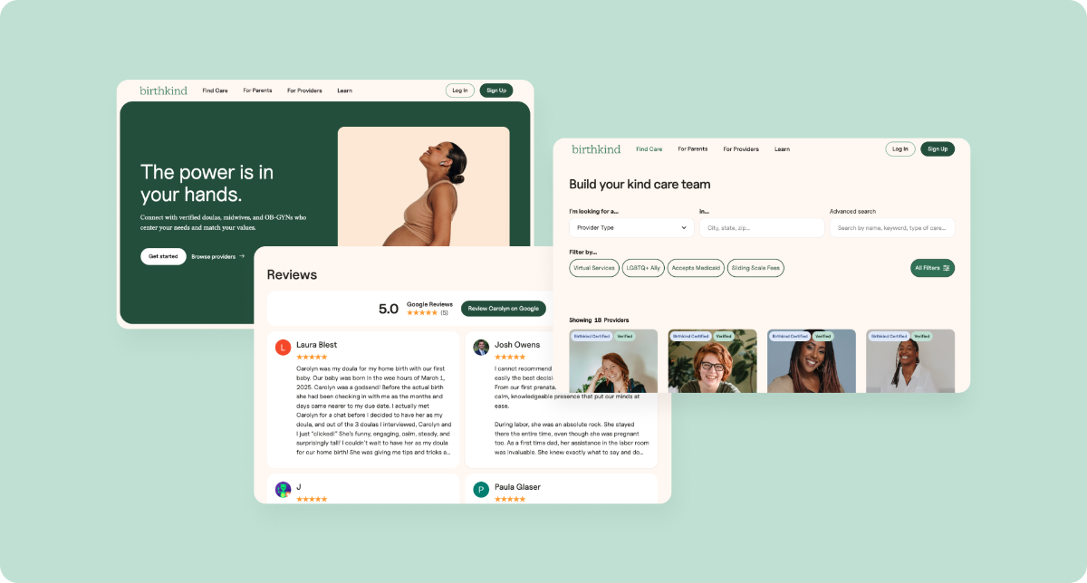
Although the product was not completed, the work became directly useful in my next project in the same problem space. I subsequently joined Birthkind, a separate pregnancy and birth platform with a similar goal: helping families find supportive, values-aligned care providers.
I was brought onto Birthkind in large part because of the deep context I already had from the Nurture project. I had researched how parents search for care, where the existing process breaks down, and what information helps them feel confident reaching out to a provider. I applied those insights directly as I helped shape Birthkind’s provider directory, profile structure, care categories, trust signals, and broader platform experience.
Birthkind expanded the opportunity beyond a traditional directory. In addition to helping families discover providers, the platform supports a paid provider membership model with business management, booking support, and other benefits for birth and early parenting professionals. It also introduces a more active matching layer between families and providers, beginning with human-led matching and moving toward more automated matching over time.
Key Product Learnings
Although Nurture’s directory did not launch, the research and design process gave me a strong foundation in care navigation and provider marketplace problems.
Centralization was the core value.
Parents were already searching across Google, referrals, forums, provider websites, spreadsheets, and phone calls. The opportunity was to bring the most important information into one searchable place.
The product needed to support comparison, not just discovery.
Parents were collecting options, tracking notes, and returning to providers over time. Features like bookmarking helped support the full decision-making process, not just the first search.
Trust needed to be built into the profile experience.
Provider photos, bios, credentials, specialties, payment details, and tone helped users assess fit. This insight later shaped my Birthkind work, where I surfaced Google Reviews directly on provider profiles instead of creating a new review system from scratch.
Search needed multiple clear entry points.
Users approached the directory by care category, payment type, specialty, keyword, and location. Supporting multiple paths helped users who knew what they needed as well as those still narrowing their options.
Reducing cognitive load was essential.
Parents were often searching while tired, busy, or under pressure. Testing pushed the design toward faster access to search, clearer CTAs, shorter homepage content, more scannable profiles, and simpler bookmarking interactions.
Final Thoughts
Nurture’s directory did not launch, but the work became a foundation for my continued product design work in maternal health, care navigation, and provider marketplaces. It also clarified a product principle I carried into later work: the goal was not simply to create a searchable list, but to help parents move from scattered research toward a more confident care decision.

More Case Studies
Designing an Online Grocery Experience for SNAP/EBT Users
