For many SNAP/EBT users, grocery shopping happens under a distinct set of constraints, with fixed budgets and benefits distributed on a set schedule. Shoppers share a need for low prices, predictability, and an experience that clearly understands how SNAP works. Yet many online grocery tools either don’t support EBT at all or treat it as an afterthought. Groupr meets these users' needs with a pickup-based online grocery platform designed specifically for SNAP/EBT shoppers. I led product design for Groupr’s custom web app, focusing on making it easy to browse, plan, and check out confidently within strict regulatory and logistical constraints.
Overview
Product Designer
User research | UX/UI Design | System Design | Regulatory UX | QA
Additionally assisted with:
Hiring | Intern management
Groupr
Founder, Product Manager (advisory), Lead Developer, 3 Development Interns
Figma | Figjam | Zeplin | Jira | Linear | Slack
The Challenge
Create a low-cost e-commerce experience for SNAP users that supports government benefit payments, complies with USDA/FNS requirements, and coordinates real-world fulfillment — all with a lean startup team building a custom system from scratch.
The Solution
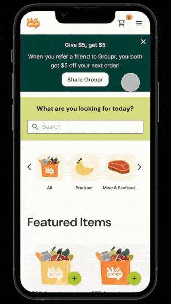
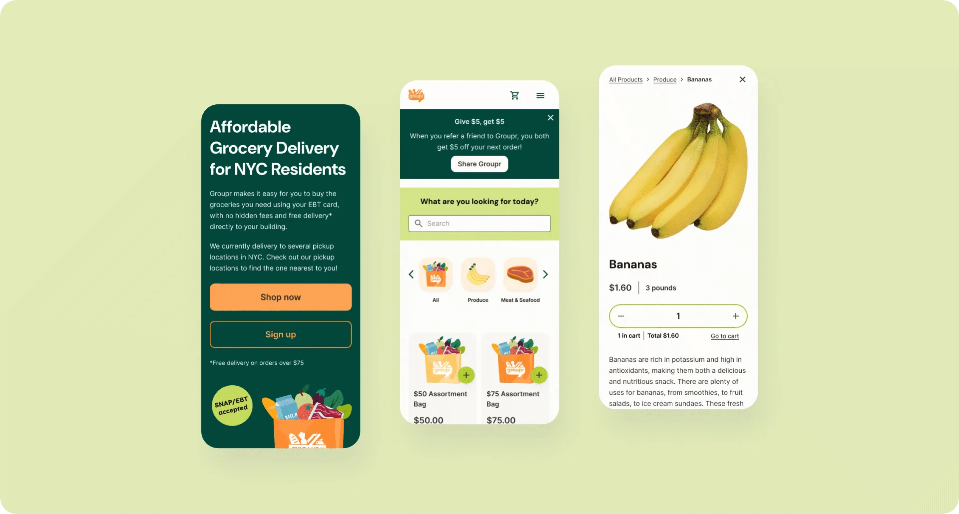
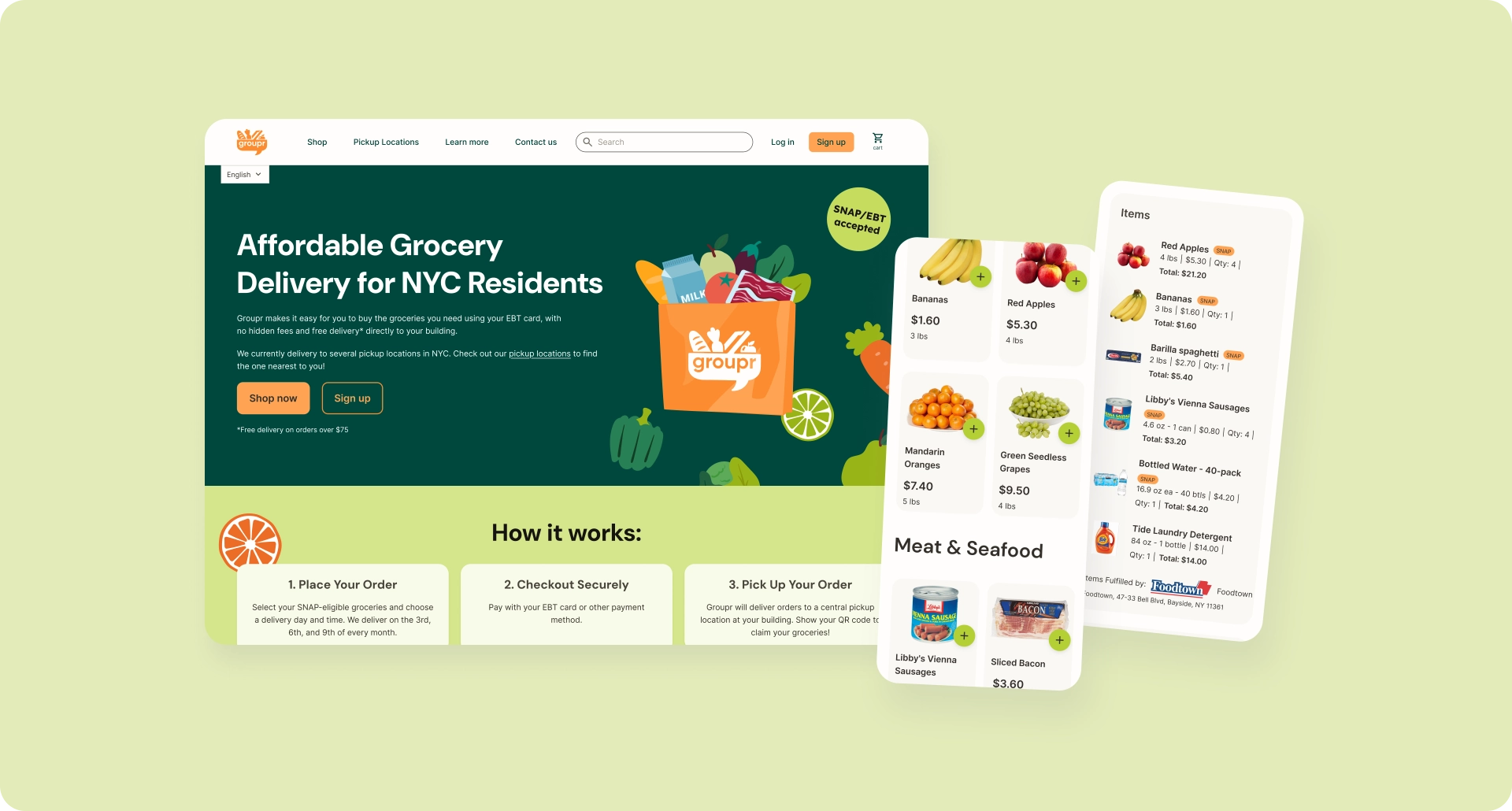
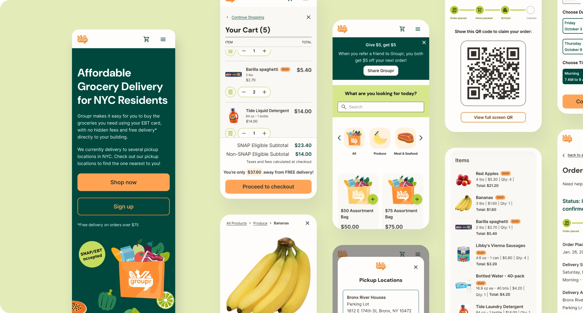
Groupr’s web app is an online grocery store with a familiar basic structure — product catalog, cart, checkout, and order history and status — but with features tailored specifically to a customer base who will largely pay with SNAP EBT benefits. Groupr aims to keep costs low by limiting fulfillment to specific dates and locations — thereby bundling deliveries together — so the checkout process is adapted to include pickup selections, and the order status page includes live updates and a QR code for claiming an order in person.

Understanding the User
I began this project by conducting lean secondary research on SNAP shopping behaviors and user needs, and expanded on this research with in-depth qualitative interviews later on. These interviews surfaced critical insights about trust, predictability, deal-seeking behavior, and community dynamics that directly shaped the core grocery and checkout experience.

What I Learned
What users need most:
- Low prices — more than convenience. Users actively hunt deals, compare prices across stores, and will change habits for savings.
- → Design implication: Features that add cost undermine the core value. Frame constraints like pickup windows as cost-saving, not limiting.
- Predictability. Users value knowing what they can afford, when they can pick up, and how much they’ll pay. Uncertainty creates anxiety.
- → Design implication: Recurring pickup dates and clearly defined windows trade flexibility for confidence.
What breaks trust:
- Fear of EBT scams. Many users are cautious about entering EBT information on unfamiliar platforms due to potential for fraud or misuse.
- → Design implication: Build trust upfront through clear communication, polished design, and secure payment flows.
- Not centering SNAP users. Most platforms treat EBT as an afterthought. Users quickly recognize when an experience wasn’t built for them.
- → Design implication: Use SNAP-specific language, visible eligibility cues, and design that signals “this is for you.”
What increases adoption:
- Community framing. Users expressed strong neighborhood connection and were more open to coordinated systems framed as focused service.
- → Design implication: Reference specific locations and allow users to select their own housing complex.
Defining the Problem
The Constraints:
SNAP Users’ Needs
SNAP shoppers operate under fixed budgets and benefit schedules, making predictability and clarity essential. Because SNAP can only be used for eligible food and beverage items, additional charges like delivery or service fees often fall outside users’ monthly expectations and complicate planning at checkout.
USDA Food and Nutrition Services (FNS) Regulations
Accepting SNAP payments online requires compliance with USDA/FNS rules around eligibility, pricing transparency, receipts, and refunds, all of which needed to be accurately reflected in the user experience.
Fulfillment Logistics
The product had to coordinate real-world fulfillment steps — from packing to pickup — where digital states needed to map cleanly to physical actions.
The Design Question:
How might we create an online grocery experience that supports a low-cost business model while clearly communicating SNAP eligibility, pricing, and fulfillment—so users feel confident, understood, and willing to try something new?
The Design Process
Creating a Visual Direction
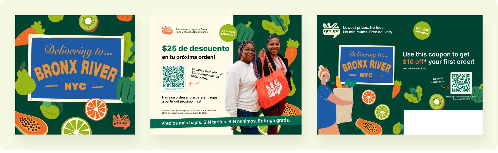
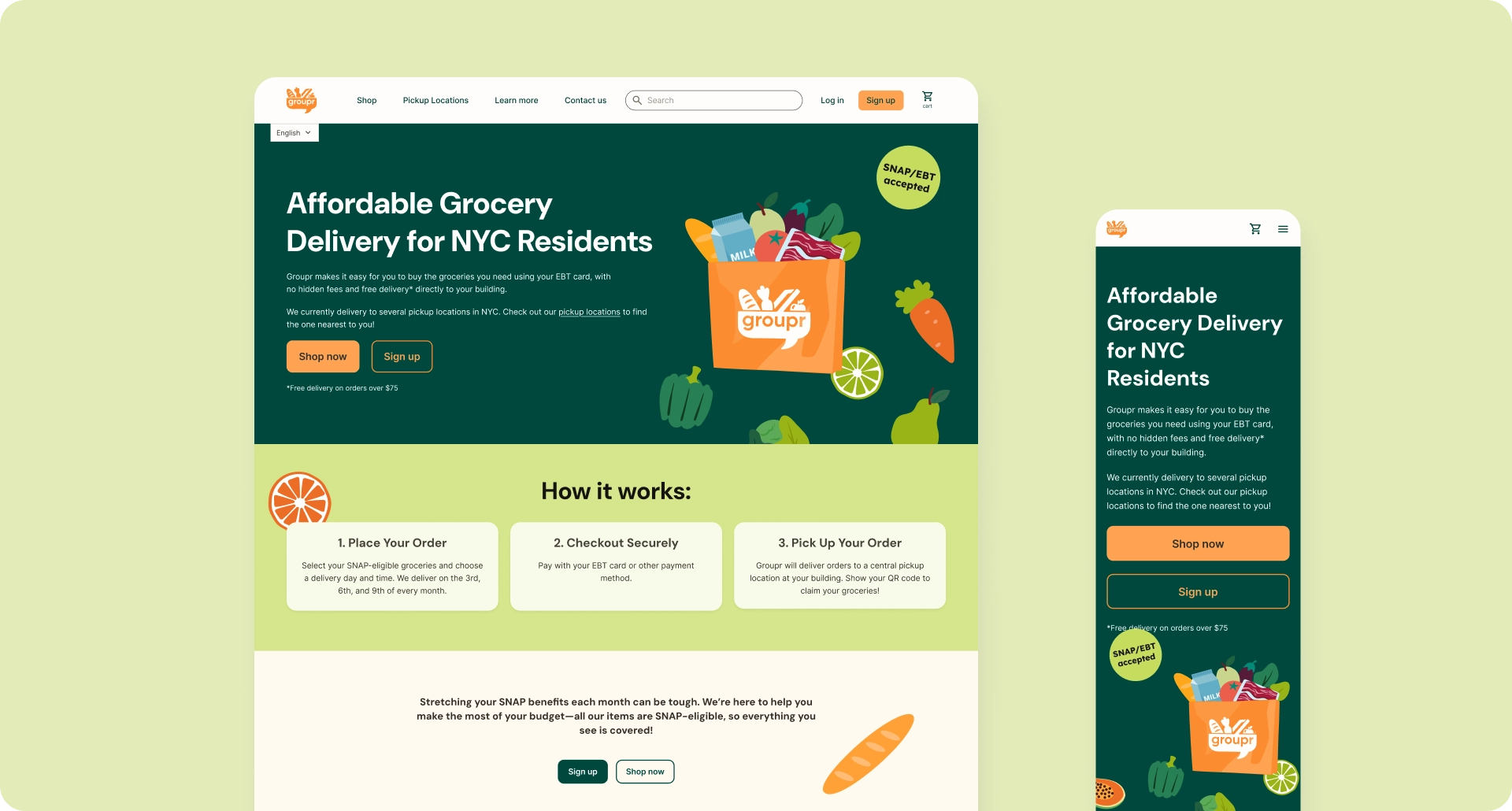
Because early outreach and marketing were happening in parallel to product design, I led a short visual design sprint before moving into deeper UX work. Working closely with Groupr’s founder and testing early styling decisions with residents of the Bronx River Houses (the pilot community), I defined a preliminary visual direction using bright oranges and greens, simple grocery illustrations, and photography featuring real community members.
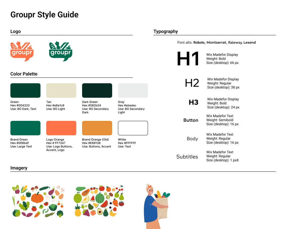
Establishing this visual language early helped the product feel approachable and representative, and streamlined later UI decisions as the system grew more complex.
Building the System Framework
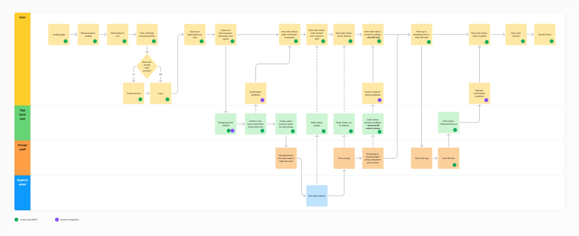
Working closely with the PM, I mapped the entire system across all actors—shoppers, grocery partners, fulfillment staff, delivery drivers, and Groupr admin. We outlined core flows, decision points, and where digital interactions meet irreversible real-world actions (packing, transport, pickup). This created a shared foundation for both design and engineering.
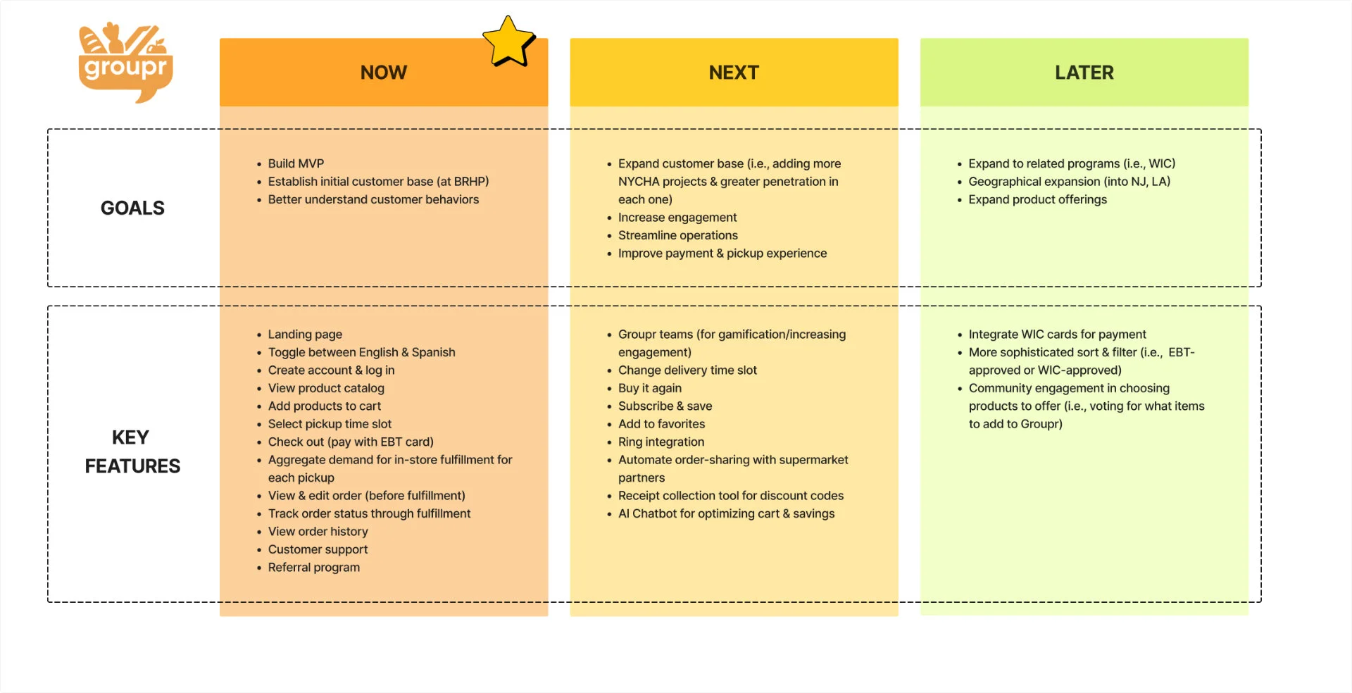
Establishing the MVP Scope
With a lean team and limited bandwidth, it was crucial to distinguish between MVP requirements and future considerations. Working with the PM and founder, I defined exactly what was needed now for the MVP versus later for post-MVP priorities or wish-list features to test in the future. I communicated these requirements carefully with the development team, and adjusted my designs when needed for development feasibility. This let us focus on delivering a stable, trustworthy core experience.
Mocking up the MVP Requirements
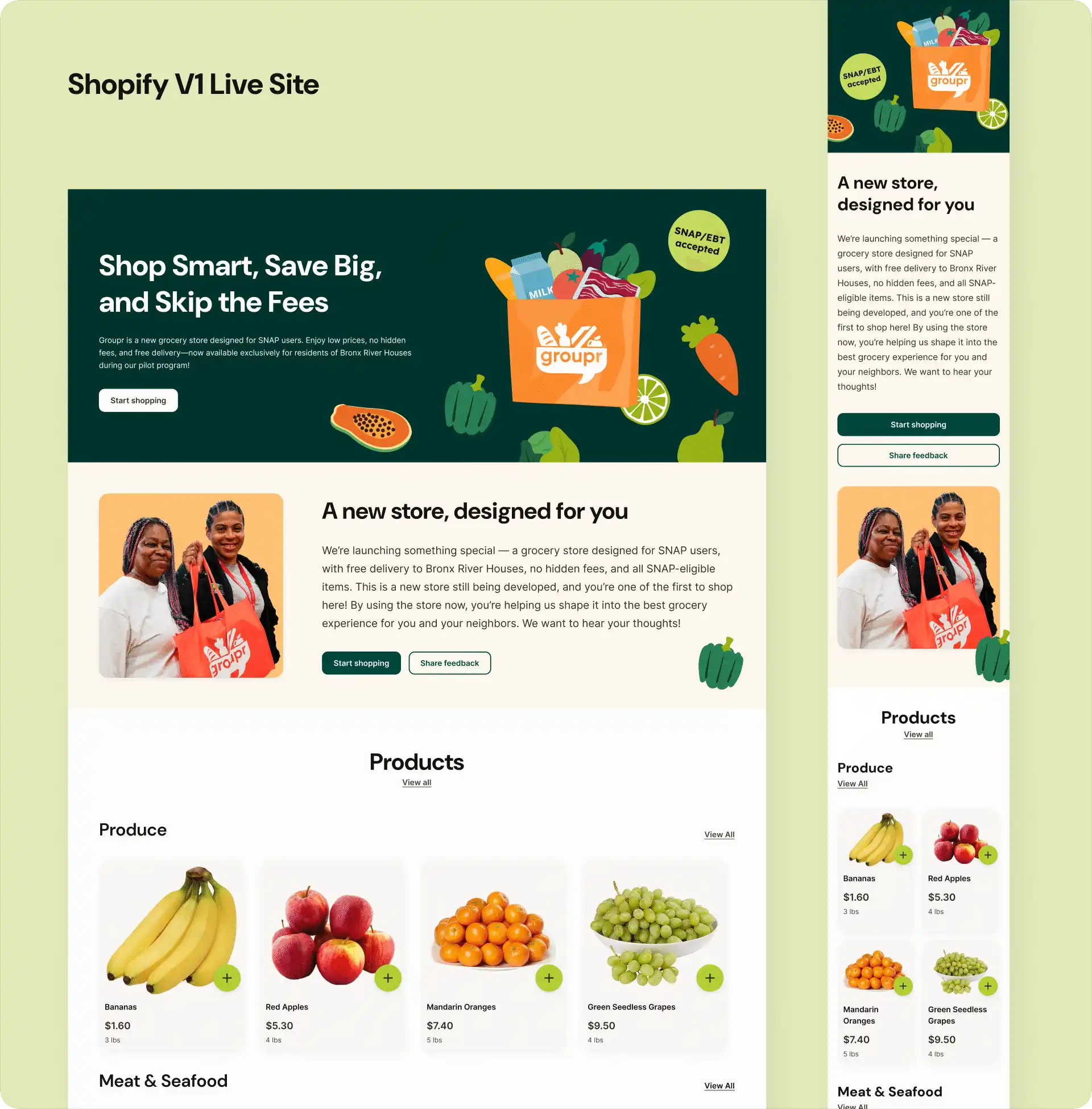
Groupr’s initial plan was to use Shopify to get a shoppable and testable MVP version of the product live as quickly as possible, and transition to a custom build later on. Because Shopify could handle much of the default styling, system UI, error states, and so on, I was able to mock features up quickly, focusing on base states and the broad strokes of what elements each of our features needed to function.
Recommending a Strategic Pivot
As development progressed, it became clear that Shopify was poorly suited to the product's core requirements. Development effort was being spent on platform workarounds rather than building the logic we actually needed.
Key limitations that forced the pivot:
- No control over checkout flow or content - Users discovered pickup constraints only at the final checkout step
- No support for SNAP-specific logic - No support for eligibility rules, split payment routing, or custom order states
- Limited UI customization - Couldn't add basic UX improvements without custom theme development
My recommendation: Accelerate the move to custom development.
Although a custom platform was always the long-term plan, I helped accelerate the transition by tying these limitations to real user impact. I also supported the pivot by helping interview and onboard a new lead developer and working closely with him to realign design and development priorities.
Designing the Complete System: States, Failures, and Edge Cases
Moving away from an out-of-the-box e-commerce platform meant there were no default UI or system behaviors to rely on. I needed to explicitly design how each feature behaved across states — not just visually, but functionally.
As I created high-fidelity screens, I allowed the designs to surface new requirements. What happens when a user empties their cart? How are client-side vs server-side validation errors handled during login or checkout? Where do we collect a phone number if it’s skipped during registration? Each interaction was designed with its real behavior in mind, accounting for edge cases, errors, and incomplete states.
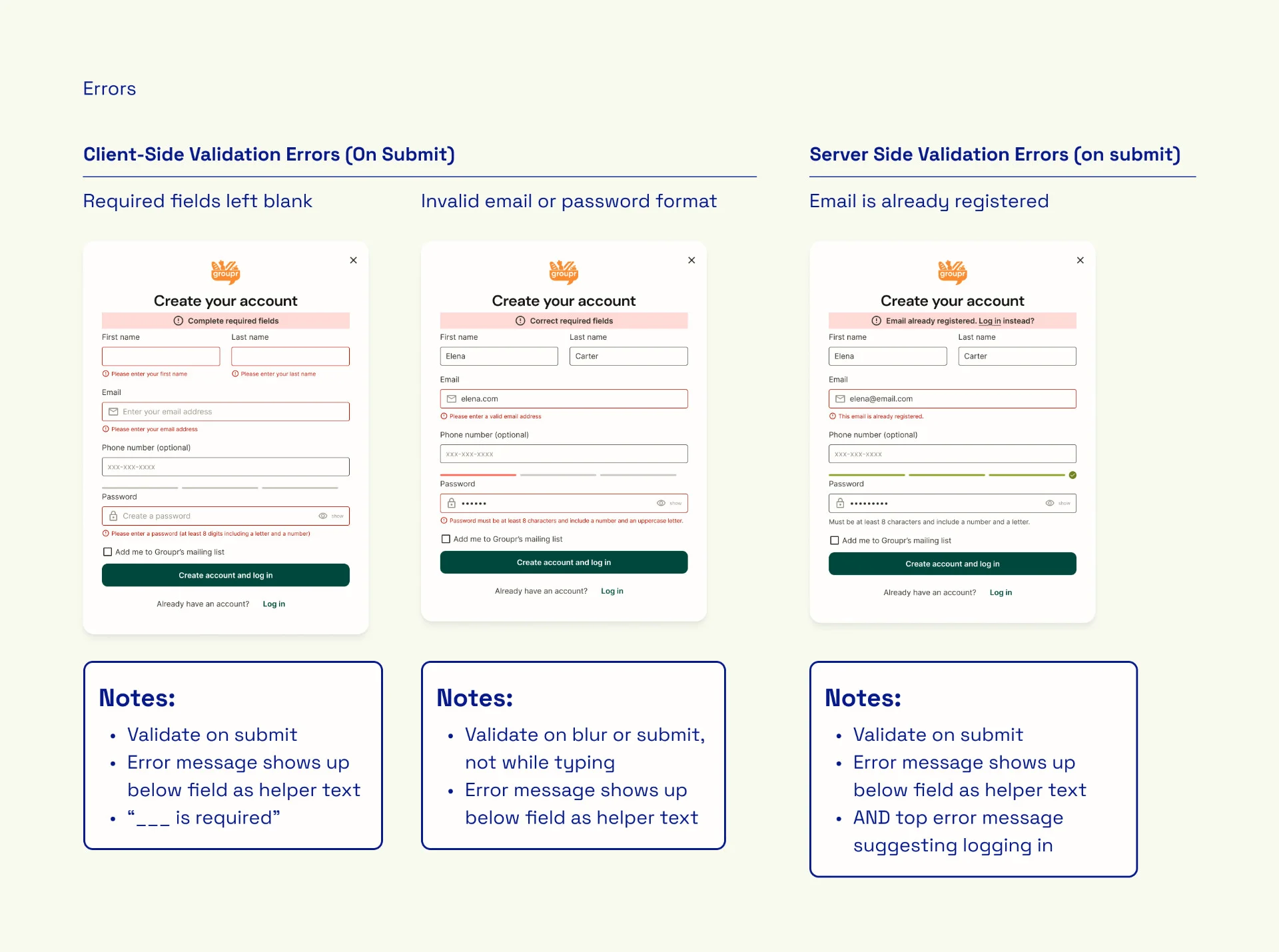
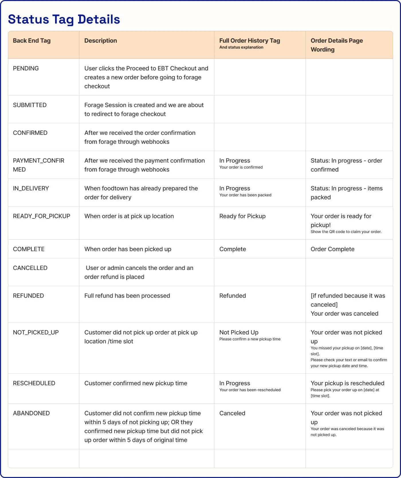
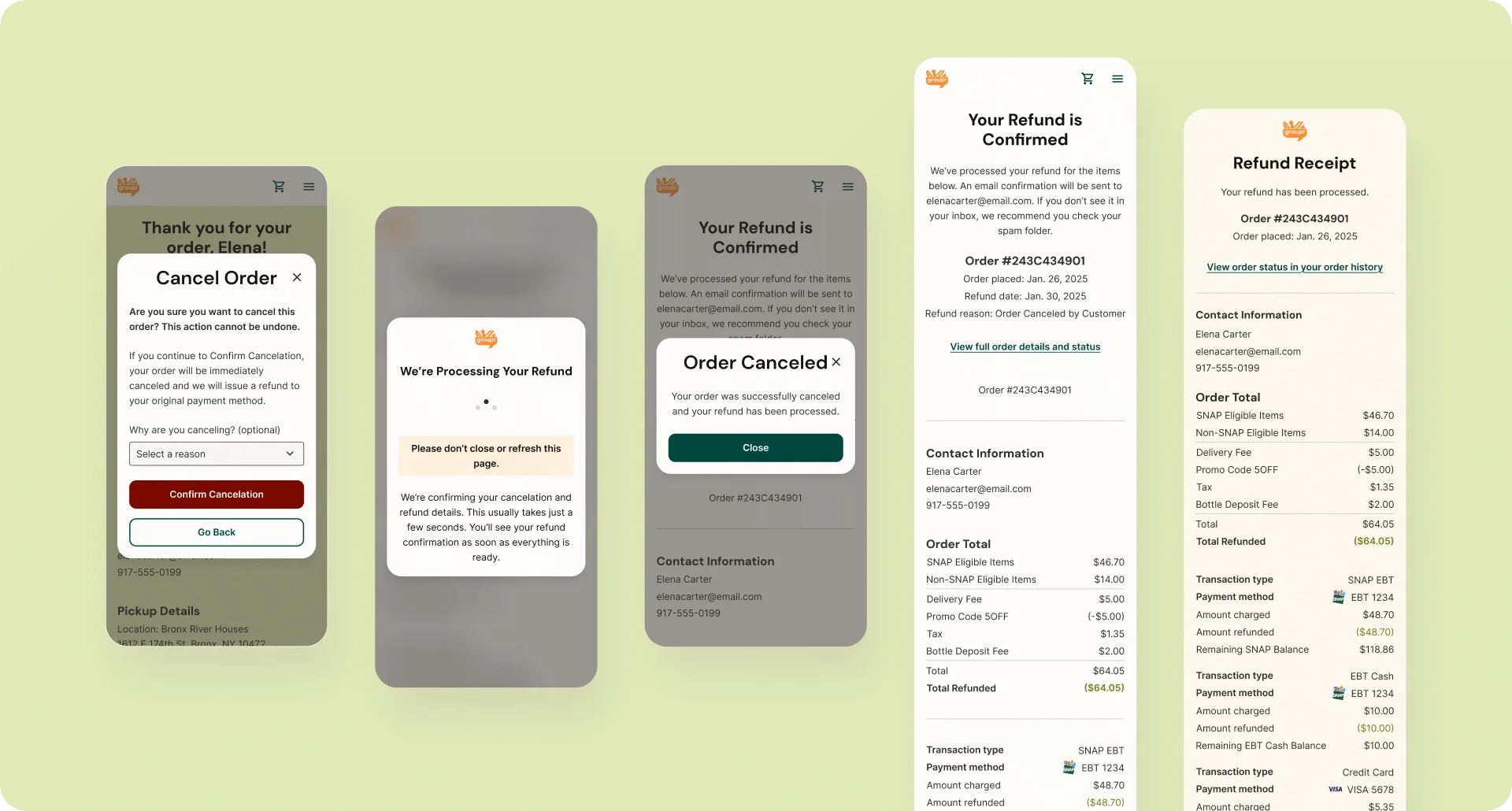
To be MVP-ready, edge cases and unhappy paths were treated as core design problems. I designed flows for missed pickups, unavailable or expired items, and partial refunds, then worked with the development team to define the backend status tags required to support these scenarios and trigger the correct UI states and notifications.
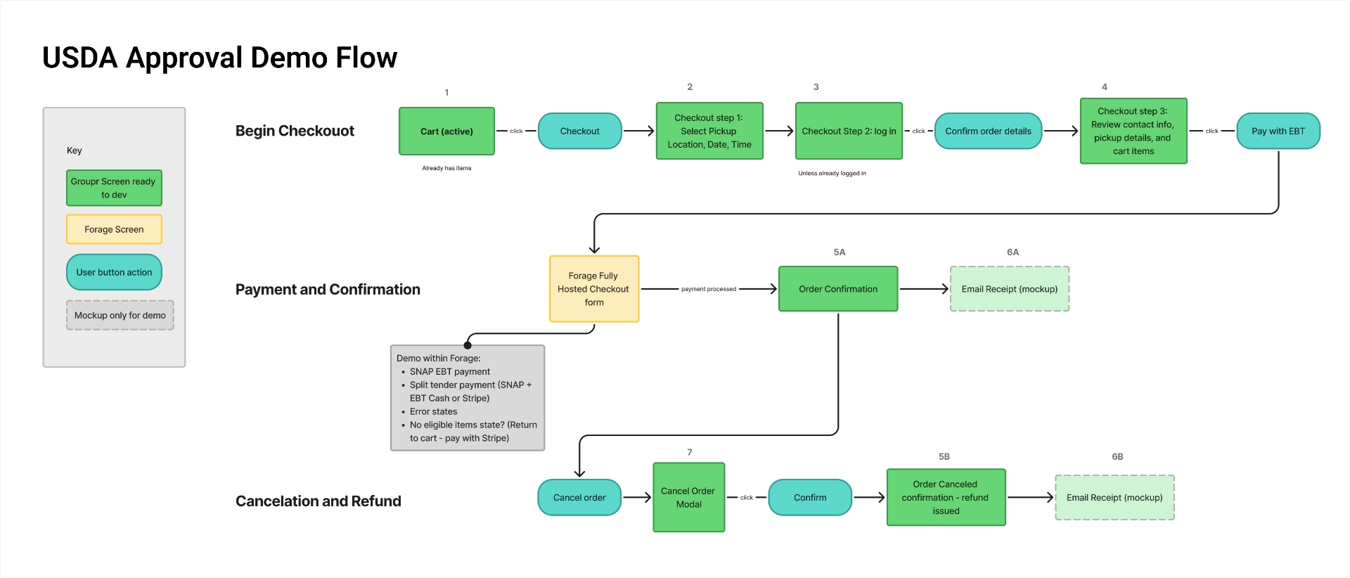
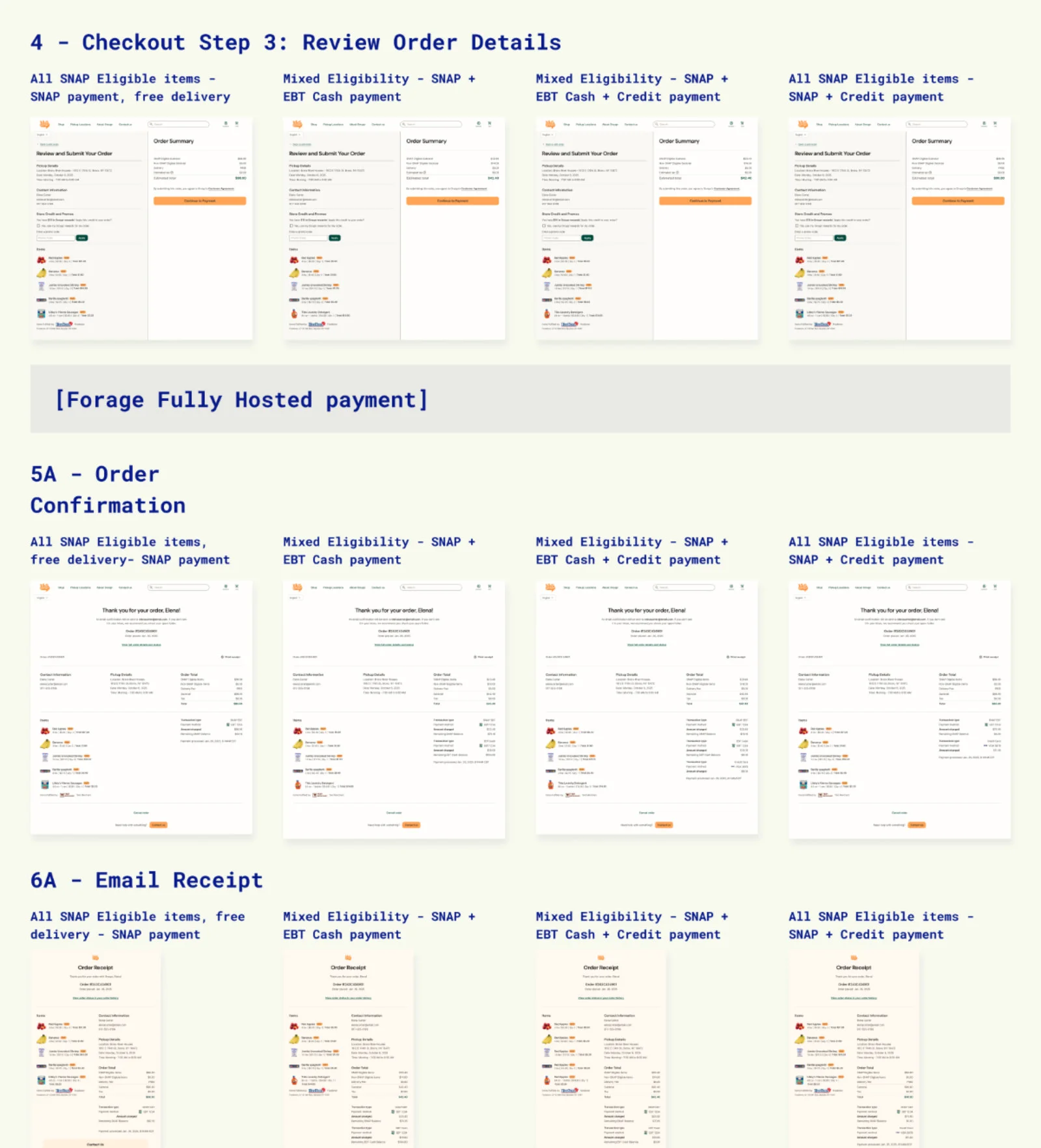
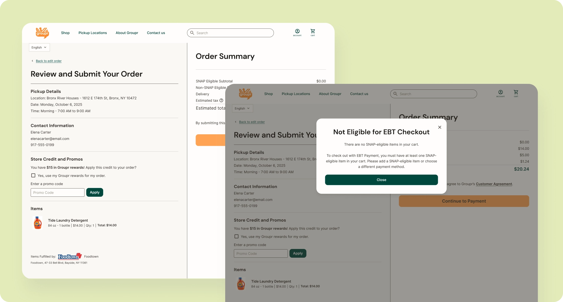
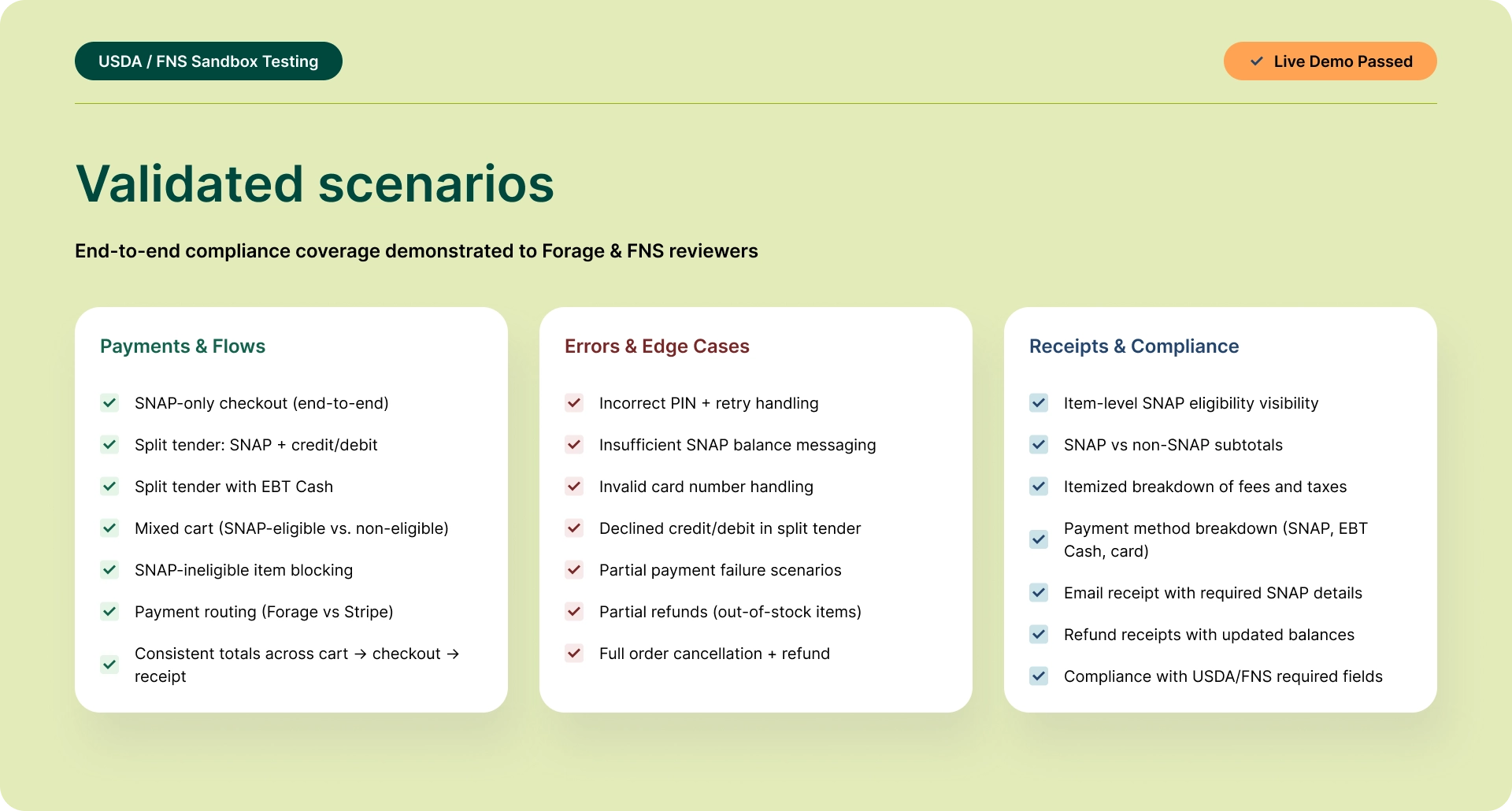
Polishing for Regulatory Requirements
To support online SNAP payments, we partnered with Forage, a third-party EBT payment processor that liaises with the USDA/FNS for approval. Forage provided a detailed set of product requirements, and I took responsibility for interpreting those guidelines and translating them into concrete UX and system behavior.
At a high level, these guidelines required that:
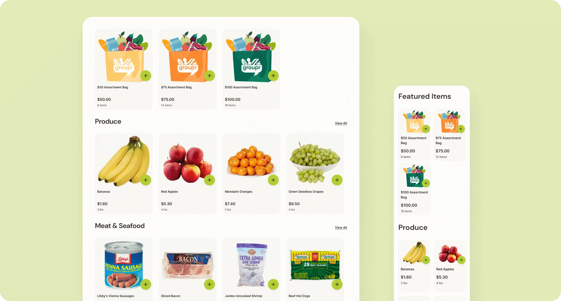
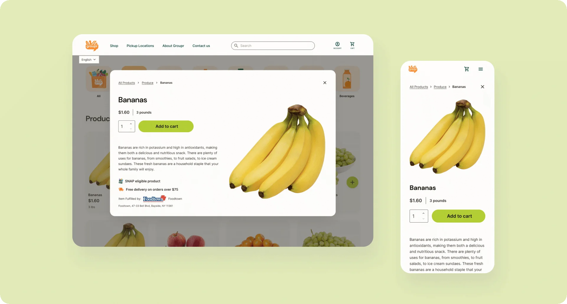
- SNAP eligibility must always be visible at the item level
- SNAP-eligible and non-eligible items must be subtotaled separately
- Checkout, confirmation, and receipts must show a full breakdown of charges and refunds by payment method (SNAP EBT, EBT Cash, credit/debit)
I ensured these requirements were reflected consistently across the ordering flow, with precise annotations so developers knew exactly what information needed to appear, when, and under which conditions.
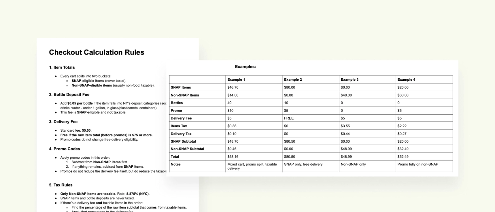
The guidelines also required defining backend calculation logic, not just UI. I documented explicit system behavior for:
- SNAP vs non-SNAP eligibility and cart composition
- Tax and fee application (including New York–specific rules)
- Split payment routing and minimum charge thresholds
- Partial refund order across payment types
This documentation translated regulatory rules into buildable logic and served as a shared reference for development, QA, and compliance review.
The Final MVP Design: Key Features
1. Pickup-First Clarity: Setting Expectations Early
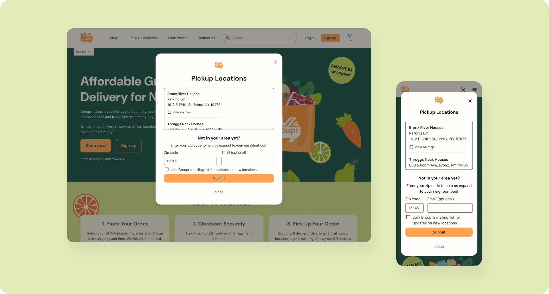
Many users are familiar with online ordering that is delivered directly to their door. Groupr’s web app needs to clearly communicate a new pattern, in which users must select from a specific set of locations and dates/times, and then go to the location to pick up the order.
Users browse freely, discover pickup locations via nav, then explicitly select location/date/time during checkout. Order confirmation reiterates all pickup details clearly. This sets expectations without blocking users from exploring the product.
Design Decisions
- Surface "Pickup Locations" persistently in global navigation
- Mention locations served on static Home and About pages
- Allow users outside pilot areas browse the full catalog, and optionally submit zip codes to signal expansion interest
- Delay hard constraints (location selection) until checkout
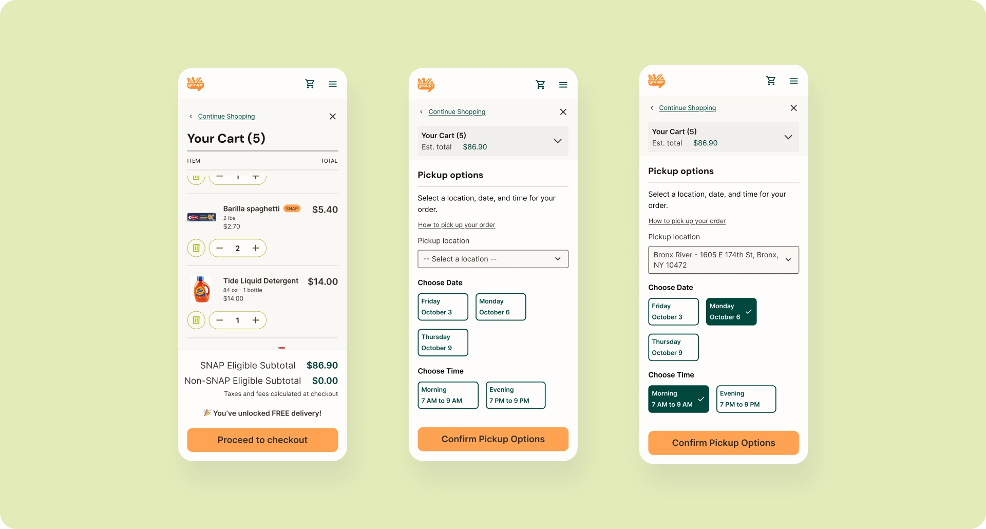
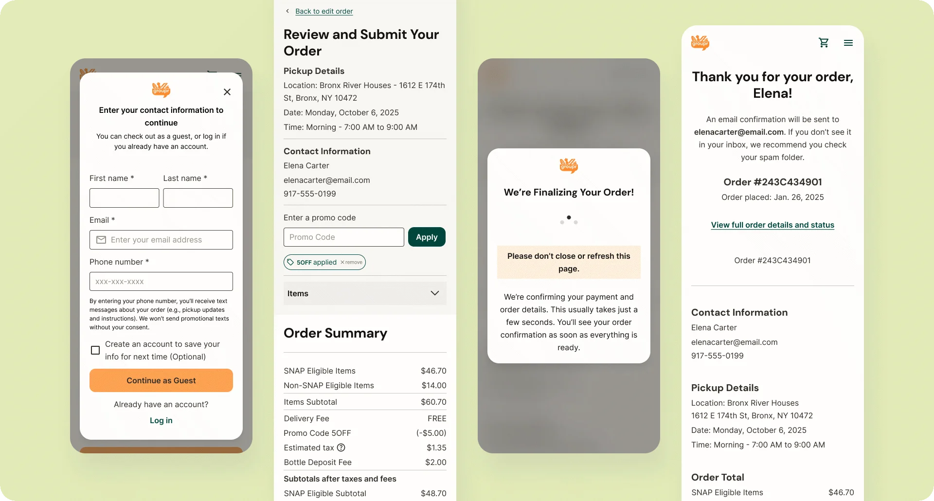
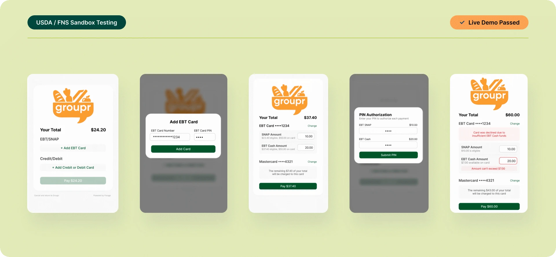
2. The Financial State Machine
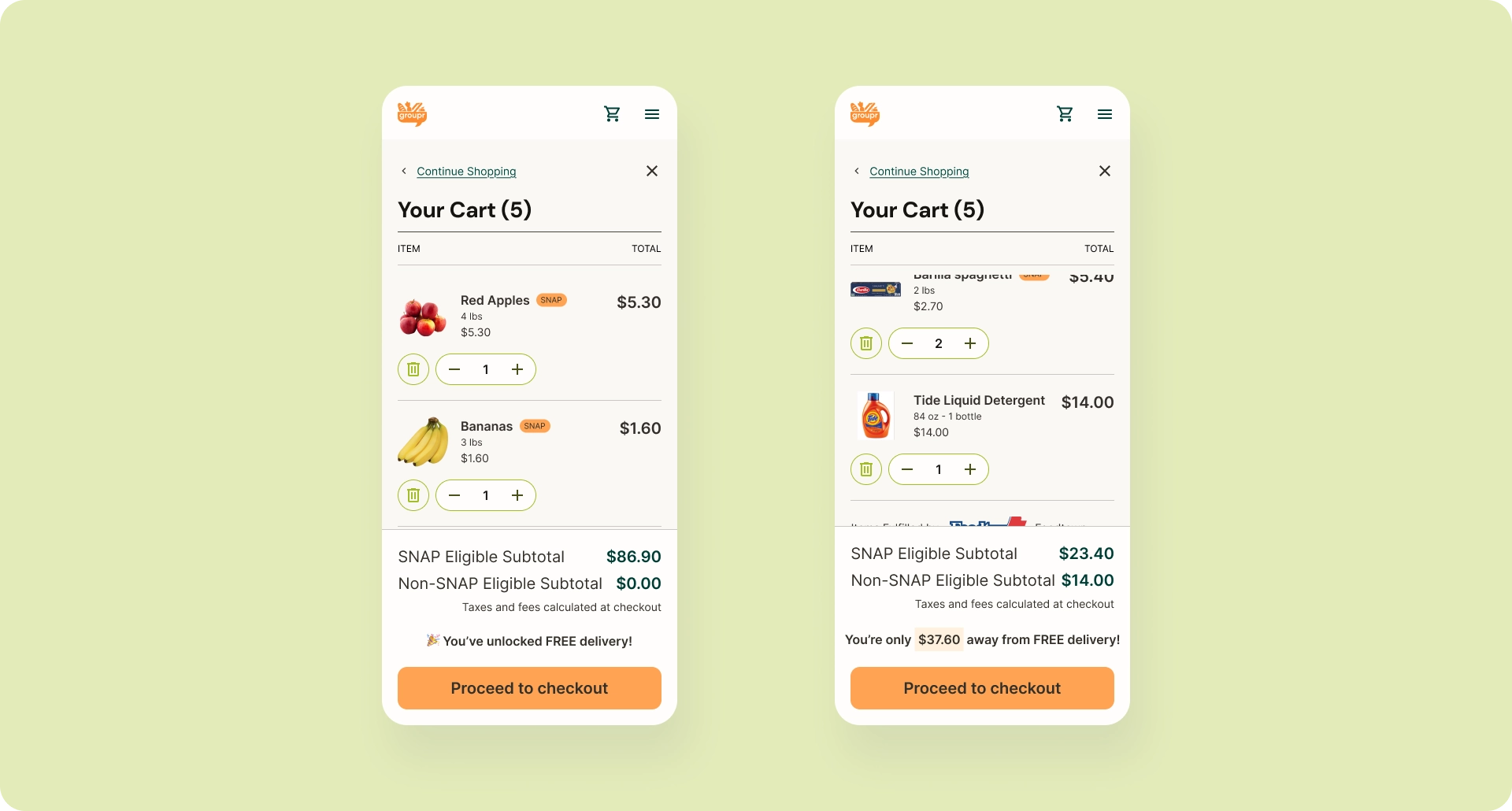
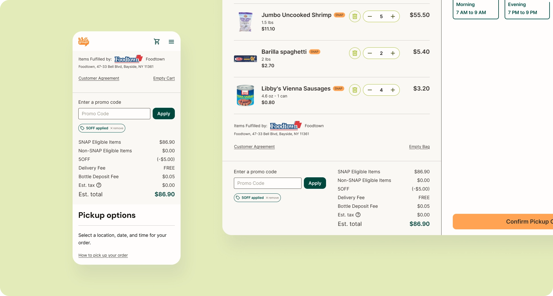
The checkout process supports split tender and complex payment rules, showing the math without muddling the details. The cart shows item totals and SNAP vs non-SNAP subtotals. Checkout breaks down costs, fees, taxes, discounts, and payment methods. The payment flow adapts based on cart composition (fully SNAP-eligible, partially eligible, or fully non-eligible).
Key Financial Logic
- SNAP-eligible vs non-eligible items in the same cart
- Bottle deposits (SNAP-eligible)
- Delivery fee eligibility and free-delivery thresholds
- Tax application based on cart composition
- Split payment routing via Forage (if cart includes any amount of SNAP-eligible items) and Stripe (if cart includes no SNAP-eligible items)
- Promo and discount application order
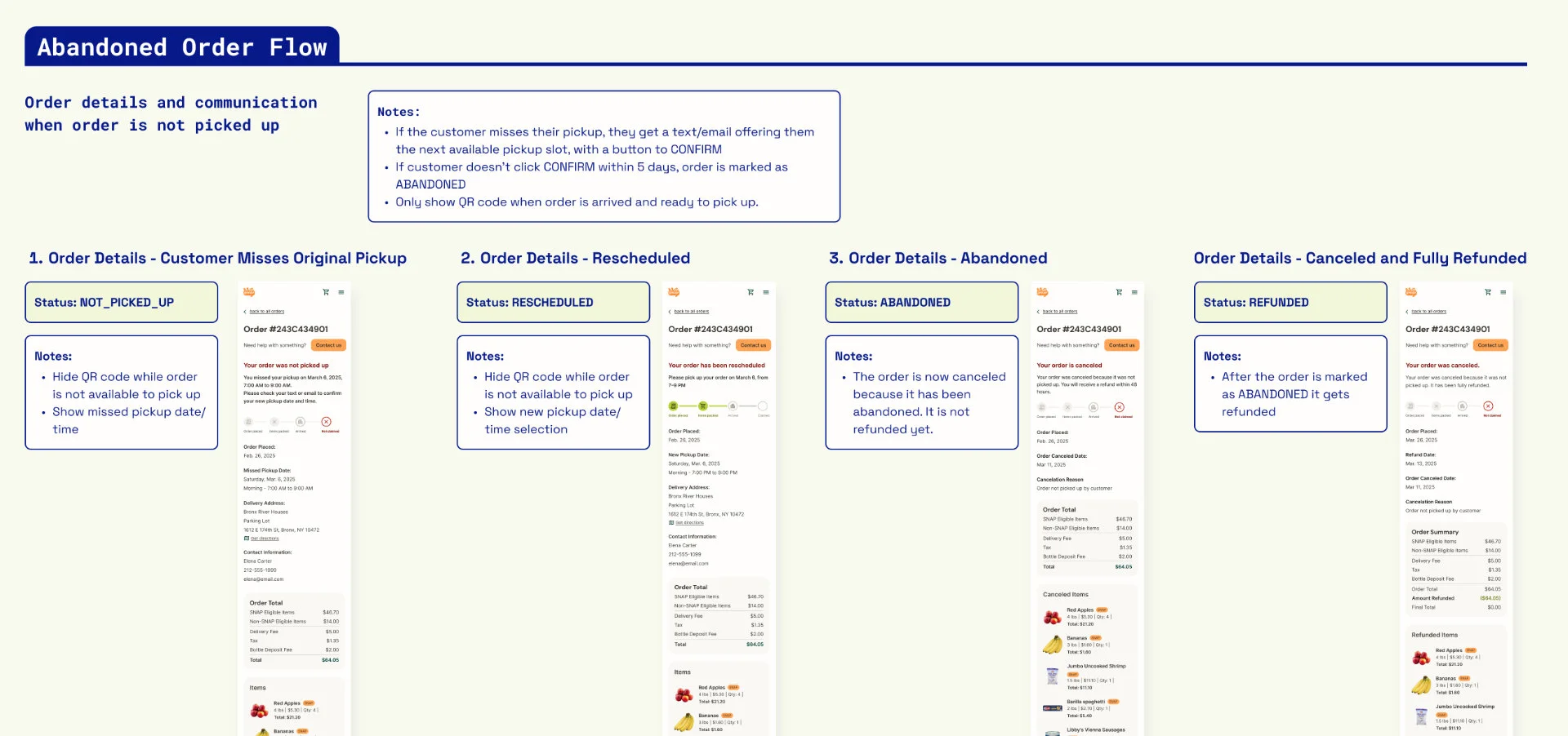
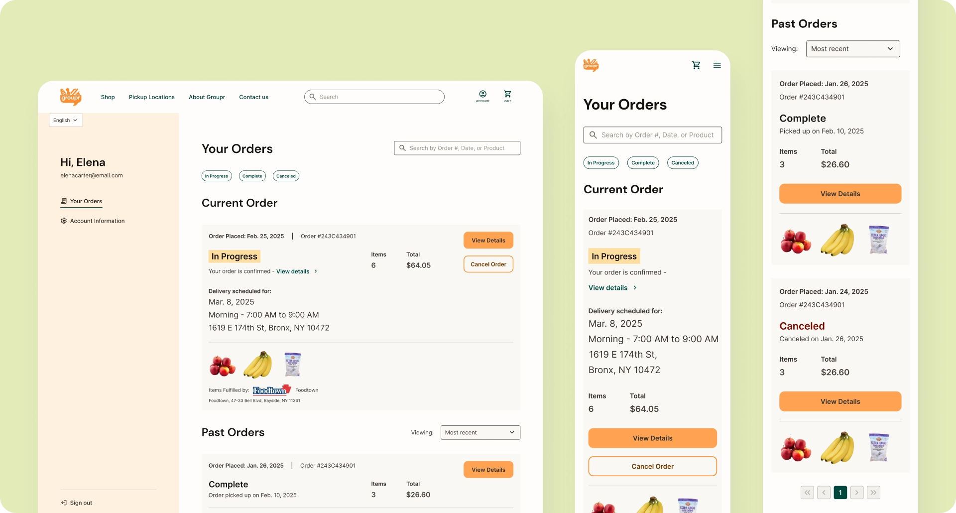
3. Order Lifecycle & Fulfillment States
The order history and order detail pages let users track what’s happening with their order, when it's too late to change or cancel, and when the order is ready to pick up.
Operationally, orders move through physical stages—packing, transport, handoff, confirmation—involving multiple parties. Backend state changes trigger notifications, lock/unlock user actions, and affect refund eligibility.
System Flow
- Admin marks order packed → order locks
- Admin marks order ready → user receives pickup notification + QR code
- QR code scanned at pickup → order marked complete
- Admin marks item out of stock → partial refund logic triggered
- Admin marks order not picked up → notification to reschedule pickup
- Admin marks order abandoned → refund and status update issued
Results & Impact
Product Status
By the end of my engagement in October 2025, the core web app supported end-to-end ordering, SNAP/EBT–compliant checkout, and pickup-based fulfillment, and had reached regulatory testing readiness.
Validating Early Success
The platform successfully demonstrated compliance-ready functionality through live walkthroughs with Forage and USDA/FNS reviewers. I led presentations of required test scenarios including SNAP-eligible vs. non-eligible carts, split payments, full and partial refunds, and error handling—validating that the system behaved consistently across critical edge cases.
This regulatory validation established the technical and UX foundation necessary for pilot launch and future scale, representing a significant milestone for a platform serving an underserved market.
Reflection
Working on Groupr required designing across multiple layers simultaneously—regulatory rules, financial logic, real-world fulfillment, and a trust-sensitive user experience—within a lean and evolving startup environment.
The project demanded constant translation: turning abstract requirements into concrete system behavior, mapping real-world processes into digital states, and balancing ideal UX with technical and operational realities. Much of the work involved defining what needed to exist at all—order states, failure scenarios, refund logic, and communication touchpoints—before individual screens could be meaningfully designed.
What made the work especially engaging was the responsibility to design for users who are often overlooked by mainstream products. Every decision carried real consequences, which made clarity, predictability, and trust central design goals throughout the system.
More Case Studies

Creating a Searchable Database of Care Providers
