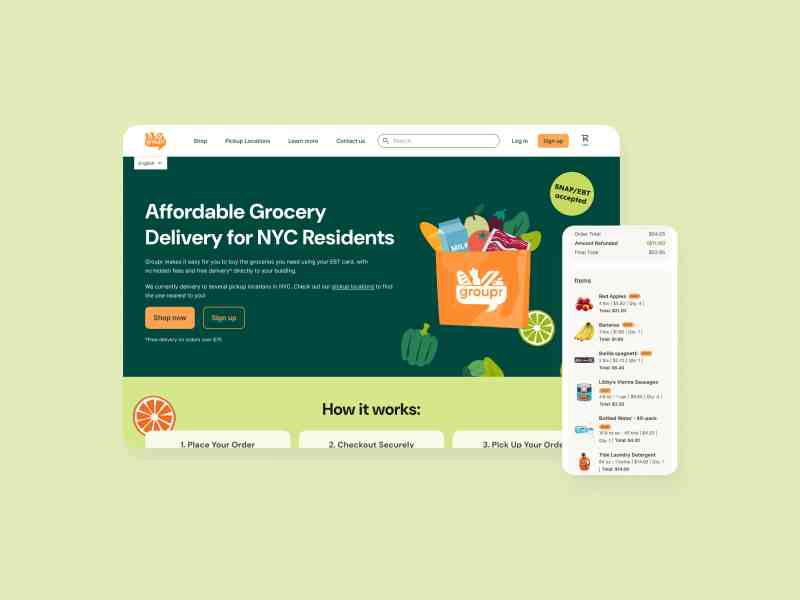
UX Design for a Volunteer Coordination App

Neighborly is a mutual aid organization that aims to decrease food insecurity by connecting people who are able to do volunteer deliveries with people who are in need of groceries. The Neighborly website is a responsive site that gives general information about the program and provides an easy way to request a grocery delivery and sign up to volunteer. The accompanying mobile app is focused on volunteering. Volunteers can easily select a delivery request to complete and then are given simple instructions on what to buy, and where to deliver. By focusing on direct connections among community members, the app and website aim to encourage solidarity between neighbors and strengthen an understanding of how easy it can be to help each other.
Overview
UX Designer | UX Researcher | UI Designer
Figma | Figjam

Background
This project began as coursework focused on designing for social good, but evolved to include research with organizers actively working on food distribution programs. I conducted exploratory interviews with stakeholders at a local mutual aid organization to understand their challenges with food distribution logistics. While organizational restructuring prevented the project from moving to implementation, the research provided authentic insights that grounded the design in real user needs.
In the early days of the Covid pandemic, several mutual aid groups sprung up around my neighborhood to provide assistance to people who, for whatever reason, didn't have reliable access to food, medication, household necessities, and more. I volunteered with one of these groups and helped shop for and deliver free groceries to people in my community. I was inspired by the mutual aid method of circulating resources within a community, and the solidarity that was encouraged between neighbors. This app and website look at one way that UX design can be used to make it even easier to give help when we're able and ask for help when we need it.

The Problem
According to the USDA, more than 34 million people in the United States are food insecure. Where I live, in Brooklyn, New York, almost 400,000 people are experiencing food insecurity, and many of them are not eligible for food assistance programs. Many mutual aid groups are working to address this issue with grocery delivery programs. These projects require a good deal of coordination on the part of organizers, who must train volunteers, do outreach to those in the community needing aid, and carry out the logistical work of matching volunteers with recipients.
The Solution
This project aims to create a hub that will connect volunteers with those in need of aid, with less direct involvement needed from organizers. Neighborly is meant to be a simple and efficient way for volunteers to sign up for and complete a grocery delivery whenever they find themselves with a bit of free time - anyone can be encouraged to help out without needing to clear their schedule. The focus is on direct connections between members of the community. By making the process straightforward and nonjudgmental, we can normalize asking for help when it's needed, and providing help when we are able.


Research & User Insights
Research Process
I conducted interviews with four residents of Central Brooklyn who at some time had been involved in mutual aid organizations and most of whom had specifically participated in mutual aid work addressing food insecurity. I set out to understand:
- What is the system of matching volunteers to requests for help?
- What is the volunteer process like, and what are the difficulties that can be improved upon?
- How is information about needs communicated between recipients, organizers, and volunteers?
- What are the barriers to addressing food insecurity on a community level?
Key Pain Points
Organizers: Takes a lot of high-level organization to match volunteers with recipients, and this takes time
Volunteers:
- No centralized place for volunteer information and assignments
- Hard to find information on shifts they have signed up for - just have to search emails
- Have to use multiple different platforms every time they want to volunteer
- Have to jump between email app, phone, and maps while out shopping and delivering
- On a phone I can't have multiple emails open at once, have to keep reopening
- Can't check off the items I shop for unless I have a printer
Ideation & Strategy
User Needs
- Volunteers need a way to help out within a busy schedule
- Volunteers need a way to easily access delivery information and shopping list on a phone while out in the world
- Volunteers need a way to keep track of information and assignments in one place
- Everyone needs the simplest possible way to request deliveries or sign up to volunteer for a delivery
- Recipients need a way to be updated about their request
- Organizers need a way to streamline the process of matching volunteers to delivery requests
How Might We
How might we...
- ...create an experience where people feel supported and encouraged to ask for help when they need it and offer help when they can give it?
- ...create a digital product that follows the spirit of mutual aid and solidarity?
- ...create a centralized volunteer experience that focuses effort and resources within a neighborhood - but also make it scalable?
- ...create an app/website that removes barriers to giving and receiving aid?
Design & Prototyping
Mobile App Design
Taking a mobile-first design approach, I began by thinking about what the absolute necessities would be to include in a dedicated mobile app. Considering my different users' needs, it was clear that a mobile app was most useful specifically for people who currently wanted to volunteer. Other users could reach their goals with a website accessed from their homes, but volunteers needed something that would be easy to use both at home and out in the world while shopping and doing deliveries.
Key Features
Volunteer Home: Displays all currently requested deliveries with filtering options for distance, family size, and timing to help volunteers select appropriate orders.
Task Flow: Once a volunteer claims a delivery order, they follow a streamlined process: confirm delivery time, shop using the integrated checklist, and complete delivery.
In-app Communication: Direct messaging between volunteers and recipients for coordination, with SMS integration for recipients without the app.
Low-Fidelity Prototype
I created an initial prototype that followed the main user flow of viewing a grocery order, claiming that order, confirming the delivery time via in-app messaging, using the shopping list to buy groceries, and delivering the groceries.


Testing & Iteration
Usability Study Results
I conducted a moderated usability study with four participants to test the low-fi prototype. Most participants had trouble with many of the same features, leading to several key insights:
- Users need to select a delivery time window without leaving the main flow. Users struggled to navigate to a chat window and back to confirm a delivery time, feeling like they were leaving the linear flow and getting lost.
- Users need a map visual in a neutral color. One user noted that the red circle used to show the recipient's approximate location could imply that the area was dangerous.
- Users need notes and special requests to be more visible when previewing a delivery request. Many participants didn't notice important requests like needing to carry groceries up stairs.
- Users need a way to tell the app their location. Participants assumed the app knew their location when order cards listed distances.
Design Updates
Based on testing feedback, I made several key changes:
- Added location input field for distance calculations
- Changed map indicators to neutral blue color
- Made delivery time selection a required radio button choice instead of messaging
- Moved important notes above shopping lists for better visibility
- Simplified the overall flow by removing the confusing messaging step


Final Design
High-Fidelity Mobile App
In creating the visual design, I focused on simplicity and legibility. I relied on white space to keep the design uncluttered and easy to read. I used a color scheme of blue and light yellow to convey a trustworthy and professional look while feeling friendly, upbeat, and optimistic.
The final prototype features a much more linear and logical flow after removing the need to chat to confirm delivery times.


Responsive Website
While the app was primarily a tool for volunteers to streamline the delivery process, the website needed to serve multiple purposes: providing information for new visitors, allowing people to request food assistance, and enabling initial volunteer signup.
I designed a straightforward hierarchical structure that would be easy for all users to navigate, with particular attention to making it as easy as possible for someone experiencing food insecurity to find assistance on the home page.

Accessibility & Inclusion
Creating an accessible experience felt particularly crucial for a project that aimed to foster community solidarity. Key considerations included:
- Spanish language option always available
- Volunteers can preview delivery requirements to select based on physical ability
- Easy-to-find grocery request process for users with limited tech access
- Cross-device compatibility for users without smartphones
- Flexible volunteering that works around difficult work schedules
Impact & Learnings
Key Takeaways
This design focuses on grocery delivery within communities to help address food insecurity affecting hundreds of thousands of people in Brooklyn alone. By making the volunteer process as simple and efficient as possible, the app aims to minimize barriers to giving help, making it easy for anyone to help out a neighbor whenever they have just one or two free hours.
What I Learned
The most important lesson was to continually go back to the WHY. At every step, I reminded myself to think about the principles of mutual aid and consider how my design was working within the goal of increasing food security from a local, community-oriented mindset. I learned that the groups of users I was considering - volunteers, recipients, and organizers - were fluid roles. Sometimes we need help, and sometimes we can offer help, and those situations don't define the "type" of user we are.
Next Steps
- Usability test with organizers of mutual aid groups, focusing on language and alignment with mutual aid ideals
- Build the request side of the app with a simple form for people who need food assistance
- Usability test with people receiving food aid, focusing on ease of use
- Develop a more thorough volunteer onboarding process that could be integrated into the app or website

More Case Studies

Creating a Searchable Database of Care Providers